Monica Cook, ‘Volley’ at Postmasters

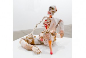
Monica Cook, Dreyvus. Photo courtesy of Postmasters.

Figurative sculpture of fantastical creatures being rare in Chelsea, Monica Cook’s first New York solo show starts out as strange, but gets more eccentrically alluring. A monkey-like character by the door sets the tone with a dignified look in his eye but a half-finished, diseased-looking body. His simian brethren, in sculptures, photos and a stop-animation video, are equally grotesque, cobbled together assortments of fur and plastic. They recall David Altmejd’s gaudy giants, but elicit more sympathy.

A parent-and-child grouping and a female with her dog hint at the possibility that the beasts are stand-ins for us humans. This suggestion is confirmed by the video, in which the critters court and mate in a manner recalling Cook’s excellent 2010 YouTube Play contribution (not in the show), featuring romantic encounters driven by bestial desires. Things work out better in Cook’s animal kingdom, however, as ulterior motives fall by the wayside and, after a series of shy glances, a male magically impregnates a female by merely proffering her a bauble.

The fact that this pretty seed was torn from a fetus-like pod, or that the female attracts the male by munching on an olive-like oval pulled from the skin of her leg, is the repulsive flip side to these creatures’ damaged beauty. Missing flesh reveals skeletons cleverly constructed from coiled phone cords, internal organs made of glass balls and baboon bottoms filigreed with lingerie-like ornamentation. Despite their disconcerting appearance, their rituals of attraction and reproduction are sincere and absurdly simple, offering a kind of prelapsarian seduction of their own.
‘Spies in the House of Art’ at the Metropolitan Museum of Art

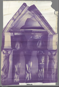
Francesca Woodman, Blueprint for a Temple, 1980.

Contrary to its title, there’s nothing particularly subversive about ‘Spies in the House of Art,’ the Metropolitan Museum’s enticingly titled exhibition of its contemporary photography collection, which opened yesterday.  Photos, films and videos take museum display and visitor responses as subject matter, but the mood of the best pieces is more fond criticism than biting institutional critique.  Still, by bringing the myriad ways we navigate the museum experience to our conscious mind, the show counteracts purely passive viewing pleasure.

A standout is Francesca Woodman’s 1980 ‘Blueprint for a Temple.’ Completed a year before her untimely death and marking a major shift from her small scale photos, this 15 foot high photo collage of a Greek temple supported by her friends dressed as caryatids and printed on blue architectural blueprint paper playfully remakes ancient culture while forces a connection between past and present that resonates with the Met’s newly crafted Moroccan court.

The show’s second major highlight, Rosalind Nashashibi’s and Lucy Skaer’s 16mm film ‘Flash in the Metropolitan Museum’ from 2006 was shot at night with a flash strobe as the artists moved through the museum, momentarily illuminating Greek ceramics one minute, African or Medieval European sculpture the next.  Unclear images, seen for a moment in varying scales and unflattering angles turn usual museum display on its head while creating an alluringly mysterious anthropological study that is equal parts ‘Blair Witch Project’ and ‘Mixed Up File of Mrs Basil E. Frankweiler.’

Less familiar work comes across as amusing and fresh, like Laura Larson’s photograph of a display in the Telfair Museum in Savannah, Georgia which delights in pointing out the tasteless clash of style in a Regency settee, a wallpapered landscape and patterned marble floor.  Sophie Calle’s text and image of a gender-ambiguous blind person describing the ‘terrific ass’ of a sculpture in Paris’ Rodin museum invites reflection on our own ideas about beauty.

By comparison, a photo of a shelf of stored artworks by Louise Lawler, an image of a painting by Tim Davis with his flash blotting out the subject’s face and a video by Lutz Bacher following a young adolescent through the Picasso Museum in Paris look at art stored, reproduced or visited in unexpected if not particularly compelling ways.   In a sense, the Met itself undermines the less nuanced work in the show – the stunning artwork and displays encountered on the way to the 2nd floor photo galleries are a tough act to follow.

Matt Collishaw ‘Vitacide,’ at Tanya Bonakdar Gallery

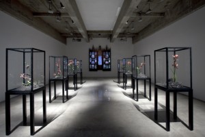
Matt Collishaw, installation view.  Photo courtesy of the artist and Tanya Bonakdar Gallery, New York.
Matt Collishaw, installation view. Photo courtesy of the artist and Tanya Bonakdar Gallery, New York.

Photos of Texas death-row prisoners’ last meals, giant prints of dead insects and sculptures of diseased flowers (titled, for instance, after a poem from Baudelaire’s Fleurs du Mal or a U.K. waste-management company) confirm that original Young British Artist Mat Collishaw still traffics in sensation. Surprisingly, the most gratuitous subject—the last meals—proves to be the most thought-provoking, despite the fact that it, too, reflects Collishaw’s fondness for grotesquery.

Collishaw rightly calculates that our morbid fascination will attract us to these photos of french fries, steak, cinnamon rolls and other repasts, dimly lit to recall Dutch still-life painting, but mainly looking gray and unappetizing. Still, evoking this last moment of pleasure does create twinges of sympathy for the condemned, whose orders range from a dish of yogurt to a heaving pile of food.

Vitrines of waxy-looking, boil-covered, meat-pink amaryllis, lilies and other flora growing in toxic soil are so blatantly gross that they kill any such nuance of feeling. A video animating decaying flowers buzzing with flies in a comically misty dead forest does a bit more than the sculptures to suggest the dark enchantment hinted at in Baudelaire’s title, but setting the flatscreen behind an 18th-century altarpiece seems like a mere ploy to stir the pot with a tangential religious reference. Collishaw gets it right when he mines the contradictions in humanity’s capacity for base thoughts and actions. But when he simply represents it, he produces more of the same.

Doug Wheeler at David Zwirner Gallery

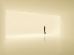
Doug Wheeler, SA MI 75 DZ NY 12, 2012, photo courtesy of David Zwirner Gallery.

Relational aesthetics took a beating last fall as critics decried participatory artworks like Carsten Holler’s three story slide at the New Museum and MoMA’s installation of Rirkrit Tiravanija’s free lunch.  The visitor’s physical experience is also key to Doug Wheeler’s installation which opened today at David Zwirner Gallery and recreates a 1975 piece made in Milan by the influential So Cal ‘Light and Space’ artist.  But the hushed environment, limited to ten people at a time and entered after donning white booties so as to keep the floor pristine, is all about aesthetics, and less about interrelating with your fellow gallery goers.

The lighting in the installation changes in intensity and color as it simulates the transitions from dawn to day to dusk, slowly revealing where the boundaries of the flat floored, egg-shaped room are.  But even in the strongest light, it’s a strain to make out where gallery wall ends and floor begins; only the toes can tell as you feel the floor’s upward slope.  The impulse is to find the spot where your senses are most confused.

Visitors who stayed in the gallery the longest this morning inched their way to the front and center of the installation and stood looking into an optical illusion – a space that appeared to extend to infinity.  The sensation was like peering into a deep fog or a snowstorm (under comfortable conditions) as my perception of space kept shifting to make sense of what I was seeing.

Wheeler’s installation recalls James Turrell’s installations, in which visitors approach a shape on the wall only to realize that it’s a rectangle of recessed light.  Here, the experience is more intimate – like entering into the space occupied by light rather than gazing in from the outside.  Uta Barth’s photographs of light come to mind, as do Yayoi Kusama’s Infinity Nets but both treat light and infinity as more concrete subjects than Wheeler does with what he calls his ‘molecular mist.’  The scale and ambition of Wheeler’s project won’t be matched again soon in New York; catch it while you can and arrive early to avoid lines.

For more background, read Randy Kennedy’s Jan 15th NYT article.


Uta Barth, “…and to draw a bright, white line with light,” Tanya Bonakdar Gallery

Uta Barth, ...and to draw a bright white line with light (Untitled 11.2), inkjet print, 2011.  Courtesy of the artist and Tanya Bonakdar Gallery, New York.
Uta Barth, ...and to draw a bright white line with light (Untitled 11.2), inkjet print, 2011. Courtesy of the artist and Tanya Bonakdar Gallery, New York.

The centerpiece of Uta Barth’s latest solo show is a photo series depicting a continually morphing strip of light beneath her living-room curtains, a preposterously simple conceit which nevertheless yields complex optical illusions. As this diaphanous sliver shifts course over an afternoon, it variously resembles a snake, a line on an EKG or a trail of cigarette smoke, all the while transforming the space between the camera, the curtain and the window into an ambiguous territory where volumes flatten or swell, and light can pass for white paint.

Two glimpses of Barth’s hand arranging the curtain folds remind us of her agency, but it’s nature’s hand that propels the work’s attractively simple narrative as the sun’s changing position gradually increases the width of the band. At this time of year, as the onset of winter makes Barth’s invitation to contemplate sunlight especially attractive, the work entices us into the pleasures of solitary idleness that are at odds with the pace of everyday urban life.

In the back room, by comparison, a second group of photographs depicting built-in closets and drawers in the artist’s bedroom seems coldly architectural. Each image is emblazoned by squares or rectangles of light cast from an opposite window: One features a particularly bright patch that suggests celestial or alien visitation; another, a band of shadow over a door latch, creates the illusion that the surface of the print is scratched. But otherwise, the real drama of transformation takes place in the front gallery.

Originally published in Time Out New York, issue 839, Dec 1-7, 2001.