Manfred Pernice, “diary” at Anton Kern Gallery

For ‘Time Out New York’ Magazine
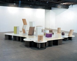
Manfred Pernice, Installation view, courtesy Anton Kern Gallery

Given the impenetrable nature of Manfred Pernice’s work, you wouldn’t confuse him for an introspective soul. Despite its title, his latest show does little to change his trademark reluctance to communicate clear meaning. Instead, a mysterious centerpiece sculpture—emblazoned with unexplained dates, dotted with everyday objects and accompanied by giveaway pamphlets stamped DIARY#8212;tentatively suggests that experience is subject to many interpretations.

A few zones of fluorescent green and deep red on the central installation are among Pernice’s few concessions to aesthetic appeal. But for those willing to grasp for associations, a honeycombed-patterned platform suggests an after-hours cafeteria, while empty plinths evoke museum or trade-show displays. If those same pedestals could also be imagined as buildings in a model urban landscape, then a kid’s ball could be a stadium, while a tiny floral tile might be seen as a garden. Who’s to say?

Certainly not Pernice, whose “diaries” mix dates, texts and underwhelming photos of blurred or mundane scenes. One unremarkable photo of a man carrying a bag is captioned EXPRESS YOURSELF, while another image shows the artist with a glazed look in his eyes. Both touch on the challenges of being original, but beg the question of why Pernice can’t provide his audience a few more clues to understanding his work.

As if anticipating such criticism, a sculpture in the back gallery consists of nothing but empty boxes (for cookies, cigarettes, etc.), dated to create a chronicle of the artist’s activities. While appearing to go in a direction diametrically opposed to the rest of the show, it still maintains the same line that artistic identity is ultimately elusive.
Betty Woodman at Max Protetch Gallery

Max Protetch Gallery Feb-Mar 2008.
Betty Woodman's sculptures/ceramics/paintings bring beauty back to the art world.

Mai-Thu Perret, “An Evening of the Book and Other Stories”

For ‘Time Out New York’ Magazine

Mai-Thu Perret, “An Evening of the Book and Other Stories”

Mai-Thu Perret’s first solo exhibition in New York aims to mine past avant-garde movements for newly provocative images and ideas, but provides little of either.  What you do get are lots of arcane references underscoring the video, sculpture and diagrams.  Take for instance, the show’s centerpiece video of young female dancers in utilitarian garb which, according to Perret, is inspired by artist Varvara Stephanova’s set designs for Vitalii Zhemchuzhnyi’s 1924 agitprop theater piece ‘An Evening of the Book.’ You wonder whether knowing any of this is worth the piece’s slim rewards.

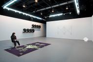
The front gallery offers an oddball assortment of artworks, including a ball of neon tubing looks like a wadded up (rejected?) version of props the Geneva-based Perret has previously shown, a carpet with a Rorschach pattern and large wall diagrams of dance steps.  But nothing quite sums up the pointlessness of this show better than the eight gigantic, cardboard commas  – which tellingly resemble quotation marks – that line a wall leading to Perret’s take on Zhemchuzhnyi’s homage to revolutionary literature.

The same commas, along with a huge blank-paged book, appear in the video as part of a set, around which the aforementioned cadre of young women performs synchronized movements that see-saw between energy and lethargy.  Apparently unable to sustain the stamina to convert past ideology to present-day meaning, the characters convey the disappointing message that such attempts are better in theory than practice.

On the Horizon: Whitney Biennial

Will this be the year that the Whitney Biennial makes critics happy? The United States’ most important contribution to today’s international circuit of biennials and triennials (and one of the oldest by far) is usually guaranteed to provoke debate about which artists were and weren’t invited to participate. The focus in 2006 was international while previous editions of the show stressed artists from regions outside New York, but this year’s show appears likely to please the New York/LA axis. Chockablock with artists familiar to gallery crowds in both cities, the list of 81 participating artists and collectives includes conceptual art pioneers Louise Lawler and John Baldessari, and representatives from the subsequent generations they influenced, including Fia Backstrom and Carol Bove. Amongst the other strains of contemporary art showcased by the Biennial will be a focus on cross-discipline work, including a series of performances staged March 3 – 23 at the Seventh Regiment Armory on Park Ave at 67th Street. Save the dates!

For more on the show, visit the Whitney Biennial’s website.

Dan Perjovschi, “You Remember My Pin?”, at Lombard-Freid Projects

For ‘Time Out New York’ Magazine

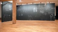
Dan Perjovschi, installation view, courtesy Lombard-Freid Projects

Even if Dan Perjovschi’s doodle-like, politically charged wall drawings seemed a little out of place in MoMA’s pristine atrium last year, the incongruity created a certain frisson. His first New York solo show is just as arresting, despite being relegated to a much smaller space. Using white chalk on gray walls, the artist turns the gallery into a giant blackboard on which he has scrawled lively if uneven critiques on issues ranging from the environment to Iraq.

Perjovschi’s nervous line, and his tendency to overlap bold and faint images by erasing as he goes along, give his work an energetic, experimental feel. On the downside, drawings of a naked derriere surrounded by puckered lips and of a puppeteer making anonymous figures dance, amount to little more than generic symbols. Perjovschi’s spontaneous approach often misfires, as in his unnuanced drawing of a giant trash can scrawled with .

Most of the time, however, Perjovschi’s economy of means yields more trenchant results. A sun labeled rich on one side and poor on the other emanates more rays on the “poor” side—a concise commentary on the inequity of global warming’s impact. The clarity, punch and provocation of such pieces suggests that they’d be just as at home outside as in a gallery—which would be just as well, given Chelsea’s recent profusion of mindless street art.