Alessandro Pessoli at Anton Kern Gallery

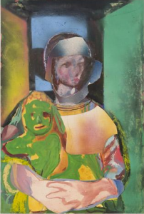
Alessandro Pessoli, "Madre e figlio." Photograph courtesy of Anton Kern Gallery, New York.

Though ubiquitous in art history, Christ rarely makes an appearance in Chelsea, meaning that Alessandro Pessoli’s recent paintings of him are surprising for their subject matter alone, not just Jesus haunting weakness. A standoff between a glowing crucifixion at one end of the gallery and a crude portrait of an unruly boy flexing his muscles in mockery at the other sets the scene for a clash between man and God. But the show gets mired in a stumbling uncertainty that there’s any difference between divine and mortal characters.

Pessoli reinvents Christ’s suffering with idiosyncratic symbolism: a body flayed pink or burnt red and a prosthetic arm bearing sunny-colored but sour lemons reinvigorate his identity as the man of sorrows. Pessoli’s indistinct style perfectly captures Christ’s unknowable depth of loss and pain, though certain details—fat, clownish tears; huge, mouselike ears—recall George Condo’s buffoonish caricatures of the Almighty. Pessoli’s portraits aren’t irreverent, however; they afford Christ dignity, just not majesty.

Judging from the show’s other centerpiece—a pessimistic portrait of humanity as presented in a series of small painted sketches—the artist similarly fails to exult God’s crowning creation. Despite being interspersed with panels of gold textile suggesting icons, ghoulish characters with exaggerated features often appear alongside—and overpower—other, more innocuous images of a family, a musician and a runner to create a picture of a corrupt mankind. Paint-encrusted scraps of cloth Pessoli used to clean his brushes accent these vignettes, implying that humans are not the apogee but the castoffs of God’s process. The artist prompts an insincere question: If creation is badly made, who’s to blame?

Originally published in Time Out New York, issue 732, October 8 – 14, 2009.

Phil Collins, “When slaves love each other, it’s not love” at Tanya Bonakdar Gallery

Phil Collins’ ability to find entertainment value in social conflict is stronger than ever in his third New York solo exhibition, in which a soap opera and amateur snapshots become lowbrow delivery mechanisms for universal truths.Soy mi madre, a telenovela-style tale of class struggle steals the show, while a subtler, voyeuristic installation of amateur photos shot by residents of several European cities is a low-key paean to everyday life.Melodrama contrasts the mundane, but each elaborates convincingly on the complexities of human relations.

Soy mi Madre is a tour de force of upper class dysfunction and working class resentment, featuring a pampered lady of the house whose hilariously quick and frequent mood swings are matched by rapid-fire clichés that paint her husband as a lecherous alcoholic and her as mentally fragile, cold and ruthless.By the end, a pistol-wielding servant declares the house’s social order irrevocably changed and one wonders if this video, commissioned by Aspen Art Museum to broaden an audience that includes the area’s immigrant workforce, has the power to alter real life labor relations in ritzy Aspen or beyond.

Free Photolab, a slide projection of selected images by amateur 35mm film users who gave Collins the rights to their images in exchange for free processing, involves exploitation of a softer sort.As photojournalism by proxy, the project provides cheap source material for Collins and more than a few gratuitous glimpses of oddballs or exhibitionists for us.But the collective result – mostly portraits of friends and family at special occasions – has an eerie familiarity echoing common experiences and recalling Nan Goldin’s intimacy, Juergen Teller’s seediness, and Jamel Shabazz’s sassy posers.Several consecutive slides present jarring contrasts (a pregnant belly, then a funeral) but the pictures’ surprising strength is in their poignant take on universal experience.

Originally published in Flash Art International, no 267, July – September, 2009.

“The Generational: Younger Than Jesus” at The New Museum

Auction houses are gravitating towards mature artists and critics have sounded the death knell for the ‘young art star,’ but the New Museum’s first triennial still carries the torch for youth with its showcase of work by fifty international artists, all thirty-three years young or less. If this extravaganza of newness suddenly seems a little out of touch, the show’s curators insist that they’re following the lead of sociologists and marketers in examining the Millennial identity, intending to show it as a generation of producers, not just the consumers they’re made out to be.  It falls to one of the generation’s own to honestly portray his contemporaries as consumable; Matt Keegan’s year-book style photo portraits of recent college grads, fresh faced and earnest, tellingly point out that their lives are, as of yet, still largely unlived.

Perhaps that’s why, despite input from fifty artistic voices, the generation’s defining characteristics stay hazy, regardless of the curators’ anthropological efforts.  Artists like Liu Chuang get in on the investigation with a creepy, clinically neat display of personal effects he purchased from unknown women on the street.  Fellow Chinese artist Chu Yun takes a reverse approach, inviting women to sleep in a bed in the gallery, presenting us with a person but no information on who she might be.  Ryan Gander’s blood-flecked white tracksuit worn by one of the museum’s guards is one of the show’s best pieces, primarily because it creates a compelling, if fictional, identity for its wearer.

The show’s two most ambitious, riveting and unsettling works loosely relate to what the Millennial dossier does make clear: that the under-thirty population around the world is booming and its perception of social relations has been radically altered by the Internet.  Cyprien Gaillard’s video of two large rival gangs in a sprawling, organized fight amid Soviet-era high-rises taps into fears of a generation out of control.  Less alarming but no less alienating, Ryan Trecartin’s two-room bachelor(ette) pad is an eccentric setting for fast-paced videos in which zany characters act out personal dramas in a world of their own.

Josh Smith’s hastily produced, collaged abstractions are a painterly version of this overdrive, though their installation in a huge, pretty grid neuters their disregard for art making tradition.  Appropriation and recycling also plays into Elad Lassry’s whimsical, ad-inspired images that evoke Sara van der Beek’s carefully constructed setups and Roe Ethridge’s mood-creating series but with more humor.  Cory Arcangel’s gorgeous, fakey cyan abstraction  (a default pattern from Photoshop) resonates with Tauba Auerbach’s process driven paintings, which recall Liz Deschenes’ op art patterns and Eileen Quinlan’s abstract setups in their adherence to a set of parameters established by the artist.

But the Generational isn’t the context for artists who are in conversation with their slightly older peers and its homogenizing approach to art from around the world assumes a global, artistic lingua franca, devoid of contextual details, that probably doesn’t exist.  Several works echo better known artwork or familiar ideas, they appear to be fragments of a more complex practice, or simply beg the question of why they’ve been chosen to represent a generation.  The show’s premise is more compelling than its content, its flip title promising big ideas that the artists themselves don’t even aim to produce.  In a recorded introduction to the show, one of its curators says that today’s super-abundance of art product forces a redefinition of ‘new,’ though it may be better to ask if we should continue to expect the youngest artists to be the chief suppliers of ‘newness’ or original artwork in tune with contemporary life.  Because to judge by this show, art’s obsession with youth is past its prime.
Scott Reeder, “Painter” at Daniel Reich Gallery

Scott Reeder, "Cubist Cokehead (Blue Table)," 2009. Photograph courtesy of Daniel Reich Gallery, New York.


Last spring’s late-Picasso blockbuster at Gagosian Gallery posited the nonagenarian as a potential role model for young artists today, a suggestion only partially rebuked by Scott Reeder. Reeder likewise takes sex and death as themes, but while Picasso raged, Reeder cracks jokes. With his characteristic slacker painting style and irreverent humor, Reeder’s work demonstrates just how wide the gap is between the 20th-century canon and the contemporary artists who appropriate it.

To his credit, Reeder isn’t anxious at all about the influence of modernism: His transformations of the subjects of classic Cubist portraits into coke whores, for instance, are funny. (After all, what are all those noses good for?) But while Duchamp’s addition of a mustache to the Mona Lisa was a groundbreaking act of cheek, Reeder’s alteration of Duchamp’s Nude Descending a Staircase into Cops Ascending Staircase seems like a cheap knockoff.

The entire show feels saddled with a pre-recessionary tone of sex and binge drinking, though Nickel & Dime (End of the World)—showing the two coins flanking a mushroom cloud—does convey an ominous vibe in keeping with the current economic meltdown. Still, if Reeder’s images illustrate anything, it’s that the more things change, the more they stay the same. Basically superficial, sometimes juvenile, Reeder’s paintings refuse to take life or art too seriously, which may limit their staying power, but makes for an entertaining show.

Originally published in Time Out New York, issue 725, August 20-26, 2009.

Paula Hayes, “Excerpts from the Story of Planet Thear” at Marianne Boesky Gallery


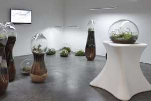
Paula Hayes, "Excerpts from the Story of Planet Thear" installation view, 2009. Photograph courtesy of Marianne Boesky Gallery, New York.

The abundantly planted new High Line, a hydroponic vegetable garden in Eyebeam’s windows, and now landscape designer/sculptor Paula Hayes’ terrariums and rooftop plantings testify that in Chelsea, green is the new black.Though Hayes’ resume includes gardens for prominent dealers and collectors, giving her plenty of art world cred, her work appears as much on terraces as galleries, and her primary media are plants and pots, begging the question of how vegetation becomes art.

Gardening has figured in the work of artists from Monet to Carsten Holler, but Hayes’ natural arrangements are an end in themselves.In undulating glass vessels roughly pedestal height, collections of tiny plants present nature as luxury object.Tiny succulents, or the fronds of a mini-fern are exquisite – a kind of maison du chocolate for greenery.Add the thrill of behind-the-scenes access to the gallery’s private rooftop installation, and taking in Hayes’ work can be a heady experience, inspiring wonder at the natural world and our ability to create beauty.

Unfortunately, Hayes doesn’t allow her terrariums and sculptures to stand on their own, introducing a thin storyline about a quasi-human gardener.On the roof, superabundant white sticks and a scattering of blue stones try for magical but come across as tacky.Part of the intrigue of Hayes project is the contrast between her organic-shaped planters and their glaringly synthetic materials – think of a small tree wearing a big blue sock over its roots.Such connections between plants and people – also evident in upright, body-shaped terrariums, or living, plant ‘necklaces’ – turn gardening from hobby to art form.

Originally published in Time Out New York, issue 722, July 30 – August 5, 2009.