For ‘Time Out New York’ Magazine
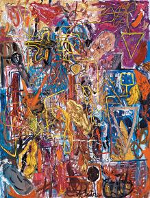
On a recent weekday, the traffic at Andre Butzer’s first New York solo show flowed in and quickly back out as skeptical visitors encountered the young German painter’s garish, Expressionist renderings of cartoony characters. Butzer’s brightly colored, monumental canvases are an amusing finger in the eye of prevailing taste – the ‘lessness’ exemplified in the Whitney Biennial – but their role as harbinger of a sea-change in art world fashion is greater than their value as art.
In the first gallery, four huge portraits of Euro-American pop-culture hybrids sport Mickey Mouse gloves and faces resembling cartoons, SS death heads and Munch’s screamer, though none are particularly amusing or menacing. Phallic projections in place of arms recall Caroll Dunham’s grotesque, penis-nosed characters but without the mystery, while the figures suggest the kitschy colors of Kenny Scharf but not his surreal creativity.
Among his own generation of painters, Butzer evinces stylistic similarities to Jonathan Meese’s colorful impasto canvases and Bjarne Melgaard’s messily rendered quasi-humans. But while their free manner with paint is accompanied by developed, albeit personal storylines; Butzer’s deadpan, recurring characters dangle the potential for narrative in front of their audience without really delivering.
The worst culprit is ‘Viele Tote in Heimatland: Fanta, Sprite, H-Milch, Mickey and Donald!’ a nearly thirty foot long canvas arranged with spectral heads surrounded by thin layers of splashed and slapped on paint. Despite the title’s suggestion of a German-American cultural mash-up, Butzer’s ambition to cover that much yardage trumps his ability to come up with appropriately tour de force subject matter, making for a disappointingly flashy debut without much substance.
Tamy Ben-Tor at Zach Feuer Gallery
For ‘Time Out New York’ Magazine

People are idiots. That is the takeaway from Tamy Ben-Tor’s second New York solo show, which offers four new videos that fearlessly skewer the racism and misunderstanding between not only Jews and gentiles, but among humans as a whole. Using characters too foolish to be believed (including obnoxious art-world denizens), Ben-Tor shifts targets between the ugliness directed at entire groups, and the relatively harmless shortcomings of her peers.
Despite the title of the main piece, Gewald (translatable as ‘violence’), Ben-Tor skirts direct confrontation, or provocation for its own sake. Her characters are laughable enough to be dismissed along with our own culpability in prejudice. Yet stunningly acute insights slipped into fleeting scenes or absurd utterances – a Hasidic woman denying that anyone would ever want to hurt Jews; a ditzy Fraulein still ‘duped’ by Hitler – allow Ben-Tor to lay bare our capacity for ignorance without getting on a soapbox.
If these characters created by Ben-Tor (who just recently performed her live work Judensau, at the Kitchen) are fantastical, her portraits of a frustrated curator, an artist laughing all the way to the bank and an arrogant art critic are also strangely off kilter. Contrary to the supposed careerism of today, a frazzled curator can’t get artists to return her e-mails, while an aggravated critic who “doesn’t even like art, let alone love it” is hilarious but probably not too representative of her ilk. Will Ben-Tor’s jumbled characters actually prompt self-examination? That will be the test of how deep our idiocy runs.
Katy Moran at Andrea Rosen Gallery
For ‘Time Out New York’ Magazine, April 2008
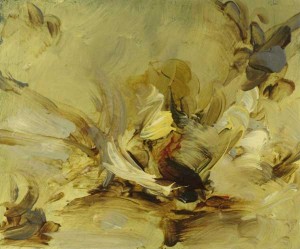
After tantalizing appearances in group shows, Katy Moran’s first New York solo affirms the young British painter’s talent for evocative abstraction. The paintings are rife with apparent contradictions: they’re small in scale yet best viewed from a distance, misty veils of white shroud the subject matter, and titles may mislead more than enlighten. Moran’s approach occasionally feels like a self-conscious gambit, but it keeps viewers guessing long enough to come to provocative conclusions.
Most canvases display the artist’s brushy, layered style and earthy, cool color palette, yet the mood of each comes as a fresh surprise. ‘Lucas’ (2007) is an ethereal cascade of blue and white that could be a waterfall, hazy beach or snowstorm. Alarming splashes of blood red dot a dark oval form that might be a boat or an open grave in ‘Volestere’ (2007). Light paint daubed over dark in the show’s most dramatic piece suggest a battlefield at night, though the title, ‘Wasabi Without Tears’ (2007) turns the painting into a funny take on high-brow, culinary machismo.
Other canvases distill the essence of different moments in the art historical canon: A cow’s head emerges from a patchwork of Futurist volumes; elsewhere a DeKooning-esque crone is rendered in dark Cubist colors while in a third painting, a rough sailboat shape in a light-toned setting recalls a Dutch harborscape. Occasionally, Moran’s jumble of forms fails to materialize into anything meaningful and her grungy color schemes can be garish. This is rare. Instead, the new work convincingly stakes Moran’s painterly territory: historically astute with a dash of humor, making nods to Karen Kilimnik’s romanticism and Cecily Brown’s jittery fluidity while possessing an energy all its own.
Los Carpinteros, ‘La Montana Rusa,’ at Sean Kelly Gallery
For ‘Time Out New York’ Magazine, April 2008
After seventeen years of exhibiting, including a memorable installation at PS1 in 2001, it’s surprising this is only the Cuban collaborative’s second New York gallery show. New Yorkers have missed out if these five new sculptures plus a suite of watercolors, which blend subtle politics, surreal domestic furniture and architectural models, are anything to go by.
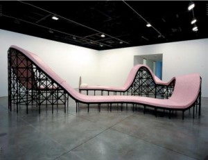
Los Carpinteros’ typical sculpture is minimal, large and makes obvious references that put it at risk of seeming simplistic were it not for underlying Cuban references that add a rewarding complexity. The show’s centerpiece, ‘La Montana Rusa,’ (2008) a long, undulating bed resembling a roller coaster, brings to mind the hair-raising and uncontrollable aspects of dreams. But read its ‘socialist’ pink color as political metaphor and it becomes a timely reminder of Cuba’s present uncertain leadership.
The show’s other sculptures are portals into mysterious, dream-like worlds: A replica swimming pool with increasingly deeper chambers arranged like the layout of a house recalls the still, eerie mood of James Casebere’s photos of flooded architectural models. Three large bookshelves resemble Crate and Barrel fare but have wavy distortions that make them appear as if they were underwater or a hallucination.
Eleven watercolor drawings include buildings in the form of meat cleavers and a basketball court whose backboard arches like the trajectory of a ball. More bizarrely imaginative for not being practical enough to realize as objects, they continue Los Carpinteros’ contrast between menace and amusement, adding another edge to their provocative body of work.
Mark Handforth, at Gavin Brown’s Enterprise
For ‘Time Out New York’ Magazine
Mark Handforth’s latest solo show offers work that is both chic and out of fashion. Bold new sculptures in his usual cheeky minimalist style are a big contrast to the ephemeral and intuitive artwork being championed in the major survey shows at the New Museum and Whitney right now. Yet his best pieces combine monumentality with humor and whimsy to exert a sophisticated, mysterious charm.
Hugging the gallery building outside, an impossibly long-necked lamppost bent into a star shape extends its top around its base like a seductively crossed leg. Inside, a similarly exploded sense of scale turns a long piece of rusty pipe, bent into a heart and dotted with colorful burning candles, into a towering declaration of love. Whether the source is freshly mass-produced or just junk metal, Handforth’s amusingly capricious sculptures suggest evidence of a powerful unseen hand, a kind of giant Gabriel Orozco cum Boo Radley.
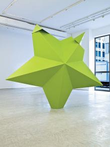
But when the readability of Handforth’s sculptures is too easy, as with the three pieces in the back gallery, it becomes clear why so many younger artists are rebelling against this sort of aesthetic. A star with two broken tips dominates the room, and also appears on an announcement card for the show in which it is ironically depicted as standing in for Mammon, Lucifer’s demonic follower in Paradise Lost. The piece’s lasting impression, however, like that of two snake-like coils of ropes and a light installation depicting a tumbleweed, is signature Handforth: made to please the eye and titillate with a knowing yet shallow allusions.
