Walead Beshty, “Popular Mechanics” at Wallspace

Three Color Curl (CMY: Irvine, California, August 17, 2008, Fuji Crystal Archive Type C), 2009
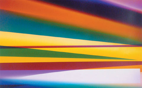
Walead Beshty’s gorgeous new color photograms are the star attraction of his third New York solo show . Yet the artist deliberately endangers their appeal by also exhibiting smaller, drabber, black-and-white depicting the machines that produced them, along with the curators, gallerists and other intermediaries who helped in their realization. In spite of Beshty’s best efforts to expose these energetic abstractions as mere commodities in a decidedly unglamorous chain of distribution, their aura remains undiminished.

As in previous photogram series, in which, for example, Beshty folded sheets of photo paper into freestanding sculptures before exposing them to light, these new images are made within certain parameters, this time involving the use of magnets and rolling techniques. It’s still unclear why Beshty has juxtaposed them with other images that are so different is size, color and mood. To do penance for dallying with pretty pictures? To draw some sort of parallel between the mechanics of the darkroom and art market?

The anthropological quality of the black-and-white portraits, which are titled not by a subject’s name but by his or her job description and nationality, along with the place and date of the photo, stands in cold contrast to the warmth of the almost glowing photograms. Maybe next time Beshty could relegate process to the background, and allow the artwork to take center stage.

Jessica Rankin at The Project

Jessica Rankin, Empty Night (detail), 2009.  Photograph courtesy of the artist and The Project, New York.

The embroideries, drawings and watercolors in Jessica Rankin’s latest solo show, while serene on the surface, hide tumultuous thoughts. On panels of organdy, she’s stitched provocative textual fragments from a Babylonian creation myth, along with diaristic phrases from other sources, which together present a picture of celestial failings and human weakness. Beautiful yet restrained, the contrast between content and delivery is both provocative and puzzling.

A gorgeous image of a shimmering moon in the first gallery introduces the show’s loose theme: Aspects of nature can act as metaphors for human misunderstandings. Titled Termagant, the piece has two referents (an old Western notion of the Muslim god’s identity and a quarrelsome woman) that, while unrelated, both sprang from failed communication between individuals or groups. In another panel, lines of text form concrete poetry, resembling the crags of mountaintops, though phrases relating to a blank night or weak body suggest a similarly rocky psychic terrain. Similarly, the profound pessimism in the texts that describe Babylonian immortals—a mother who loathes her children, a father overly proud of his son—read like a lament for a prelapsarian time that never was.

Comparing ancient times to present-day experience is fertile territory, but not one that Rankin explores deeply and the meaning of these semiabstract images remains as ephemeral as the fabric they’re sewn on. Rankin seems to like it that way, though she runs the risk that, consequently, our memory of this show will be equally fleeting.

Paul Morrison at Cheim and Read

Paul Morrison, "Cultigen," 2007. Photograph courtesy of Cheim and Read Gallery.

Flower painting may have sustained two centuries of Dutch artists, but Paul Morrison’s latest solo show suggests he’s maxed out on the genre. After a decade of producing black-and-white landscapes dominated by schematically rendered flora, Morrison has decided to add figures and a splash of gold leaf. Still, like his repertoire of cartoony dandelions and mushroomlike trees, the new material doesn’t communicate much beyond a noirish mood.

One of the show’s best pieces crowds a 19th-century Alice in Wonderland look-alike, a giant Disneyfied daisy and something suggesting an exploding pinecone into a small canvas with dizzying, psychedelic effect. Similarly, a work featuring the moon’s reflection in water, morphing into a sinister ghost, makes for a striking design. But the human subjects in two other paintings—a young Elizabethan noblewoman in a Bambi-esque woodland, and a pouty top-hatted schoolgirl in profile set against bleak pines—are just stand-ins for their floral counterparts.

The girls’ anonymity and their fakey surroundings don’t reward speculation about who they are or what they represent. Unlike Walton Ford, whose meticulous renderings of the animal kingdom reveal as much about human attitudes as animal life, Morrison’s conceptual gambit stops at juxtaposing historical and contemporary images of nature, while throwing in evocative but unrelated titles culled from botanical terminology. Allusions to the subjectivity of taste—exemplified by two huge,elegant dandelion sculptures in the show—are so common in contemporary art that Morrison’s next move will have to be more radical to be relevant.

Originally published in Time Out New York, March 12 – 18, 2009.

Erik Lindman, “House Wine, House Music” at V&A Gallery

Erik Lindman, "17 days, 17 long nights...but slow," 2008. Photograph courtesy of V&A Gallery, New York.

Erik Lindman can’t make up his mind to play it straight as an abstract painter or follow a conceptual path. And who can blame him? At age 23, he still has time to mull things over, though three moody canvases in his gallery debut are a cut above the other ephemeral objects on display. Colorful and complex, they’re enough to add him to a growing cadre of young painters reinvigorating abstraction.

A small photo—of a storefront window covered with torn notices and paint smudges—is the show’s Rosetta stone, directing viewers to look for evidence that the paintings were also added to over time. Lindman pays homage to those who came before him (Pat Steir, Jasper Johns), but he’s so intent on leaving traces of the significant labor put into each canvas that they’re in danger of looking overly manipulated.

Lindman’s inspirations are interior and graphic design, and while he’s careful to mask them, at least one add-on to the show tips his hand: A curvy wicker stool sitting before a painting in which the combination of circular motif with green-yellow haze creates a sense of intrigue. In the best piece, an expanse of ugly brown gives way to a triangular, rippled pattern of color, as if a subway poster had been torn away to reveal what was underneath. Rich with association, Lindman’s paintings don’t need their sources to be spelled out. They allow the pleasure of looking to be the final word.

Originally published in Time Out New York, February 26 – March 4, 2009.

Cindy Sherman at Metro Pictures

Metro Pictures Nov-Dec 2008.
Cindy Sherman dresses for success, donning a range of disguises that masterfully evoke the absurdity of the 'too much money, too little taste' crowd.