Rodney Graham is the artist behind this brightly colored lightbox titled ‘Sunday Sun, 1937,’ but who is the character hidden by the Technicolor funnies surrounded by gentile flowers on wallpaper and bedspread? Male or female, kid or adult, this character maintains his/her private world of reading pleasure with an upturned paper. (At 303 Gallery, Chelsea, through Dec 21st).
Mario Merz, Canti errabondi I, acrylic and oil on canvas with tree branch and beeswax, 1983.
The sheer size of ‘Wandering Songs I (Canti errabondi I)’ from 1983 makes it a standout in ‘Mario Merz: Major Works from the 1980s’ at Sperone Westwater Gallery on the Lower East Side. The Arte Povera artist’s natural materials abound in an oil painting of leaves and pine cones on a 25’ long canvas, accompanied by a block of beeswax formed around a tree branch. The contrast between nature depicted (the painting), sampled (the branch) and made (wax made by bees) gives the piece its energy. (through Dec 22nd).
Here’s a look at Edvard Munch’s ‘The Scream,’ a version of the iconic artwork from 1895 in pastel-on-cardboard, currently installed at the Museum of Modern Art. Recently purchased at auction for nearly $120 million, its owner has anonymously loaned it to the museum for six months. (Arrive early to avoid a new nonmembers line just to get into the fifth floor galleries.)
Does anything say ‘elegant urban funky construction worker’ like a workman’s shirt with embroidered logo, workman’s jeans, a fur coat and a chicken bone necklace? This outfit from artist collective Bernadette Corporation’s mid-90s fashion label turns the street into a runway by merging everyday fashions with haute couture. (BC’s retrospective is in SoHo at Artists Space through Dec 16th).
Artist Mark Barrow and textile designer Sarah Parke (partners in art and life) turn the weave of a canvas into a work of art itself by devising loom patterns from red, green and blue thread to make a support. Barrow then applies additional paint to the surface in tiny dot patterns creating a kind of secondary artwork on top of the woven fabric. (At Elizabeth Dee Gallery, Chelsea through Dec 15th.)
Headless animals wander in and out of a bamboo cage-like structure while a giant deity collapses into pieces in Chinese-French artist Huang Yong Ping’s latest installation at Barbara Gladstone’s 21st Street gallery. The piece feels a little too eerie and apocalyptic for its cynical title, ‘Circus.’ (through Jan 19th.)
Carl Andre, Redoubt, 100 Western Red Cedar timbers, 1977.
Four parallel rows of twenty-five Western Red Cedar timbers extend out from the walls of Chelsea’s Paula Cooper Gallery in Carl Andre’s 1977 piece ‘Redoubt.’ As much as it suggests a stronghold, the piece also recalls architectural ruins on the order of Roman ruins near Hadrian’s Wall. (through Dec 15th).
This collage by Fred Tomaselli (seen here in detail), is hidden away in James Cohan Gallery’s back viewing room but has been a big attention grabber on tours lately, and no wonder. Its color, pattern and mesmerizing detail give your eyes (all 20 of them?) and brains a workout.
Isabella Kirkland, Nova: Canopy, oil paint on polyester over wood panel, 2008.
Titled ‘Nova: Canopy,’ this meticulously detailed painting by Isabella Kirkland (an artist and a research associate in the department of aquatic biology at the California Academy of Sciences) brings together plants and creatures found in the rainforest canopy, though not all in the same geographic location. All discovered in the past twenty years, they’re a powerful testament to earth’s profusion. (At Feature, Inc’s group show ‘Punt’ on the Lower East Side through Dec 22nd.)
Kutlug Ataman, installation view of ‘Mayhem,’ 7 channel video projection, 2011.
Step into the entrance of Turkish artist Kutlug Ataman’s latest solo at Sperone Westwater and you step into the flow of the Iguazu Falls in Argentina…or at least a projection of them in ‘Mayhem,’ a seven channel installation on screens and the floor. Ataman explains the piece as a response to the Arab Spring as it symbolizes cleansing and destroying power. (At Sperone Westwater on the Lower East Side through Dec 22nd).
Leo Villareal, Hive (Bleeker Street), LED tubes, custom software, electrical hardware, aluminum, stainless steel, 2012.
Not every piece of art commissioned by the Metropolitan Transit Authority ends up looking great in the subway system, but that’s not the case with this instantly enticing new installation by noted light artist Leo Villareal titled ‘Hive (Bleeker Street)’ on the uptown 6 platform at Bleeker. Created from LED tubes, aluminum and stainless steel, the honeycomb patterned lights constantly shift color, creating a welcome distraction for worker bees. (On permanent display).
Daniel Joseph Martinez, A Story for Tomorrow in 4 Chapters, Dostoevsky Loved the Hunchback of Notre Dame, Muhammad Ali & Dandelions, Lick My Hunch!, archival pigment print with UV finishing coating, 2010-2012.
Never one to shy away from controversy, Daniel Joseph Martinez’s latest body of work at Simon Preston Gallery features a hunchbacked figure in a Pope’s mitre, praying on an Afghan prayer rug, and tattooed with ‘blasphemous inscriptions in Hebrew, Arabic and Latin’ (according to the gallery handout). Is this social commentary or overkill? (Through Dec 23rd.)
Kent Rogowski, ‘I Can’t Stop Thinking About Yesterday,’ aluminum, plexi, lights, unique.
Why does Kent Rogowski’s light sculpture ‘I Can’t Stop Thinking About Yesterday’ strike me as having excellent gift potential (for the right situation)? Too bold to be a declaration of love, it could be a stunningly straightforward way of starting an apology. (At Jen Bekman on Spring nr Bowery, through Dec 9th).
Lin Tianmiao, Badges installation view, Galerie Lelong, NY, 2012.
Lin Tianmiao ‘s installation at Chelsea’s Galerie Lelong, titled ‘Badges,’ features sixty embroidered American and Chinese slang terms for women, most of which aren’t particularly flattering. When asked for a recent Artnews article if she’d call herself feminist, Lin’s great reply was “…in China, we don’t have that tradition…but no matter how you look at it…it is better to have respect in mind and equality in mind.” (through Dec 15th).
Jules de Balincourt, Off Base, oil and acrylic on canvas, 2012.
Jules de Balincourt’s soldiers have a dazed, world-weary expression and, like Andy Warhol’s ‘Triple Elvis,’ each has at least one shadow character in near proximity. In this detail from the larger painting ‘Off Base,’ the artist turns the mens’ face paint camouflage into Fauvist masks that resonate with a reinterpreted Matisse painting nearby. (At Salon94 Bowery, on the Lower East Side, through January 13th.)
Mickalene Thomas, ‘Vertical View of Jardin d’Eau,’ rhinestones, acrylic, oil and enamel on wood panel, 2012.
Mickalene Thomas is having her moment in New York, with gallery shows at Lehmann Maupin Gallery in Chelsea and on the Lower East Side while her retrospective at the Brooklyn Museum continues. This landscape, now on view on the Lower East Side and titled ‘Vertical View of Jardin D’Eau’ was inspired by Thomas’ residency at Monet’s residence and garden at Giverny, home of his famous water lilies. (At Lehmann Maupin Gallery through Jan 5th).
‘The Art of Scent,’ Museum of Art and Design, Installation view, 2012.
Though it looks like a mini-version of a Doug Wheeler Light & Space installation crossed with a urinal and an abstracted cleavage, this wall indentation (designed by architecture firm Diller, Scofidio & Renfro) is the receptacle for an artwork that is scent alone. It is one of twelve concoctions on display in the Museum of Art & Design’s ‘The Art of Scent’ and is called L’Eau d’Issey after designer Issay Miyake, who commissioned a scent that would suggest water. (Through Feb 24th, 2013).
Trenton Doyle Hancock, Plate of Shrimp, acrylic and mixed media on canvas, 2012.
For a decade, Trenton Doyle Hancock’s busy, messy and captivating collages told the tales of his invented creatures – the Mounds and the Vegans. He leaves those characters behind in his latest solo show at Chelsea’s James Cohan Gallery, but not before making this disconcerting self-portrait in which his eye and mostly removed face emerges from the open maw of a screaming, striped Mound. (through Dec 22nd)
Alice Channer, installation view at Lisa Cooley Gallery, 2012.
London-based artist Alice Channer’s sculpture ‘Backbone’ makes the best use of stirrup pants ever. Cast in polyurethane resin and paired with aluminum bars, they elegantly slink across the gallery floor towards two huge vertical banners featuring elongated shampoo bottles. (At Lisa Cooley Gallery on the Lower East Side through Dec 23rd).
Dan Perjovschi, window installation, Lombard-Freid Gallery, 2012.
Romanian artist Dan Perjovschi’s window installation at Chelsea’s Lombard-Freid Gallery remains from pre-Hurricane Sandy, though his installation of politically attuned drawings made directly on newpaper front-pages had not yet opened when this photo was taken – exactly three weeks after the storm. It’s a poignant plug for critical thinking.
Edward & Nancy Kienholz, ‘The Ozymandias Parade,’ mixed media installation, 1985.
Installation art pioneers Edward & Nancy Kienholz’s 1985 sculpture ‘The Ozymandias Parade’ is heartfelt and bitter enough to give pause to both post U.S. presidential election gloaters and wound-lickers. Depicting a national leader and his deputy falling from horses and a top ranking general riding an elderly taxpayer’s back, it also reveals the results of a poll taken this fall prior to the installation asking, “Are you happy with your government?’ The answer was ‘no.’ (At Pace Gallery, 510 West 25th Street through Dec 22nd).
Join me on one of my final art gallery tours of 2012! On Dec 1st, 2-4pm, we’ll be seeing the best that Chelsea has to offer. The next day, Sunday Dec 2nd, 10:30am – 12pm, I’ve added an additional tour of ‘Regarding Warhol’ at the Metropolitan Museum of Art. On December 8th, 11am – 1pm (a new time), we’ll check out the highlights of New York’s more experimental galleries on the Lower East Side. And as always, if you can’t join me on a tour, I’m glad we can see ‘an outstanding artwork a day’ together on Facebook!
Anish Kapoor, Untitled, stainless steel and lacquer, 2012.
Anish Kapoor’s concave sculptures, like this untitled stainless steel and lacquer disk currently at Chelsea’s Barbara Gladstone Gallery (24th Street location), are austere and elegant, a complete contrast to the lively Gangnam style video he recently released in support of artist/activist Ai Weiwei and Amnesty International. It’s worth another Gangnam parody just to see clips from dancing staff at MoMA, the Whitney, Guggenheim, and Gladstone Gallery and more.
Barnaby Furnas, Jonah and the Whale #2, water-based pigment, color pencil and acrylic on linen, 2012.
Whale-lovers beware at Barnaby Furnas’ latest solo show at Marianne Boesky Gallery in Chelsea – riffing on Herman Melville’s ‘Moby Dick’ and Jonah’s cetacean misadventure, Furnas’s new paintings picture whalers in total, gory triumph. Inspired by the fact that whale oil provided light for lamps, Furnas bathes a tattered Jonah in celestial light as he reaches shore, prepared to follow a new path. (Through Dec 21st).
Peter Stichbury, Xavier Gravas, acrylic on linen, 2012.
Xavier Gravas is adrift in the contemporary, communication-saturated world. Consternation bows the perfect swoosh of his arching eyebrows. His full lips are set grimly together. He is an invented character that his creator, Aukland-based artist Peter Stichbury, calls a ‘Superfluous Man.’ Haunted by a sense of insignificance, Xavier peruses personal perfection to exquisite and troubling effect. (At Chelsea’s Tracy Williams, Ltd., through Dec 22nd).
Charles Ray, Shoe Tie, solid stainless steel, 2012.
Charles Ray’s sculptural self-portrait is stunningly perfect – his body has the unflawed, fluid shine of poured mercury – and relentlessly banal – he sports an everyman physique and needs to tie a shoelace. This first impression holds true to the man vs machine process he used to create the sculpture: a digital drawing is recreated as a clay sculpture which becomes the model for a computer controlled machine that sculpts the sculpture from a solid piece of steel. (At Matthew Marks Gallery on 22nd Street through Jan 12.)
Yinka Shonibare, Revolutionary Kid (fox girl), mannequin, Dutch wax printed cotton, fibreglass, leather, taxidermy fox head, steel base plate, BlackBerry and 24 carat gold gilded gun, 2012.
Yinka Shonibare’s crafty revolutionary looks set for success with money, guns and communications, as embodied by his ’12 ‘Revolution Kid (fox girl),’ spotted today in the back viewing room of Chelsea’s James Cohan Gallery. Toting a blackberry and a 24 carat gold gilded gun and dressed in Shonibare’s signature Dutch-imported, ‘African’ textiles, she begs the question of who she is and who’s backing her.
Couple with Figure of Cupid, Unknown photographer, British, 1910s.
From its invention, artists manipulated photographs to show what the camera couldn’t capture – from moving clouds to group portraits – and to produce a more interesting composition. This unknown British artist’s photo from the 1910s in the Metropolitan Museum of Art’s ‘Faking It: Manipulated Photography Before Photoshop’ exhibition shows true love, if not a true image. (Through Jan 27th).
Kevin Zucker, ‘Rain (Paradise Cove Towers),’ acrylic and toner on canvas, 2011.
Kevin Zucker’s new paintings of resort hotels in the rain might make us feel bad for the terrible weather on his travels…if he’d actually travelled. Drawn together from various digital photos, imaginary scenes like ‘Rain (Paradise Cove Towers)’ resonate with recent work by other artists who have created ‘street photography’ from Google Street View. However, as paintings, they seem to have more gravitas, regardless of how his dot technique emphasizes digital origins. (At Eleven Rivington on the Lower East Side through Dec 22nd).
Kevin Zucker, ‘Rain (Paradise Cove Towers),’ acrylic and toner on canvas, 2011.
Martha Rosler, Meta-Monumental Garage Sale, installation view, 2012.
Martha Rosler’s ‘Meta-Monumental Garage Sale’ officially opens tomorrow at MoMA, allowing visitors to browse and buy second-hand clothes, furniture, home décor and more collected by the artist. Though MoMA’s major art acquisitions make headlines, buying and selling is strictly behind the scenes; here, Rosler puts consumption – the kind involving money AND aesthetics – center stage. (Though Nov 30th, opens at 12pm).
Constructed of layers of cardboard, plywood, foam and felt, Phyllida Barlow’s untitled column sculptures at Hauser & Wirth are monumental without being macho. Bright, enticing colors and soft materials humanize these minimalist stacks. (At Hauser & Wirth, 32 East 69th Street through 12/22).
Eberhard Havekost’s painting ‘Ocean’ is once again on display as Chelsea’s Anton Kern Gallery reopened today, post-Sandy. It’s a standout in a show about Havekost as artist and consumer, who transforms an enviable body (sourced from a German ad) into a mottled obstacle to the paradisiacal scene behind. (Through Dec 15th).
Hellen van Meene, Untitled #307, (Heiloo, Netherlands), c-print, 2008.
Chelsea is slowly coming back to life, post-Sandy. Yancey Richardson Gallery just reopened a show of panorama photos by Hellen van Meene including this portrait of an exquisite girl in a dilapidated interior, taken in Heiloo, Netherlands in ’08. (Though Nov 24th.)
Barb Choit, Untitled Faded Beauty (NYPD #2), digital c-print, 2012.
Faded posters of ‘fade’ hairdos headline Barb Choit’s latest solo show, ‘Fade Diary.’ Featuring non-professional models, they recall yearbook photos, anthropological studies and mug shots while documenting faded fashions. In another photo, a model sporting a red glove echoes past styles while reflecting the present day NYC street in an image that has resonance with Lee Friedlander’s store-front photos currently uptown at Pace Gallery. (At Rachel Uffner Gallery, Lower East Side through Dec 23rd.)
Barb Choit, Barbershop Fade #2, digital c-print, 2012.
Pieter Schoolwerth, After Troy 6, oil acrylic, giclee print and oil pastel on canvas, 2012.
Painter Pieter Schoolwerth rewrites art history with a new series of paintings that remake 17th century French painter Simon Vouet’s 1635 ‘Aeneas and His Family Fleeing Troy.’ Here, Aeneas, his invalid father and his small son crowd into one dynamic figure (created from digital printout, drawn lines and thick areas of painting) in an urgent escape. (At Miguel Abreu Gallery, Lower East Side, through Dec 22nd).
Chuck Close, ‘Mark/Felt Hand Stamp,’ oil paint on paper, 2012.
Technique rather than subject matter (he’s painted portraits for over thirty years) drives interest in Chuck Close’s recent artwork. For this remake of his iconic ‘Mark’ (’78-’79), Close layered gesso on the paper and screenprinted a grid. Using a dowel with felt on the end, each square is hand stamped three times with different colors. Factor in a week’s drying time for each layer and it’s no wonder that edition of 40 is still being printed. (At Pace Prints, 57th Street through Nov 21st.)
John Baldessari, Double Play: Never Swat a Fly, 2012.
Conceptual artist John Baldessari pairs song lyrics with images abstracted from canonical paintings in his latest series of paintings. The odd angle of this deer’s head gives its source away as an 1867 hunting scene by Gustave Courbet. The hunt looks more comical than gruesome in Baldessari’s version, though on reflection maybe both deer and fly should be spared. (At Marian Goodman Gallery, 57th Street, through Nov 21).
Lee Friedlander, Nude, gelatin silver print, 1980.
John Szarkowski, MoMA’s photography director for nearly 30 years, called Lee Friedlander’s nude photos, “… the most unblinkingly, unreservedly candid descriptions of other people’s bodies that serious photography has produced.” Pace Gallery proves his point with a show of photos from the late 70s to the early 90s that practically interrogate female bodies in their intensity. (On 57th Street through Dec 22nd).
Lee Friedlander, New York City, gelatin silver print, 2010.
Photographer Lee Friedlander returns to his roots by shooting reflective store windows with a 35mm camera in his latest series, titled ‘Mannequin.’ Here, a building’s façade tries to impose its grid on a Dolly-Parton-haired good-time girl while a curtain and rod at the top complicates ideas of public and private space. (At Pace/MacGill Gallery, 57th Street through Dec 22nd).
‘Regarding Warhol’ at The Metropolitan Museum of Art
Andy Warhol’s Cow Wallpaper and Silver Clouds, originally created for a solo show at Leo Castelli Gallery in 1966, reunite in the final room of the Metropolitan Museum of Art’s ‘Regarding Warhol’ exhibition for a jolt of interactive fun. Join Merrily on Sunday, Nov 18th (10am – 11:30am) for a small group tour of this blockbuster show. (Space is limited to six participants. $40pp. To make a reservation, please email merrily@newyorkarttours.com.)
Though not many of Olafur Eliasson’s projects are going to measure up to the impact of his past large-scale artworks (creating waterfalls on New York City’s East River or a sun in the Tate’s Turbine Hall), his latest solo show at Chelsea’s Tanya Bonakdar Gallery features this simple but mesmerizing display of three fountains, lit by strobes, which turn moving water into seemingly static sculptures. (through Dec 22nd).
Judy Pfaff, The Path to the Center Was Clearly Marked, honeycomb cardboard, pigmented expanded foam, melted plastics, fluorescent and incandescent light, 2012.
Judy Pfaff’s new sculptures, on view at Chelsea’s Ameringer McEnery Yohe Gallery, channel Lynda Benglis’s neon colors and puffy forms, Louise Bourgeois’ or Yayoi Kusama’s profusion of phallic protrusions, and the commanding presence of a more recent wall-mounted Frank Stella. Yet the profusion of optical seduction is typical Pfaff, as seen in pieces like ‘The Path to the Center was Clearly Marked’ (2012), an over 7ft wide tour de force created from honeycomb cardboard, pigmented expanded form, melted plastics, fluorescent and incandescent light. (Through November 10th.)
Joel Meyerowitz in front of Easter Parade, Rockefeller Center, New York City, 1964.
Today, Joel Meyerowitz chatted with visitors to Howard Greenberg Gallery on the occasion of a show of his street photographs from the 60s and 70s, which include iconic shots like his couple in camel colored coats walking through NYC steam, the odd spectacle of a fallen man on a Paris sidewalk, and this eccentric human/cat threesome from New York’s 1964 Easter Parade. (On 57th Street through December 1st).
Glenn Ligon’s ‘Double America’ occupies its own room at a show of the artist’s text-based neon artworks made since ’05, enhancing the impact of a high-wattage piece that brings to the fore division and binary oppositions in this country. (At Chelsea’s Luhring Augustine Gallery through December 8th).
Seth Price, installation view at Friedrich Petzel Gallery, 2012.
Known for vacuum forming objects (masks, a bomber jacket) in polystyrene, Seth Price explores new sealing options with giant fabric envelopes in his latest solo show – the inaugural exhibition in Petzel Gallery’s beautiful (pre-flood anyway) new 18th Street location. Printed with patterns derived from financial businesses like Capital One and Paychex logos, the envelopes suggest an unclear but persistent connection between art and commerce. (Through Dec 22nd.)
Judy Fox, Large Octopus 2 (Dowager) & Large Octopus 1 (Elder), original terracotta & casein, 2011.
PPOW Gallery in Chelsea has some pretty pompous door greeters in the form of Judy Fox’s charmingly absurd, anthropomorphized ‘Large Octopus’ sculptures, subtitled ‘Dowager’ and ‘Elder.’ At around 2.5 and 3.5 feet high the duo are impressively large to be crafted in Fox’s signature terracotta & casein materials but small enough to present more of an amusement than a threat. (Through Dec 15th).
Mounir Fatmi, Maximum Sensation, plastic, metal & textile, 2010.
The Brooklyn Museum will open its doors tomorrow, a day after Sandy hit the city. In a cheeky, colorful display there, Moroccan-born, Paris-based artist Mounir Fatmi presents fifty skateboards covered in Islamic prayer rugs. Titled ‘Maximum Sensation,’ the installation begs the question of where we find heightened consciousness – in faith, sport or both? (On long-term installation in the Contemporary Art Galleries).
Nina Chanel Abney, detail of ‘I Dread to Think,’ acrylic on canvas, 2012.
Nina Chanel Abney says she’s ‘living in an age of information overload,’ and her new paintings prove the point by piling up disguised references to mass media content, from politics to advertising. This detail – from an over 20-foot long mural titled ‘I Dread to Think’ – surprisingly jumbles race, religion and gender in two female deities. (At Kravets/Wehby Gallery and Anna Kustera Gallery on 21st Street in Chelsea through Nov 24th).
Mark Bradford, We May Be Running Out of a Past, mixed media collage on canvas, 102 x 144 inches, 2012.
Mark Bradford is back with more of the mixed media collage/decollage canvases that have made his reputation as a leading contemporary abstract artist, like this mixed media on canvas piece, ‘We May Be Running Out of a Past.’ His latest solo show at Chelsea’s Sikkema Jenkins & Co opened this evening, showcasing eight huge, vibrantly colored pieces that don’t evidence a new direction for the artist but do explain his popularity. (Through Dec 15th .)
Zhan Wang, Jiashanshi No 106, stainless steel, 2006.
In the 90s, Zhan Wang caused a stir in China by intervening in the landscaping around new, modern buildings by replacing natural rock formations with his large, chrome-covered stainless steel scholars rocks. In the atrium of 590 Madison Ave, the ‘stones’ are in keeping with the glass wall and bamboo plantings, but they still have a ghostly, shape-shifting presence.
Al Taylor, Cans & Hoops, plastic hula hoops, tin cans, wire, 1993.
Strapped for cash to buy art supplies after a trip to Africa in the early 80s, Al Taylor started fashioning sculptures from material found on the street, transferring his usual work on paper and canvas to three dimensions. Cans & Hoops – fashioned from plastic hula hoops, tin cans & wire – allows his 2-D drawings to come alive in real space. (At David Zwirner Gallery, through Oct 27th).
Chuck Close, Kara/Felt Hand Stamp, oil paint on handmade, Twinrocker/Hot Press paper with Feature Decal, 2012.
With over 200 solo shows to his credit, Chuck Close is one of America’s best known artists, and he’s still pushing the boundaries of his craft. His latest solo show at Pace Gallery’s 534 W. 25th Street space features oil paintings, watercolors made with a printer and other works, including this portrait of artist Kara Walker made with oil and a felt hand stamp. (Through Dec 22nd.)
Mickalene Thomas, Le Dejeuner sur l’herbe: les trois femmes noires, 2010.
Mickalene Thomas’s ‘Le Dejeuner sur l’herbe: Les trois femmes noires,’ rethinks Manet’s 1863 original by substituting three black women for Manet’s two men and a nude woman. Manet’s version was rejected by the Salon, while Thomas’s rhinestone bedecked beauties headline her current show at the Brooklyn Museum (Through Jan 20th.)
Ai Weiwei, ‘Forge,’ reinforcement steel, 2008-2012.
Further to yesterday’s post, Ai Weiwei’s activism continues at Mary Boone’s Chelsea gallery with ‘Forge’ an installation of twisted pieces of rebar. Though the print and carefully arranged, twisted pieces of metal on the floor appear to be calligraphic abstractions, they’re created from pieces of metal retrieved from shoddily constructed schools that collapsed in the 2008 earthquake, killing thousands of children. (Through 21st.)
Ai WeiWei, He Xie (river crab), installation at Mary Boone Gallery, 745 Fifth Ave, 2012.
In Chinese, ‘river crab’ sounds like a euphemistic term used to describe censorship, so when artist and human rights activist Ai Weiwei learned in 2010 that his newly built studio was to be demolished by the local government, he hosted a protest feast at which 10,000 river crabs were served. This installation of 2,500 handmade ceramic crabs at Mary Boone Gallery’s Fifth Ave & 57th Street space recalls that event and demonstrates WeiWei’s insuppressible resistance. (Through Dec 21st.)
Alessandro Pessoli’s painted figures usually look like they’ve emerged from a dream or hallucination; these absurdly phallic Maiolica ceramic sculptures, fittingly titled Sancho Panza & Don Chiscotte, lack the typical atmospheric surroundings of Pessoli’s paintings, but their lighthearted vibrant colors and mobile-like hanging lend them an amusing whimsy. (At Chelsea’s Anton Kern Gallery through Oct 20th.)
As Sally Mann recovered from an accident in which she was thrown from and pummeled by her dying horse in ’06, she turned to self-portraiture to create haunting ambrotypes like this one. Streaking, blurring, over and underexposures mar the images, speaking movingly to the damage inflicted on their subject. (At Edwynn Houk Gallery on Fifth Ave & 57th Street through Nov 3rd.)
Gordon Parks, Ingrid Bergman on location for the filming of Roberto Rossellini’s ‘Stromboli’, 1949 & Mr & Mrs Albert Thornton in their living room in Mobile Alabama, 1956.
Gordon Parks’ iconic photographs spanned the worlds of fashion, celebrity and social documentary from this 1949 photo of Ingrid Bergman on location for the filming of Roberto Rossellini’s ‘Stromboli’ to a photo from the ’56 Segregation Series that demonstrates the respectable normality of Mr & Mrs Albert Thornton in their living room in Mobile Alabama. Both are on view at Howard Greenberg Gallery on 57th Street through Oct 27th.
Andra Ursuta, installation at Ramiken Crucible, 2012.
Smashed gallery windows and a wall plowed down by a shiny cart set a restive mood for Andra Ursuta’s latest solo show at Ramiken Crucible on the Lower East Side. Totemic female torsos crafted from a mix of concrete and manure and marble statues of a Romanian gypsy woman awaiting deportation from France are weighed down and beautified by jewelry made from coins. Partly informed by a story of Romanian witches casting a curse on their government, the show’s female characters stubbornly resist tidy concepts of national identity. (Through October 21st.)
You don’t even have to be a dog lover to appreciate William Wegman’s videos with his Weimaraners May Ray and Fay Ray. Here, the duo watches an off-screen ball with rapt attention, creating a mesmerizing, slow-motion dance performed with the utmost concentration. See this video and more early Wegman videos at Salon 94 Freemans on the Lower East Side. (Through Oct 27th).
Conceived of by accident when a shirt used as a glue rag dried into an arresting form, Matt Johnson’s Wifebeater is as pedestrian and delicately ephemeral as a plastic bag in the wind. At least on first glance. A closer look reveals Johnson’s trademark twist of using unlikely materials to make his sculpture. This t-shirt is made of bronze. (At Chelsea’s 303 Gallery through Nov 17th.)
Anya Kielar, installation view of ‘Women’ at Rachel Uffner Gallery, 2012.
From dyeing fabric to altering the weave of burlap, Brooklyn-based artist Anya Kielar harnesses an assortment of techniques to create her monumental ‘Women’ now on view at Rachel Uffner‘s Lower East Side gallery. Totemic goddesses and folksy females on floating screens transcend the everyday, literally becoming larger than life. Join Merrily next Saturday the 13th, 2-4pm on a tour of this show and more on the Lower East Side.
Marco Anelli, four selections from ‘Portraits in the Presence of Marina Abramovic,’ 2010.
For two and a half months in 2010, during every hour the Museum of Modern Art was open, performance artist Marina Abramovic sat silently facing a chair filled by a steady stream of visitors. Photographer Marco Anelli was there with her, capturing the thoughtful, blank and tearful faces of each participant as they engaged in a wordless exchange with the artist. (Anelli’s ‘Portraits in the Presence of Marina Abramovic is at Chelsea’s Danziger Projects through Oct 27th).
Sam Samore, Lips Tower #7, 2012, installation view.
Lips and eyes fill Team Gallery’s 47 Wooster St space in SoHo where Sam Samore (whose 1973 ‘Suicidist’ photos were featured here yesterday) continues to summon filmic moments, offering seduction on an enormous scale. Here, Lips Tower (#7) resembles a stacked sculpture by Minimalist Donald Judd, though the serial units – lips – are the antithesis of the Minimalists’ cold aesthetic.
Sam Samore, ‘The Suicidist #11,’ gelatin silver print, 1973.
Thirty-nine years ago, artist Sam Samore killed himself by asphyxiation, stabbing, overdose, and in an amusingly absurd twist, being buried head first in a sandbox. Photos of these grisly, staged deaths from his 1973 ‘The Suicidist’ series and many more line the walls of SoHo’s Team Gallery recalling film stills both familiar and bizarre. (At Team Gallery’s 83 Grand Street location through October 27th).
Jonah Freeman and Justin Lowe’s latest feat of installation art takes visitors through a series of rooms, transporting us into both strange and familiar worlds. This show is the talk of the town, art-wise, and is a stop on this Saturday afternoon’s Chelsea Gallery Tour, 2-4pm. For more info, see the scheduled tours page. (At Chelsea’s Marlborough Gallery through Oct 27th).
Lynette Yiadom-Boakye, Acid for an Act, oil on canvas, 2012.
The young British artist Lynette Yiadom-Boakye was a standout in last spring’s New Museum Triennial. She’s back with a show of new paintings at Chelsea’s Jack Shainman Gallery titled ‘All Manner of Needs’ in which solitary subjects gaze out at us with searching eyes. (Through October 13th.)
‘You break it, you buy it’ does not apply at the Austrian art collective Gelatin’s latest solo show at Greene Naftali in Chelsea, where the point is to send art objects flying in order to ‘finish’ them. Pressing the pedal to send objects like these crashing to the floor feels as wrong as dropping a baby, regardless of their artistic merit (or lack thereof). (Through Nov 13th.)
This is one watermelon you do not want to eat…or be eaten by. A giant lick of modeling paste extends from Valerie Hegarty’s repulsive ‘Watermelon Tongue,’ curbing the appetite and recalling ‘Little Shop of Horrors,’ one inspiration for this painting. Hegarty was also thinking of last year’s news reports of exploding watermelons in China, which were mistakenly sprayed with growth accelerator. Now do you want to know where your food comes from? (At Nichelle Beauchene Gallery on the Lower East Side, through October 20th).
Ryan Whittier Hale, Cluster, video, color, sound, 00:27 min, 2012
What’s at the cutting edge of visual art animation? Check out the New Museum’s answer to that question – the on-line only exhibition, ‘3-D Form,’ which features four artists whose human characters dance, flirt and float as they occupy strange realms of cyberspace. (Through October 17th.)
One thousand hand-painted, porcelain sunflower seeds made in Jingdezhen, China are on offer at Carolina Nitsch as part of a show of work (80s NYC photos and Qing Dynasty chairs) by dissident Chinese artist Ai Weiwei. Once a metaphor for the Chinese populace following their leadership as the sunflower follows the sun, these remnants of Weiwei’s five ton installation at Tate Modern suggest that it’s the artist who is followed so closely as his popularity continues to rise. (At Carolina Nitsch through Nov 3rd.)
Andrea Zittel, A-Z Carpet Furniture: Cabin, nylon carpet, 2012.
Why is one textile hung carefully on a wall for display while others are put on the floor for everyday use? Andrea Zittel’s latest solo show, designed by her and crafted by weavers from around the country, digs into the question of why we want both beautifully designed objects with use value and objects to rever as fine art. Zittel created this carpet to fill the floor of her yet-to-be-built 12 x 16 foot cabin. (At Andrea Rosen Gallery, Chelsea, through October 27th).
Toba Khedoori, Untitled (mountains 2), oil on linen, 27 1/2 x 40 7/8 inches, 2011-12.
Toba Khedoori is known for her monumental paintings on paper devoid of human subjects, but in her latest show at Chelsea’s David Zwirner Gallery, she makes a major shift to small-scale oils on canvas. The size change lessens the works’ dramatic impact but a mood of still isolation remains, prompting writer Julian Bismuth to compare each new work to, “…a puzzle piece removed from its set and held up to the light.” (Through October 27th).
Ever think Christopher Columbus would invite you over to his place? Something like that is happening on Columbus Circle, starting tomorrow, as the Public Art Fund opens Japanese artist Tatzu Nishi’s ‘Discovering Columbus.’ After climbing six flights of stairs, visitors who’ve reserved free, timed passes can lounge in a furnished living room constructed atop a scaffolding that surrounds the 13-foot tall sculpture from 1892. (Through November 18th. Passes available at publicartfund.org.)
LA artist Julian Hoeber’s first NY solo show features a recreation of an old roadside attraction, a ‘gravitational mystery spot’ in which the laws of gravity were altered. Inside a plywood and metal-framed cube, the trick is a simple sloping floor and ceiling which non-the-less demonstrates how easily our perception can be tricked. (At Harris Lieberman, Chelsea through October 20th).
Teresita Fernandez created this sculpture on site at Lehmann Maupin’s Lower East Side location this summer, turning thousands of translucent, colored layers of polycarbonate into an installation evoking the lights of the aurora borealis. (Through October 20th.)
You use tools to make art, but can you make art out of studio tools? Martha Friedman gives it her best shot, transforming a rather impersonal object – the wedge – into mysteriously totemic towers punctuated with flaccid, pizza-paddle shapes in day-glo orange silicone rubber. (At Chelsea’s Wallspace Gallery through October 20th).
Erik Parker, ‘Out of the Ark, acrylic on canvas, 2012.
‘Bye Bye Babylon,’ the title of Erik Parker’s latest solo show at Paul Kasmin Gallery, and his subject matter – edenic landscapes teeming with psychedelic flora – suggest he’s left the city for greener pastures. In fact, he’s still Brooklyn-based but uses the exotic locales he depicts to take a mental break from urban life. (Through October 13th). For more fuchsia skies and purple seas, check out Paul Kasmin’s website.
Nancy Davidson, Carnivaleyes, latex, fabric and rope, 1998-1999.
Before you get to the giant inflated and conjoined rear ends, you have to pass under ‘Carnivaleyes’, a pair of 3 x 4 ½ foot wide peepers made from latex, fabric and rope by Nancy Davidson. Slightly risqué with their net-stocking-like lids, they seem a little vexed with their oddball neighbors in Davidson’s solo show at Chelsea’s Betty Cunningham Gallery. (Through October 6th). Check out Davidson’s odd bodies on her website.
Paul Pfeiffer, 100 Point Game, digital video transferred to 16mm film, 2012.
Paul Pfeiffer continues to manipulate footage of sporting events in his latest solo show at Chelsea’s Paula Cooper Gallery; though he makes welcome forays into new areas, the show’s most entertaining piece collages footage of basketball games from the 50s through the 90s, only with the players and ball digitally removed. What’s left are bright lights and a ghostly, swishing net as Pfeiffer turns a popular game into a magic act. (Through October 13th).
Rachel Whiteread, Untitled (Sequence III), plaster, polystyrene and steel, 2002.
Books – in colorful grids on the floor, piled on a remainders table, preciously designed and placed far out of reach on high shelves and in many more guises – fill Friedrich Petzel Gallery’s biblio-centric group show, ‘The Feverish Library’ (organized in cooperation with Matthew Higgs). Rachel Whiteread’s plaster, polystyrene and steel ‘Untitled (Sequel III)’ from 2002 lends a note of gravitas and mystery to the show by recording only the cast space around a bookshelf. (In Chelsea’s Friedrich Petzel Gallery through Oct 20th).
Adam Cvijanovic, ‘Discovery of America,’ flash acrylic on Tyvek, 2012.
Known for his nature-inspired, mural-sized dramas affixed to the gallery wall, Adam Cvijanovic doesn’t disappoint in his first New York solo show since ’08. At 15 x 65 feet, the show’s centerpiece, ‘Discovery of America’ is a trompe l’oeil triumph, appearing to bring a prehistoric, Rocky Mountain scene into a wall-splintering conflict with an image of human settlers racing across the plains all of which appears to take place in a messy art studio. (at Postmasters, Chelsea through October 13th).
The new art season officially roared to life again this week with dozens of major shows opening in the last few nights. Leonardo Drew’s installation at Chelsea’s Sikkema Jenkins & Co is one of the outstanding offerings thanks to a huge, gallery-filling installation composed of rough lengths of burnt wood as well as more tidy but no less ambitious wall relief sculptures. (Through October 12th.)
There aren’t many artworks at the Metropolitan Museum of Art that could be described primarily as ‘fun.’ Anish Kapoor’s ‘Untitled’ from 2007 falls into that category by creating a surprising visual experience as tiny, polished stainless steel tiles on a concave form reflect viewers’ images as a blurry multitude of shapes. London-based Kapoor’s best known works in the US (Chicago’s Cloud Gate, for example) make viewers aware of their surroundings. At the Met, Kapoor’s piece is surprisingly intimate and thoroughly amusing. (On view in the 2nd floor Modern and Contemporary Art Galleries).
Alighiero Boetti, installation view at the Museum of Modern Art, Aug, 2012.
Alighiero Boetti’s gorgeous installation in the MoMA’s atrium defies Sol LeWitt’s oft-quoted 1967 remark about conceptual art that ‘all of the planning and decisions [for a work of art] are made beforehand and the execution is a perfunctory affair.’ In ‘Mappa’ from the 70s and 80s (on the back wall) and kilims from 1993 (in the foreground) Boetti commissioned his artwork from Afghan craftswomen, ensuring that execution shares the spotlight with conceptual content while recalling Minimalist seriality and Jasper Johns’ proto-Pop.
Xaviera Simmons, Landscape (2 Women), color photograph, 2007.
Xaviera Simmons is known for her portraits in America landscapes, but in ‘Landscape (2 Women)’ from 2007, her models contend with an urban environment consisting of a dramatic red wall that sends out conflicting associations that include love, anger, danger and a sense of urgency. Simmons past series have sometimes featured subjects with skirts pulled over heads and assortments of objects hung around the waist like visual essays on identity; here, however, the womens’ differently aged bodies and their relationship are left to speak for themselves. (Included in tête-à-tête, curated by Mickalene Thomas at Yancey Richardson Gallery through Aug 24th.)
Bruce Nauman, One Hundred Fish Fountain, bronze fish suspended with stainless steel wire from a metal grid, 2005.
Stepping out of the elevator at Gagosian Gallery’s uptown, Madison Ave location, the roar of rushing water is immediate and surprisingly loud. Around the corner, squeezed into the main 6th floor exhibition space, is iconic conceptual artist Bruce Nauman’s sculpture of 97 cast bronze fish spouting water from their bodies as if they’d been hunted by rifle as well as hook and line. Elegant in photos, the mechanics of the piece – trailing tubes, a leaky basin, wires – dominate the in-person experience, creating typically Nauman-esque disconcertion. (‘One Hundred Fish Fountain’ is at Gagosian Gallery through Aug 31st).
Imagine perusing bedroom sets in IKEA and finding a quarrelling married couple bedding down for the night. Israeli artist Guy Ben-Ner is half of the couple starring in his own hilarious 18 minute 2007 video ‘Stealing Beauty’ that he shot without permission with a small camcorder in IKEA stores in New York, Berlin and Tel Aviv. As he, his wife and two kids discuss the ramifications of capitalism on their family life, they pretend to read from the store’s libraries, shower in the bathroom and sip drinks in the kitchen, creating a provocative dissonance between public and private life and questioning the personal impact of political ideology. (‘Stealing Beauty is in ‘Idea is the Object’ at D’Amelio Gallery, Chelsea, through Aug 24th).
Lizzie Fitch, Title TBD, wood, wood stain, ink on canvas, ink on paper, 2012.
Lizzie Fitch’s ‘Title TBD’ begs a few suggestions. ‘Man power?’ ‘Guy stuff?’ The central panel’s car/power tool/DIY theme and a pile of spike-ended lumber that looks like its destined for fencing tries hard to conjure masculinity. The piece tries so hard to look manly, it looks nothing like usual gallery fare (though it recalls Josephine Meckseper’s hot rod imagery). ‘Feminine’ artwork abounds in New York galleries, so why so little that’s blatantly male? (At Andrea Rosen Gallery, Chelsea, through August 21st).
Erica Love & Joao Enxuto, from the series Anonymous Paintings, inkjet print on cotton canvas, 2012.
Can abstract art be used as a tool to resist Google’s efforts to map the world’s every nook and cranny? Using screen grabs from Google Art Project’s museum walk-throughs, Brooklyn-based artists Erica Love and João Enxuto have launched a ‘counter archive’ of blurred images that have been obscured for copyright reasons. As large inkjet prints on cotton panels instead of tiny rectangles on a computer screen, they have a shimmering depth that recalls the 60s ‘Light & Space’ movement while pioneering a new medium somewhere between photography, installation and virtual art. (Love and Enxuto’s ‘Anonymous Paintings’ are included in ‘The Skin We’re In’ at Yossi Milo Gallery through August 31st.)
Oscar Tuazon, ‘People,’ sugar maple tree, concrete, metal basketball backboard and hoop, 2012. Photo by Jason Wyche.
Known for overtaking galleries with his wood and concrete constructions, Oscar Tuazon’s new site-specific sculptures on the Brooklyn waterfront have space to breath. Here, a sugar maple, concrete, backboard and hoop come together to form ‘People,’ a sculpture inviting folks to play a role in cleaning up the Brooklyn waterfront by having a little fun. (Organized by the Public Art Fund, Tuazon’s sculptures are on view at Brooklyn Bridge Park.)
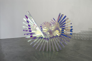
Alyson Shotz, Wavelength #2, dichoric acrylic on aluminum tube and steel, 2008. Image courtesy of Alyson Shotz Studio.
‘Dazzling’ is a good way to describe Alyson Shotz’s optically enticing sculpture whether it’s the shimmering curtain of Fresnel lenses she memorably installed in the Guggenheim’s atrium in ‘07 or a mirrored fence hidden in plain view in the fields at the Storm King Art Center. ‘Wavelength #2’ from 2008 continues Shotz’s interest in waveforms and uses dichroic acrylic to both transmit and reflect different wavelengths of light, creating a range of colors from a clear material. (‘Wavelength #2’ is at Paul Kasmin Gallery as part of ‘Sculpted Matter’ through August 17th.)
Ashley Bickerton, ‘Seascape: Floating Costume to Drift for Eternity I (Armani Suit), suit, glass, aluminum, wood, caulk, fiberglass, enamel, canvas and webbing, 1991.
As far as self-portraits go, ‘Seascape: Floating Costume to Drift for Eternity I (Armani Suit)’ by Ashley Bickerton is a little on the dark side, despite its bright orange buoys. Made in 1991, just two years before this regular on the downtown New York art scene relocated permanently to Bali, it seems to foretell his departure. Quixotic, a little lonesome, and stylishly branded by Armani and his signature ‘Susie’ logo – a semi-corporate brand of his own invention – Bickerton’s craft signals a dignified leave-taking, a memorial to a past life and an adventure about to begin. (Through August 17th at Lehmann Maupin Gallery, Chelsea.)
Tyler Rowland, The Stonebreakers (All the Objects Needed to Install a Work of Art), trash from jobsite, 2004-06
Artist Tyler Rowland was so taken by 19th century Realist painter Gustave Courbet that he spent a year impersonating (in appearance anyways) his forebear. In ‘HiJack!’ a show of work organized by the art handlers at Chelsea’s Jack Shainman Gallery, Rowland’s contribution is a missing Courbet painting (presumed destroyed in the WWII bombing of Dresden), along with the tools necessary to install it (all carefully manufactured by the artist from materials recycled from construction jobs). The layers of reference are complex but readable, making this piece a testament to the continuing influence of art history on contemporary painting while challenging preconceptions of what an artwork should look like. (‘The Stonebreakers (All the Objects Needed to Install a Work of Art), 2004-06’ is on view through Sept 1st. )
Tyler Rowland, The Stonebreakers (All the Objects Needed to Install a Work of Art), trash from jobsite, 2004-06
Linsanity goes on hiatus in Andrew Kuo’s tiny painting of Houston Rockets star Jeremy Lin as he is chastised by an angry basketball. Floating in a tank a la Jeff Koon’s basketballs in his 1985 ‘Equilibrium’ series, the ball becomes the object of our attention, forcing a downcast Lin into the backseat. The vicissitudes of stardom never looked so cute. (‘Tallboy’ is in the group exhibition ‘In Plain Sight’ at Chelsea’s Mitchell-Innes & Nash through August 17th).
Jennifer Zackin & Sandford Biggers, ‘a small world,’ video still, 2012.
If you’re at The Jewish Museum to visit the Vuillard show, don’t miss the chance to see a side exhibition of a single work – Sanford Biggers and Jennifer Zackin’s memorable video ‘a small world’ from ’99 – ’01. Zackin grew up in a New York Jewish American family and Biggers an African American family in LA; the video piece pairs home movies from each artist’s family side by side. Similarities between their experiences beg the question of how viewers might expect race and geography to influence a middle class upbringing. (Extended through October 14th).
Matthew Brandt, Bees of Bees 5 (detail), gum bichromate print with honeybees on paper, 2012.
Whether he’s burning trees to make charcoal or soaking a photograph of a lake in lake water to get an abstracted effect, Matthew Brandt uses his subject matter to create an image of that subject. When bee colony collapse led to his discovery of hundreds of dead or dying bees on the California coast, he collected the bees and photographed them in his studio, printing them with an emulsion made of the bees. The resulting prints are huge and swarming with bees (like the one in this detail), but chilling when a closer look reveals that they are in various states of decomposition. (At Yossi Milo Gallery through August 31, 2012).
Joan Brown, Mary Julia y Manuel, enamel on canvas, 1976.
Apart from its large size and bold color, Joan Brown’s ‘Mary Julia Y Manuel,’ from 1976 stands out for its romantic drama, played out on a bright red stage before a swirling San Francisco Bay. Mary Julia, model and poet, holds a similar pose to Goya’s supposed lover, the Dutchess of Alba and her name is paired with Brown’s ex-husband Manuel, making this nighttime scene ring with tension. (‘Viva la Raspberries’ is at Harris Lieberman, Chelsea, through August 17th).
Davina Semo, You Said We’re Skipping the Prelude; Start the Insults, reinforced concrete, safety glass, enamel paint, 2011
Three panels of painted concrete covered in shattered safety glass by Davina Semo at Chelsea’s Derek Eller Gallery rest on the floor like they were just brought in from a war-zone. Minimalist stripes in safety orange appear to have suffered heavy attack but survive to bear witness. Together they’re titled, ‘You said we’re skipping the prelude: start the insults.” (Though August 16th).
Walter Robinson, ‘Dallas BBQ,’ acrylic on canvas, 2001.
Walter Robinson’s ‘Dallas BBQ’ arouses a different kind of desire than his erotically charged paintings (resembling romance novel covers from the 60s) at Chelsea’s Haunch of Venison. ‘Here’s the beef’ this small but powerful canvas shouts as it evokes the danger of a cholesterol bomb and the pleasures of one of America’s favorite indulgences. (Through August 17th).


, LED tubes, custom software, electrical hardware, aluminum, stainless steel, 2012.")


, mannequin, Dutch wax printed cotton, fibreglass, leather, taxidermy fox head, steel base plate, BlackBerry and 24 carat gold gilded gun, 2012.")

,' acrylic and toner on canvas, 2011.")
,' acrylic and toner on canvas, 2011.")


, c-print, 2008.")
, digital c-print, 2012.")


 & Large Octopus 1 (Elder), original terracotta & casein, 2011.")


, installation at Mary Boone Gallery, 745 Fifth Ave, 2012.")


, 2006-12.")


, mixed media, 2012.")


, 2009.")

, oil on linen, 27 1/2 x 40 7/8 inches, 2011-12.")


, plaster, polystyrene and steel, 2002.")


, color photograph, 2007.")


, suit, glass, aluminum, wood, caulk, fiberglass, enamel, canvas and webbing, 1991.")
, trash from jobsite, 2004-06")
, trash from jobsite, 2004-06")


, gum bichromate print with honeybees on paper, 2012.")


