Curator Profile: Melissa Chiu

For ‘NYArts’ Magazine

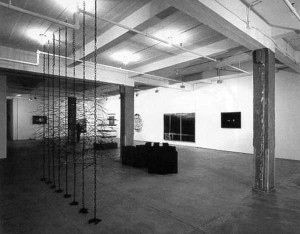
Navin Rawanchaikul, Tuk Tuk Scope, 2001. Mixed Media

Melissa Chiu is a curator’s curator. Headhunted from her native Australia by the Asia Society and Museum, the thirtysomething Chiu has just become the first museum curator of contemporary Asian art in the United States. Over the past ten years, she not only founded a non-profit gallery space in Sydney but also curated over twenty exhibitions at other alternative gallery spaces in Australia. Chiu will even admit to loving the art of curating as much as the visual arts themselves.

“I think it’s generational,” she explained. “When I was at university…I was trying to find literature on curatorial practice, and there was not a lot in the early 90s…I was quite curious about this idea of curatorial practice being as much a practice as artistic practice.” One of Chiu’s early exhibitions, ‘Anthology: Six Perspectives on Curatorship’ positioned six curators for a period of a week each in the gallery space. By curating an exhibition of both curatorial practice and artwork, Chiu aimed to drag usually hidden organizational processes under the gallery floodlights. Since then, whether she is focusing on Australian, Asian or multi-ethnic artists, there is an underlying sensitivity to who has put the show together and why.

Chiu came on board at the Asia Society and Museum in September, a few months before the organization reopened in its renovated space. She has inherited the Museum’s ambitious commitment to contemporary art, evidenced most recently by the long-term installations commissioned from a number of internationally known Asian contemporary artists. On the opening day, Chiu led a panel discussion, during which Heri Dono from Indonesia introduced his flying cocoons, Vong Phaophanit explained how living in France and now England for much of his adult life influenced his neon and beeswax sculpture, and Indian artist Nilma Sheikh discussed her long scrolls, which hang from the third floor down to the lobby on the open staircase. Rounding out the new commissions is work by Yong Soon Min from South Korea, Navin Rwanchaikul from Thailand, Shahzia Sikander of Pakistan and New York, Sarah Sze from Boston and Xu Bing and Xu Guodong, both from China.

The new curator will finally come into her own with two shows planned for September. First, the Asia Society will host ‘The Native Born: Objects and Images from Ramingining, Arnhemland,’ a traveling exhibition of Aboriginal art curated by Djon Mundine, a world expert on Aboriginal art. Fusing the traditional and contemporary is the m.o. at the Asia Society, and at the same time as the Aboriginal art show, Chiu will curate her own show of porcelain busts by Chinese artist Ah Xian. Ah, one of the many Chinese artists who moved to Sydney after the Tiananmen Square massacre in 1989, recently won Australia’s National Sculpture Prize, and although his work has been exhibited widely in Asia, this will be his first show in New York. Working with master potters and painters in the Jingdezhen, China, Ah uses the uniquely Western art form of the portrait bust and makes a number of Eastern adaptations. The sculptures are made of porcelain, depict Asian likenesses, and are painted in traditional Chinese designs.

Like Ah Xian, Chiu works at the intersection of cultures. And like the Asia Society’s combination of artists from eight different countries in its recent commissions, she will have to juggle the personal and national concerns of artists from around the world. Born in Australia to a Chinese father and Australian mother, Chiu has first hand experience of living simultaneously in two cultures, an experience with relevance for her professional life. Before leaving Sydney for New York, she was the founding director of the Asia-Australia Arts Centre, a non-profit art exhibition space established to support the work of Asian contemporary and Asian-Australian artists. “We had an interesting curatorial premise to provide these artists with a working environment that wasn’t exclusively Asian,” Chiu explained. “We wanted to create a broader context and perspective of Asian art and culture that wasn’t exclusive or ghettoizing.”

With a strong background in Asian-Australian art, and the Asian and Australian art scene, why did Chiu choose to give it all up and move to New York? “The idea of curating significant exhibitions of contemporary Asian art was a real lure for me,” said Chiu. “Australia for the last decade really focused itself on the Asia Pacific region and becoming part of that, so there are lots of really significant things that have been done but which aren’t known elsewhere. So there is the idea of engaging with a broader audience.” And if traveling to the other side of the world to start a new job doesn’t keep her busy enough, Chiu is also finishing a PhD on contemporary Chinese artists. The focus is on the diasporic communities in Sydney, New York and Paris, particularly how the artists’ work has been affected by the change in context.

It seems fitting that Chiu would eventually be employed by the US institution that presented the influential 1994 show ‘Asia/America,’ of work by ex-pat Asian artists living in the US. And one of the most significant shows of contemporary Asian art to date in the US, ‘Inside Out’, was also organized by the Asia Society along with the San Francisco Museum of Modern Art. This second exhibition of work by Chinese artists took place in 1998-99, after a decade of major shows of Asian art in Europe. At first slow to catch on to the rising interest in contemporary Asian art, the US audience has since embraced several major Chinese and Asian artists. However, Chiu sees an element of following the fashion in this. “When it settles down ultimately, there are probably only three or four artists who get remembered. They are the ones who are still on an international circuit or who have representation from major galleries, like Xu Bing, Zhang Xiaogang and Zhang Huan…And they have in many ways a higher profile than a lot of the Asian-American artists.”

Back in Australia, in her work at the Arts Centre and in many independent exhibitions, Chiu championed the work of Asian-Australian artists. Time will tell if this ends up translating into an interest in Asian-American artists. Coincidently, before she left for New York, Chiu was developing an exhibition that would include some comparative views of artists from Asian origins in both the U.S. and Australia. But whatever the future holds for contemporary art shows at the Asia Society and Museum, it looks promising. The new commissions, the hosting and organizing of landmark exhibitions, and the creation of Chiu’s position are signs that the commitment to putting contemporary Asian art on the map in New York has grown stronger. With her considerable experience and drive, Chiu seems up for the job.
If These Walls Could Talk: Gary Simmons

For ‘Flash Art’ Magazine

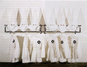
Six-X, 1989. Mixed media, 142 x 183 x 8 cm.  Shine, Hooch, Backyard Brew, 2001. Chalk and slate paint on paper, 16 x 16 cm
Six-X, 1989. Mixed media, 142 x 183 x 8 cm. Shine, Hooch, Backyard Brew, 2001. Chalk and slate paint on paper, 16 x 16 cm

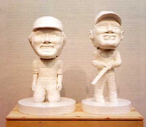
The story begins in the remote mountains of north Georgia. Four buddies from the city are canoeing down a river on a weekend trip when their back-to-nature bonding experience suddenly turns into a nightmare. Out of the blue, a couple of backwoodsmen hold two of the party at gunpoint and rape one of them. This is both the pivotal scene in the 1972 film ‘Deliverance’ and the inspiration for ‘Here Piggy, Piggy,’ a new sculpture by Gary Simmons. ‘Here, Piggy, Piggy’ is an all white, fiberglass replica of the two hillbillies but with a twist. Their overalls, grimy caps and appalling dental hygiene are the same, but they have been transformed into bobbleheads, with giant rotating heads and bodies shrunken to the size of a child’s.
Gary Simmons, Here Piggy, Piggy, 2002. Painted foam, fiberglass, wood, metal. Courtesy Metro Pictures. New York.

Beautiful, haunting, poetic…These are some of the words that come to mind when looking at Simmons’ erasure drawings, which are the signature works he has created for over a decade. The artist makes them by drawing his subjects in white chalk on chalkboards or slate colored backgrounds, and then partially erasing the drawings, leaving incomplete figures and smeared traces of white chalk. On first viewing, the new sculpture, modeled on collectibles with nodding heads, seems to be a dramatic departure from the serious sensibilities of the artist’s earlier work. But on further consideration, the differences are not as great as they first seemed. In fact, the new work continues Simmons’ tradition of embarking on new projects while maintaining continuity with a steady series of erasure drawings. The drawings and the sculptural, photographic or video projects are symbiotic, mutually beneficial to each other by their elaboration on themes of memory, history and the presentation of cultural difference in pop culture.

In the thirteen years since Simmons had his first solo show, he has moved from producing racially charged drawings, sculpture and installations to creating enigmatic wall drawings on a huge scale, accompanied by drawings on paper, linen and chalkboards. Simmons came of age in the late 80s and early 90s when multiculturalism was the art world buzzword and his child-sized Klu Klux Klan outfits, for example, were in keeping with the times. But by the mid-‘90s, his work experienced a shift that was emphasized in the artist’s first large-scale museum exhibition curated by Thelma Golden of The Studio Museum in Harlem (SMH). The catalogued show began in 2001 in Chicago, stopped at Santa Fe and ended this month at the SMH. Nearly thirty drawings, sculptures, photographs and videos from the past seven years were included, along with a major new sculpture (‘Here, Piggy, Piggy’) and a large site-specific wall drawing.

When his early drawings of popular cartoons that stereotyped African-Americans were first exhibited in Europe, Simmons soon discovered that much of his audience considered the work part of a uniquely American situation. Partly in response to this reaction, Simmons gradually changed the subject matter and style of his work in an attempt to address more universal issues. He explains that, “I wanted to open up the dialogue so it wasn’t as isolated to the African American experience. [I included] images of sites that we all interact with or come into contact with so that [in terms of] access to the work and the issues around the work, each person could import their own experience.”* Meanwhile, back in New York, Simmons’ other projects were also being perceived as specific to his experiences as a young African-American. Writing for the New York Times, critic Holland Cotter wrote that Simmons “…brings the language of black hip-hop into an art world that still doesn’t know what to do with it.” Reviewing the same show for Artforum, Jan Avgikos turned Cotter’s observation around to propose that the artist “…emphasizes the ‘outsider’ position of the institution in relation to Pop art…”

Faced with being pigeonholed as an artist whose work related only to a particular time and place, Simmons altered his style around the mid-90s. That change was the starting point of the museum survey. With the exception of ‘Flute Player,’ a drawing from 1995 in which a cartoon figure with a bone on his or her head plays the flute, the focus of the exhibition was entirely on work with no obvious racial or political content. There were drawings of staircases leading into the unknown, of city apartment buildings and shacks in the countryside, of roller coasters, pine trees and stars, but not a stereotyped cartoon drawing, pointed white hood or noose to be seen. Did Golden and Simmons team up to rewrite his history, editing out the artwork which links him to the multicultural art discourse which disappeared from view in the mid-90s?

‘Lost Ones,’ a site-specific drawing executed on an entire 40-foot long wall of the largest gallery helps answer this question. Near the center of a vast, slate colored background, two enigmatic bell-like shapes hang at angles to each other. Each has been partially erased by hand, and the clearly visible finger marks moving out towards the far wall create the impression that they are moving quickly towards each other. In fact, the shapes are bird cages, and the ‘Lost Ones’ the two birds that have flown away. The cages hint at confinement, emancipation and finally the violent crash of the mechanisms that held the birds captive. They also refer back to an installation from 1990, ‘Pollywanna’ in which Simmons placed a live, caged parrot in front of a drawing of two crows from the Dumbo cartoon. Observing the bird led the artist to experiment with an erasure technique. He explains that “…as you looked at the bird, it almost left trails in the wake of the movement of the wings…you see ghost images of the wings moving.” These chains of association run through all of Simmons work and are what link the bobbleheads to the birdcages.

In their own ways, ‘Lost Ones’ and ‘Here, Piggy, Piggy’ deal with power relations and the loss of self-governance. ‘Lost Ones’ does so allegorically, while ‘Piggy’ references violence from a popular film seen and remembered by a generation. At the beginning of the movie, the four adventurers make contact with two families living in extreme poverty and badly affected by inbreeding. These scenes set up a conflict between the city men and their country counterparts, between civilized and wildness, a dichotomy that is often premised by racial difference. In this case, both parties are white, but Simmons points out that “…the fears and stereotypes are all right there and inherent within the film. It’s about the fear of others.” The artist’s interest in the cultural ‘other’ led him to make work that investigates the culture of the southern U.S. As well as being the site of hundreds of years of racial violence, Simmons says of the South, “I think there is a lot of hidden imagery, language and culture that effects us day to day that is literally ghosted.” All of the artist’s erasure drawings summon a ghostly presence that hints at hidden histories. In fact, this accounts for the color of ‘Piggy’ which has been painted all white to, “…almost disappear. They mirror the spirit of the drawings in that way; you’re dealing with something that is recognizable to a point. Like the way your memory works, the edges are sanded down…”

Simmons’ erasure is neither a consequence of a particular working method, nor an aesthetic device. Instead, it has political overtones that are reinforced by the fact that no humans ever appear in the drawings. Some of the best pieces in the exhibition are from a 1996 series of roller coaster drawings titled ‘Ghoster.’ Sections of the coaster’s support structure are rendered as jagged beams, ending in spikes that communicate a menace beyond the scariness of the ride. As in ‘Piggy,’ the thrill seekers are in for more than they bargained, as they lose control in the presence of the, in this case supernatural, ‘other.’ In a major project from 2001, Simmons created a ‘haunted house’ by transforming the walls of an abandoned house in rural New Mexico. The dilapidated structure was not restored, nor were plans made to preserve the wall drawings. The partially erased drawings, their stories obscured by the form they take, mirror a ghost’s fleeting presence as they disappear over time.

Simmons also awakens his audience to the existence of the cultural ‘other’ by making erasure drawings of text that relates to the particular series on which he is working. In a series about drinking, Southern terms like ‘Moonshine’ or ‘Ruckus Juice’ appear in paintings with the same names. Drawings of wishing wells and stars are accompanied by different versions of the words ‘I wish,’ and his current series involves slang and words that refer to pot smoking. By abstracting terms that won’t be found in the dictionary, Simmons focuses attention on the way language is adapted by individuals and communities. The way the words are blurred mimics the way that meaning is obscured for someone from outside the community. For instance, if a viewer isn’t familiar with the reference in Simmons’ painting to Lauryn Hill’s song ‘Lost Ones,’ a shade of meaning is hidden. Simmons compares his work with a DJ’s sampling saying, “There will be references that will be picked up and then there are others that won’t be. That’s OK. When I put two images together and recontextualize them, they become something new anyway.” Simmons is careful to say that, “The viewer might question the fact that they’re on the outside, but they won’t feel like an outsider.” But unless the term ‘ruckus juice’ happens to be in the viewer’s common usage, he or she necessarily assumes the role of ‘outsider.’ Whereas Holland Cotter and Jan Avgikos pointed out in 1993 that the work positions the art world and the art institution on the ‘outside’ of art that references African-American culture, the text drawings, which reference slang terms from a variety of communities, unseat the viewer from an authoritative position.

Ironically, we spend much of our lives wishing to be what, who or where we are not. The precursor to ‘Piggy,’ and the artist’s first all white sculpture were replicas of the stills used to illegally manufacture liquor. Coincidently, the protagonists of ‘Deliverance’ first assume that they have aroused their opponents’ anger by stumbling on a whiskey still. In fact, stills symbolize the supposed lawlessness of deeply rural areas, beyond the arm of the law’s reach. At any rate, Simmons’ focus is the potential of these stills to meet the demand for cheap liquor and plenty of it. In an interview in 2001 with Franklin Sirmans (printed in the exhibition catalogue), Simmons explains that these sculptures are “…about a desire to be somewhere else.” In this respect, they relate to a series of drawings of stars, wishing wells and text drawings of the word ‘wish.’ Wishfulness and drunkenness are ways to escape or take a break from reality, to step into another life. In this respect, both also address what it is to imagine, in a sense, being ‘other.’ Like the birds in ‘Lost Ones,’ who have received or taken their freedom, viewers are left with a choice to fear or embrace their desires.

The four outsiders in ‘Deliverance’ ventured into unknown territory and suffered the consequences. The rules to which they were accustomed no longer applied, and they received no mercy at the hands of their armed captors who Simmons preserves in fiberglass. The Ghoster series also alerts viewers to powers beyond their control, because the appearance of the supernatural subverts even the laws of nature. Finally, by isolating words particular to a culture or geographic region, Simmons hints at the way in which otherness is embedded in the English language. The combined effect of this body of work is to reawaken viewers to the complexity of cross-cultural relations by destabilizing their own positions. Viewers will find themselves on one side or the other (or neither) of the distinction between North and South, and no single viewer will be familiar with all of the jargon that inspired the text drawings. Simmons work forces viewers to see themselves rooted in a particular experience, one of many.

*Unless otherwise noted, all quotes are from a conversation with the artist on November 19, 2002.

Man Hunt: A Profile of Curator, David Hunt

For ‘NYArts’ Magazine

Installation View of 'Dusk', at I-20

I first met curator, writer and editor David Hunt when he agreed to an interview at Silverstein Gallery in Chelsea. I imagined that he would be there organizing another show or writing a catalogue essay with the gallery owner, but was surprised to find that he, too, joins the ranks of gallery workers. My other misconception was that he would be in his late 30s, considering that he curated exhibitions in two New York galleries last season, he is the New York correspondent for artext, and he regularly writes for magazines like Flash Art and frieze, amongst many others. Instead, I was greeted by a man who couldn’t be much over 30 years old, a scenester not lacking in the art world requirements of cool glasses and funky shoes.

We sat down in his gracious employer’s back gallery, and before I could ask my first question, Hunt started to talk. He has plenty to say about ‘the art world’ and was eager to give me his opinion on the state of art writing. “Art writers are notoriously bad because it is a good way to start out. Because the pay is so low, art magazines don’t have the luxury of turning people away.” Thanks, Dave, nice to meet you, too.

So why does Hunt write and curate? “I started doing it because I just didn’t want to go to shows and have no connection. I am not an artist. I am not a dealer. So, and the curatorial aspect sprung out of the same thing. I was in Italy and I [thought]…I’m in this country. These people are being so nice to me. I might as well do something with it. So I curated a show of Italian video artists at…Gallery 16…when I went back to San Francisco.”

This exhibition led to others when he moved to New York in 1999. Over the past two years, Hunt has put together two shows in New York art galleries and written dozens of texts on the artists that interest him. He says that he aims to “…work with as many different galleries as possible…to maintain as many relationships as possible.”

“Dusk”, an exhibition which took place at the I-20 gallery last Fall, took its name from a time of day often associated with natural beauty and an element of intrigue. Hunt chose 20 works by different emerging artists whose work resists the romantic and ‘gothic.’ In a catalogue essay written in the form of an internal office memo from the marketing department of a company whose products are artists, Hunt elaborates on the heavily marketed concept of dusk (think photography magazines, think romantic couples) as beautiful and subverts it, pointing out that “any moment of the day can be beautiful.” At the same time, he tackles elements of what he sees as gothic subculture.

He explained to me that, “Dusk is about this anti-gothic sensibility….I just think that the whole gothic subculture is just so anachronistic….We’re coming back to the 80s. Before that we came back to the 70s. But gothic exists no matter what. It never goes away. There are always gothic clubs in every city. There are always people who…[have] pancake makeup on….And one of the elements of the art world is black.” Despite the vast difference between the ever-acceptable black clothing worn by art world denizens (Hunt himself was wearing at least two shades of black when we spoke), and the black leather and crushed velvet worn by goths, Hunt makes a mental connection between two distinctive styles of dress, and combines them under the rubric of impending darkness.

His next show, seen last summer at Caren Golden Fine Art, joined together no fewer themes under the title “Superimposition”. Given free reign in the gallery by Caren Golden, Hunt put together a tightly packed exhibition that included the work of another 21 emerging artists. For many, ‘superimposition’ referred to the process of constructing an image in layers, an organizing principle described by artforum.com reviewer Martha Schwendener’s as, “…impossibly, almost irrationally nebulous…” On the other hand, New York Times critic Holland Cotter turned the ambiguity into a positive point in his review, saying that, “One comes away reminded afresh of how much of interest there is to choose from these days and thinking how smart so many of Mr Hunt’s choices are.”

Speaking in outline form, Hunt set the scene for the exhibition: “The show was like an anti monochrome show. You noticed that there were no big fields. It was all over gestural mark making. You had to be working to the edge. Jim Lambie’s eye thing – tons and tons of eyes. Super, super imposition. Marsha Cottrell. Those computer drawings. All those lines. Thousands of little marks. That’s the type of stuff I am into. Supercomplexity.”

Complexity is what Hunt thrives on and the combination of unlikely themes in a single show has become his trademark. Last month, he opened his latest exhibition at MullerDeChiara, a new contemporary gallery in Berlin, co-directed by Laurie DeChiara of DeChiaraStewart in New York. The gallery’s inaugural exhibition is Hunt’s “Wattage and Friendship.” The inspiration for the show began with an article in The New Yorker magazine profiling an electricity resale company that encouraged its employees to sell electricity to friends and family. Hunt played on the idea that, “…the more power you have the more connectivity, the more friends you have. But really, the more alienated you are, the more you stay at home, the more acquaintances you have.”

Also in October, Hunt was asked to curate “Video Windows”, a selection of three video artists which changes monthly, at Stefan Stux Gallery. Taking the title, “Respirator”, the gallery will showcase work by Lila Friedland, Yorgo Alexopoulos and Jonathan Calm. More projects are on the horizon, including “Ursa Major” and “Druid: Wood as Superconductor”, two exhibitions slated to appear in New York galleries this season. My suggestion that Ursa Major, being a constellation of stars, might produce some art stars failed to win a smile. Instead, Hunt quickly related the constellation of the big bear to the bear market. “It’s about the market crash and more specifically the tech market crash – the NASDAQ. But it has two elements. One is the market crash and the other is this idea of day trading and people talking about the market as if it is a rational mechanism when really, it is just a kind of mystical, unpredicted mechanism. So there is artwork dealing with mystics, and psychics and cults…” “Druid…” also involves the mystical. It will include artists whose work in some way uses or references wood, a low tech natural object which cannot be improved by technology.

Hunt chooses a range of young artists, some better known than others. Matt Bakkom, for one, appears in every show. How can Hunt find relevance in Bakkom’s work for every show? “I just like the guy’s ideas. I mean, all of his ideas are good. Sometimes it’s like that. Some people are one trick ponies. This guy, he has the whole stable.”

Hunt’s own sense of disbelief that he has been able to achieve so much in such a short time and without a ‘proper’ art background kept coming up in our conversation. He reminded me several times that he is self-taught when it comes to art (his BA was in English) and has been living in the city only a little more than two years. Maybe it is his self-perceived outsider status that gives him a unique curatorial perspective. His ambition doesn’t hurt either.

To add to the success that Hunt has had in promoting exhibition ideas to gallerists, he has been well received by critics. Part of his appeal as a curator lies in his ability to showcase so many young artists while tying their work into his sometimes abstract themes. Both “Dusk” and “Superimposition” were shows that could have easily washed over the heads of gallery visitors who look at art like they shop for groceries – speeding down the aisles ticking off shows they’ve ‘picked up’. But for those with a little more time on their hands, Hunt’s work leaves much to be discovered.

In both his curatorial and writing styles, Hunt expresses his thoughts by making a steady stream of pop cultural references. Written in rapid fire, stream of consciousness prose, his catalogue essays and critical writing can be difficult to untangle. Caren Golden read a passage to me from one particularly dizzying catalogue essay on the artist, John Kalymnios. She concluded enthusiastically that, “this is an introduction to a catalogue of someone’s artwork that takes us to Kubrick, Spielberg, Rodney Brooks, Star Troopers, Robot Wars, Star Wars and Beckett in the first paragraph….He is coming from a fresh point of view. He doesn’t have to use the grad school lingo….I found it so high energy and fresh.”

Caren Golden isn’t the only one who thinks Hunt has hit upon a new way of curating. When asked by The Art Newspaper recently to name the best recent show in New York, Whitney Museum contemporary art curator Laurence Rinder picked “Dusk”, saying that, “I saw works by a number of artists whose work I hadn’t known of before and thought that David explored the theme in a fresh, unexpected way.” By putting together exhibitions crowded with the latest talent, Hunt reminds viewers of the role that galleries should play as laboratories for developing new ideas in art and in contemporary culture. History may be written by the slower moving museums, but it is in galleries that experimentation can take place. It might not be easy to encounter 20-something works by different artists in an average sized gallery space or digest a stream of cultural references in a catalogue essay, but there is enjoyment in the challenge.

Toward the end of our talk, Hunt cast some light on his technique for choosing the artists for his shows, saying, “I’m really into novelty…If it’s interesting right now and it’s not interesting next week, well…I don’t really have a problem with it. If it gets people excited for that amount of time then that’s a cool thing. I’d rather see that than…” Like he did many times during our talk, he trailed off before changing tack. Our interview ended in much the same way when, in midsentence (his, not mine), I turned around to find him gone. He had raced out of the gallery to intercept an artist, and so I left him doing what he seems to do best – following hard on the heels of the new and novel.