Sophie Calle at Paula Cooper Gallery

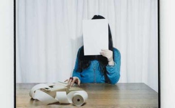
Sophie Calle, 'Take Care of Yourself. Accountant, Sylvie Roch,' 2007.  Photograph by Florian Kleinejenn/AiA Productions, ©Sophie Calle/ADAGP. Courtesy of the Paula Cooper Gallery, New York.

Casanovas, do not visit this show. In a juicy new twist on Sophie Calle’s practice of turning her private life into art, the artist invited 107 professional women, from a French intelligence officer to a Talmudic scholar, to respond to a Dear John e-mail she received. Predictably, the resulting dossier in text, photography and video pours scorn on the boyfriend while lavishing Calle with sympathy. But unlike the cringe-worthy wallow in self-pity that was her last show, Calle manages to turn her experience universal, making her project uplifting and entertaining.

Assembling a wide array of opinion on a document of consequence to only two people seems indulgent, but has a quixotic charm. Ironically, its also stymies understanding if you don’t read French, the language of most of the responses. However, given that the show also includes versions of the breakup e-mail in Latin and bar code, Calle may be hinting at a fundamental inability to communicate between her and her ex-lover, or between the sexes. The best responses—from dancers, a sharpshooter, even a parrot who rips up a little replica letter—are forceful with no words at all.

The show’s sense of feel-good, sisterly camaraderie is slightly soured by Calle’s disingenuousness: The break-up letter suggests that the relationship had been short and that both the artist and her boyfriend had continued to see old flames. But the concern that Calle’s responders show her—as when a sexologist gently discourages antidepressants or a clown sticks up for Calle—reinforces the show’s overall message that support is out there, and life goes on
Picasso in Rehab

Image credit copyright P.A.R Photo by Marc Domage
Image credit: © P.A.R. Photo by Marc Domage

Picasso may be one of the 20th century’s most influential artists, but the jury is still out on the value of his late works. ‘Mosqueteros,’ an exhibition of nearly one hundred paintings and etchings at Chelsea’s Gagosian Gallery is the first major U.S. effort since a 1984 Guggenheim show to change the prevailing perception that the late master had lost his touch by the time of his death at age 91 in 1973.

In a great blast of energy, Picasso spent the final years of his life creating hundreds of paintings after canonical works by Velasquez, Goya, Delacroix and other old masters. Adapting images of soldiers, prostitutes and performers to his trademark, fragmented and twisted style, Picasso seemed to be grappling with his own position in art history. At the same time, the works’ title, ‘Mosqueteros,’ or musketeers, referred to the non-paying rabble at the theater and hinted at the artist’s status as an onlooker as contemporary art rejected abstraction.

Response to the Guggenheim show was underwhelming. New York Times critic Michael Brenson praised Picasso’s energy more than the work itself, while the less gracious Robert Hughes opined that the work showed only fragments of Picasso’s talent.

So why try to change the record now? John Richardson, curator of this show and Picasso’s biographer, says he’s ‘avenging’ Picasso of the poor response to his work; more interesting to a contemporary art audience, he also explains that he intends the artist to, “…look like a brand new painter.”

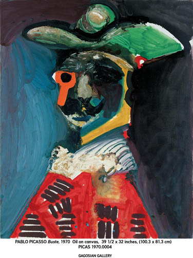
Portraits like Buste (1970), a character whose feline face is created with pools of dark paint punctuated by a phallic or key-like orange monocle, immediately make the case for Picasso as a forerunner (albeit distant and far more dignified) to young, expressionist-inspired artists like Jonathan Meese and Andre Butzer. Though the character’s terrible, black-eyed gaze ties him to Picasso’s other harrowing portraits, Picasso eschews the sketchy outlines he uses in many of the show’s other works, and composes using blocks of color in a style that enhances the mystery of his shadowy personality.

In 1984, Hughes noted the speed with which Picasso painted, and condemned the artist for making his painting process more important than the final product. Nowadays, that’s accepted practice in any media, from Josh Smith’s paintings, to Fia Backstrom’s performance/installation work to Walead Beshty’s photography and sculpture.

Picasso’s late paintings aren’t likely to be direct precedent for any of these artists. But given the popularity of mining 20th century avant-garde art history (think camera-less photography, constructivism, 60s and 70s performance), it’s fascinating to see evidence of the reverse process – a canonical artist who seems to have deliberately pointed several ways forward. As evidence that he was a wellspring of ideas until the end, this exhibition will doubtless have the legacy-effecting impact it deserves.

Walead Beshty, “Popular Mechanics” at Wallspace

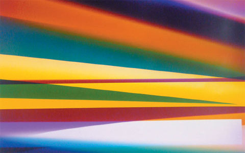
Three Color Curl (CMY: Irvine, California, August 17, 2008, Fuji Crystal Archive Type C), 2009
Walead Beshty’s gorgeous new color photograms are the star attraction of his third New York solo show . Yet the artist deliberately endangers their appeal by also exhibiting smaller, drabber, black-and-white depicting the machines that produced them, along with the curators, gallerists and other intermediaries who helped in their realization. In spite of Beshty’s best efforts to expose these energetic abstractions as mere commodities in a decidedly unglamorous chain of distribution, their aura remains undiminished.

As in previous photogram series, in which, for example, Beshty folded sheets of photo paper into freestanding sculptures before exposing them to light, these new images are made within certain parameters, this time involving the use of magnets and rolling techniques. It’s still unclear why Beshty has juxtaposed them with other images that are so different is size, color and mood. To do penance for dallying with pretty pictures? To draw some sort of parallel between the mechanics of the darkroom and art market?

The anthropological quality of the black-and-white portraits, which are titled not by a subject’s name but by his or her job description and nationality, along with the place and date of the photo, stands in cold contrast to the warmth of the almost glowing photograms. Maybe next time Beshty could relegate process to the background, and allow the artwork to take center stage.

Jessica Rankin at The Project

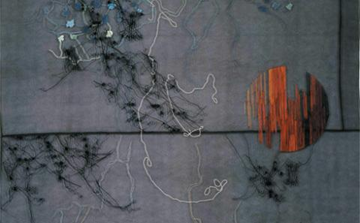
Jessica Rankin, Empty Night (detail), 2009.  Photograph courtesy of the artist and The Project, New York.

The embroideries, drawings and watercolors in Jessica Rankin’s latest solo show, while serene on the surface, hide tumultuous thoughts. On panels of organdy, she’s stitched provocative textual fragments from a Babylonian creation myth, along with diaristic phrases from other sources, which together present a picture of celestial failings and human weakness. Beautiful yet restrained, the contrast between content and delivery is both provocative and puzzling.

A gorgeous image of a shimmering moon in the first gallery introduces the show’s loose theme: Aspects of nature can act as metaphors for human misunderstandings. Titled Termagant, the piece has two referents (an old Western notion of the Muslim god’s identity and a quarrelsome woman) that, while unrelated, both sprang from failed communication between individuals or groups. In another panel, lines of text form concrete poetry, resembling the crags of mountaintops, though phrases relating to a blank night or weak body suggest a similarly rocky psychic terrain. Similarly, the profound pessimism in the texts that describe Babylonian immortals—a mother who loathes her children, a father overly proud of his son—read like a lament for a prelapsarian time that never was.

Comparing ancient times to present-day experience is fertile territory, but not one that Rankin explores deeply and the meaning of these semiabstract images remains as ephemeral as the fabric they’re sewn on. Rankin seems to like it that way, though she runs the risk that, consequently, our memory of this show will be equally fleeting.

Paul Morrison at Cheim and Read

Paul Morrison, "Cultigen," 2007. Photograph courtesy of Cheim and Read Gallery.

Flower painting may have sustained two centuries of Dutch artists, but Paul Morrison’s latest solo show suggests he’s maxed out on the genre. After a decade of producing black-and-white landscapes dominated by schematically rendered flora, Morrison has decided to add figures and a splash of gold leaf. Still, like his repertoire of cartoony dandelions and mushroomlike trees, the new material doesn’t communicate much beyond a noirish mood.

One of the show’s best pieces crowds a 19th-century Alice in Wonderland look-alike, a giant Disneyfied daisy and something suggesting an exploding pinecone into a small canvas with dizzying, psychedelic effect. Similarly, a work featuring the moon’s reflection in water, morphing into a sinister ghost, makes for a striking design. But the human subjects in two other paintings—a young Elizabethan noblewoman in a Bambi-esque woodland, and a pouty top-hatted schoolgirl in profile set against bleak pines—are just stand-ins for their floral counterparts.

The girls’ anonymity and their fakey surroundings don’t reward speculation about who they are or what they represent. Unlike Walton Ford, whose meticulous renderings of the animal kingdom reveal as much about human attitudes as animal life, Morrison’s conceptual gambit stops at juxtaposing historical and contemporary images of nature, while throwing in evocative but unrelated titles culled from botanical terminology. Allusions to the subjectivity of taste—exemplified by two huge,elegant dandelion sculptures in the show—are so common in contemporary art that Morrison’s next move will have to be more radical to be relevant.

Originally published in Time Out New York, March 12 – 18, 2009.