Amy Sillman, at Brent Sikkema

For ‘Flash Art’ magazine
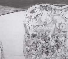
Amy Sillman, 'Me & My Ugly Mountain', 2003, Oil on Canvas, 152 x 183cm

Against all odds, a tiny figure pulls an enormous bundle filled with a jumble of surreal forms by a slender rope across the white expanse of a snowy mountainside. This literalization of ‘personal baggage’ was the subject of ‘Me and Ugly Mountain,’ the first painting to greet visitors to Amy Sillman’s sixth New York solo show. As suspiciously humorous as the diminutive soldier who famously encouraged his buddies to “…pack up their troubles in their old kit-bags and smile, smile, smile,” the opening painting provoked a grin, but it was one that could quickly turn quizzical. ‘Me and Ugly Mountain’ juxtaposed oddball characters with semi-abstract, expressionist compositions, creating a unique mix of levity and gravity.

Titled, ‘I am curious (yellow),’ the exhibition’s bright colors and quirky, cartoony figures suggested a lightness that was wasn’t upheld by the subject matter. Dramatically divided landscapes dominated in pieces like ‘Hamlet,’ which presented a cross-section of earth, with flattened human bodies representing layers of subsoil. Shooting from the earth like a jet of water, a long-necked, balloon-like head shouted ‘hello.’ Likewise, in the apocalyptic ‘Unearth,’ brilliant red and orange streams of light in the heavenly realms are separated from the drab earth below save for a mountain, straining to meet a little blue cord dangling from above. In the back gallery, a colorful patchwork of twenty-five paintings on paper shifted the focus onto abstract shapes and drawn figures, like the irritated beauty whose body was stretched like a trampoline supporting several pairs of feet.

In her work on paper, Sillman tempted viewers to decode her private symbolic language. The paintings, on the other hand, defied verbal description. Their roiling compositions and vibrant colors were a visual experience, unraveled through determined looking. But in ‘Letters from Texas,’ the third major component of the exhibition, Sillman abandoned her de Kooningesque tangles of line and the energy dissipated. This end-to-end installation of paintings flipped the focus onto the cartoony figures, losing the drama of the large canvases and suffering from a lack of continuity. Nevertheless, the main body of painting combined the fantastical and the funny, abstract and figurative, in a way that rewarded viewers who took the time to enter into Sillman’s zany universe.
Ruth Root, at Andrew Kreps Gallery

For ‘Flash Art’ magazine

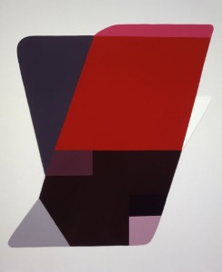
Untitled, 2002-2003, Enamel on Aluminum, courtesy Anrdew Kreps Gallery

Ruth Root’s paintings have reached their ‘mature-cute’ phase. Spread out evenly along the gallery walls, ten new pieces flaunted a grown up sophistication, with their hyper slick surfaces and tightly controlled geometric divisions. Gone were the little eyes and the smoking cigarettes that characterized previous work, and the hanging was arranged, with a few exceptions, in a traditional way. The paintings may be on their best behavior, but plenty of quirky touches in the relation of form and color still lent a mischievous character to the compositions.

Each untitled painting was an assemblage of overlapping rectangular, square and triangular shapes in various shades of purple, gray and orange with accents of yellow. All had an aerodynamic quality, with rounded edges and were hung flush against the gallery wall. One untitled piece had the look of an airplane fin or an Ellsworth Kelly painting jazzed up with more color. The rounded contours of another evoked the shape of a cartoon speech bubble, waiting to be filled by a jokey text. But what really gave the pieces their idiosyncratic, ironic character were the little blocks of color that appeared out of nowhere, usually accenting the edge of the paintings. Their diminutive size and outrageous colors gave them a cheekiness that pervaded the whole show.

Liam Gillick, at Casey Kaplan

For ‘Flash Art’ magazine

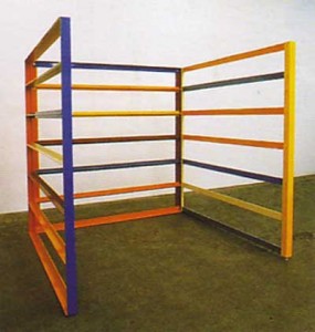
Liam Gillick, Reconciliation Corral, 2003. Installation view, courtesy Casey Kaplan

Liam Gillick offered a new take on glitzy art openings by washing the floor of Casey Kaplan’s gallery with cheap vodka and covering it with black glitter. Visitors tracked the sparkly stuff into the main space, where a row of aluminum corrals as colorful as jungle gyms faced a line of black text on the wall opposite. Arranged in a broken Greek key pattern and missing the usual colored Plexiglas panels, Gillick’s architectural sculptures tempted viewers to interact with them. On the wall, a repeated text reading, ‘sit now on a ridge,’ referred to a journey described in the artist’s recent book, ‘Literally No Place’ (a translation of the word utopia), which in turn was inspired by behavioral scientist B.F. Skinner’s proposals to alter human behavior through environmental stimuli.

Without reading Gillick’s book, which was not part of the exhibition, it was next to impossible to understand what was taking place, particularly with the unnecessary glitter and vodka element. The show was elegant but so highly conceptual that viewers who bought the book instead of the art came out ahead. Gillick’s signature retro-chic sculptures are meant to provoke discussion about how the built environment effects human thought and behavior, but it’s only in his writing that these complex investigations into social science are developed. Structured as a series of proposals for fictional stories, the book forces the issue of how space is constructed, and it’s here that the audience is taken ‘literally some place.’

Robert Wogan, at UCU

For ‘Tema Celeste’ magazine

Robert Wogan, Below (United Radiance), 2003, Video Projection, Sound, Installation View

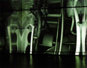
A low light bobs along a gangway in the belly of an abandoned cruise liner accompanied by the sound of heavy breathing and footsteps. It could be a scene from the film Ghost Ship, but it’s a video installation by Robert Wogan, featuring footage from the lower decks of the decommissioned SS United States. The artist made his way through room after room of mechanical apparatus, filming a journey that never seems to end. In a loop lasting just under an hour, Below (United Radiance) perfectly recreated the experience of being lost, complete with a sense of deja vu. It also documented a fall from glory by what was once the fastest and largest ship in the world.

To reach the video at UCU, viewers had to wind their way through two corridors that partially recreated a more elaborate installation from the Liverpool Biennial 2002. The metal-clad gallery walls didn’t come close to reproducing the alien atmosphere of the ship, but did transport viewers into an unfamiliar environment. The video was almost immediately disorienting and at times slightly dizzying as it followed Wogan’s unrelenting progress, never stopping to explore a room or plan a route. While the scenario would be perfect for a horror movie, the artist didn’t hesitate long enough to make his footage scary. Instead, his steady march suggested that the point was not to find a way out, but to cover as much territory as possible.

As the camera delved further and further, the ship’s enormity became apparent. At over five city blocks in length, it was unsurpassed in size and speed when it embarked on its maiden voyage in 1952. Ironically, this was also the year of the first jet airliner, an innovation that essentially paved the way for the ship to go out of service less than twenty years later. Below (United Radiance) is an exploration of loss on an industrial scale, a subject that many contemporary artists explore. The uniqueness of Wogan’s project lies in his selection of an American icon that was once world-renowned, the epitome of progress, but which now languishes in obscurity. In a unique plot twist, during the run of the exhibition, Norwegian Cruise Line bought the ship in order to renovate and recommission it. A tidy story of progress and decline is disrupted as Wogan’s documentary approach reminds us that life doesn’t stop when the cameras do.

Seeing Out Loud: Jerry Salz

For ‘Flash Art’ magazine

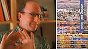
In nearly five years as art critic for the Village Voice, Jerry Saltz has written over 200 essays on art exhibited in New York. A selection of these appears in ‘Seeing Out Loud,’ a book that Saltz calls a ‘core sample’ of art seen in the city. Whether he is musing on the state of the art world or examining exhibitions by artists as diverse as Kai Althoff and Norman Rockwell, Saltz never shies away from making his opinions known.

MK- How did you determine the book’s contents?

JS –I kept most of the one-person reviews, a few of the two persons, and most of the museums. Like a lot of people who make things, I hope I’m getting better not worse, so I put the more recent reviews first. My deepest fantasy is that my work could be like desert island reading, where you could dip in and out over and over.

MK – Your writing is self-aware. Do you think that’s an important part of what criticism should be?

JS – I want subjectivity, subjectivity, more subjectivity. I think that’s all there really is. There is no one rule that says ‘Rubins is great’ or ‘Rubins is not great.’ I think it’s all a matter of taste. I write what I think, but I hope that plugs into a bigger, shared feeling so it’s not just some cockamamie nut, running around going, “Oh I like this; I hate that.” To me an ideal review has an opinion in every sentence – some temperature. I hate it when I don’t know what a critic thinks.

MK – Are you unusual in that respect as a critic?

JS – It’s strange. Only in the art world do people say, “Why write about things if you don’t like them?” You would never say that to a restaurant critic or to a sports writer, “Write about the Mets, but only say they’re good.” I think critics let everyone down, especially artists, when they don’t share a strong opinion one way or the other. Frankly, that’s the situation we’re in, and I think that has to stop.

MK – You’ve written that the critic has no power. Can you explain?

JS – I don’t say this to be a provocateur, but art critics don’t have true power. Theater critics have power; they close shows. Art critics can’t do that (Although I sometimes wish we could). If something I write curtails a sale, I’d like to think that those collectors shouldn’t be buying that work anyway. If a dealer backs off you because of what I write, then something’s really wrong with the dealer.

MK – Do you need an eye to be a critic?

JS – Everyone has an eye, and everyone, I suppose, has a voice, so anyone can be a critic. But only a few people can be good critics. For that I think you do need a good eye. But you also have to write clear, entertaining, jargon free prose; you should never take anything for granted, talk down to the reader, or think you understand everything you see. Art is about experience, not understanding. In a sense, it is beyond words. Of course, that hasn’t stopped me from trying to put what I see into words.