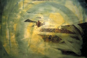
Erik Lindman can’t make up his mind to play it straight as an abstract painter or follow a conceptual path. And who can blame him? At age 23, he still has time to mull things over, though three moody canvases in his gallery debut are a cut above the other ephemeral objects on display. Colorful and complex, they’re enough to add him to a growing cadre of young painters reinvigorating abstraction.
A small photo—of a storefront window covered with torn notices and paint smudges—is the show’s Rosetta stone, directing viewers to look for evidence that the paintings were also added to over time. Lindman pays homage to those who came before him (Pat Steir, Jasper Johns), but he’s so intent on leaving traces of the significant labor put into each canvas that they’re in danger of looking overly manipulated.
Lindman’s inspirations are interior and graphic design, and while he’s careful to mask them, at least one add-on to the show tips his hand: A curvy wicker stool sitting before a painting in which the combination of circular motif with green-yellow haze creates a sense of intrigue. In the best piece, an expanse of ugly brown gives way to a triangular, rippled pattern of color, as if a subway poster had been torn away to reveal what was underneath. Rich with association, Lindman’s paintings don’t need their sources to be spelled out. They allow the pleasure of looking to be the final word.
Originally published in Time Out New York, February 26 – March 4, 2009.