Known for semi-abstract and often small-scale sculpture including the ‘Lynch Fragments’ series recently on view at the New Museum, Melvin Edwards takes over the south entrance to City Hall Park via Public Art Fund with this large-scale sculpture depicting broken chains. Titled ‘Brighter Days’ the exhibition’s curving minimal forms enhances the attractiveness of the message displayed – freedom from bondage. (On view through Nov 28th).
Melvin Edwards, ‘Song of the Broken Chains’ in installation view of ‘Brighter Days’ at City Hall Park, summer 2021.
Using a homemade camera positioned in the back of a pickup truck, John Chiara records unique images onto paper prepared as a negative, creating otherworldly photos that challenge our sense of time and place. Occasionally, a new skyscraper will loom in the background or a streetlight will invade the scene, making it undeniably contemporary, as in this East Village view. But without storefronts or people, and under a fiery sky, Chiara’s scenes turn Manhattan into a glowing landscape of intrigue. (On view at Yossi Milo Gallery in Chelsea through Oct 27th).
John Chiara, East 2nd Street at Avenue C, negative chromogenic photograph, approx. 50 x 40 inches, unique, 2018.
A faintly reflected man in a white shirt and tie looks on while a hand fondles jewels in the window of a looted shop in photographer Stan Douglas’ careful staging of a hypothetical New York City blackout. Strangely calm, the scene suggests looting as leisure activity and – given the man’s gaze – as potential romantic encounter. (On view at David Zwirner Gallery’s 525 West 19th Street location through April 7th).
Stan Douglas, Jewels, digital chromogenic print mounted on Dibond aluminum, 36 x 36 inches, 2017.
Holly Coulis’s latest paintings feature kitchenware, fruits and foods with a clean-lined graphic sensibility. Strong red outlines and softly glowing orbs of light take the still lives into another realm, however, making the familiar delightfully strange. (At Klaus von Nichtssagend Gallery on the Lower East Side through Dec 6th).
Holly Coulis, Fruit, Pitcher in a Corner, oil on canvas, 30 x 22 inches, 2015.
LA artist Mark Bradford takes full advantage of his new affiliation with Hauser & Wirth Gallery and their huge gallery space with this piece, titled ‘Waterfall.’ Bradford is known for embedding cords and other materials in his paper-on-canvas artworks; here, he has pulled thick cords away from his ‘paintings,’ bringing the paper with them. Hung over a rafter, the cascade gives new life to action painting. (In Chelsea through Dec 23rd).
Mark Bradford, Waterfall, mixed media, dimensions variable, 2015.
Further to yesterday’s post, this late 4th – 2nd century BC Greek bronze is another reason to visit the Met sooner rather than later. On view in the Greek and Roman galleries through Sunday, this remarkably detailed depiction of a boxer fresh from a fight even includes copper inlay to convey cuts to the face and ear as well as an altered alloy under one eye to suggest bruising.
Boxer at Rest, Greek, Hellenistic period, late 4th – 2nd century B.C., bronze inlaid with copper. Lent by Republic of Italy, 2013.
Ajay Kurian explores the chemicals we consume using materials that range from melted gummy bears to microwaved bars of soap. The surprise in this attractive display is that these pretty ‘rocks’ contain traces of recycled nuclear waste. (At Jack Hanley Gallery on the Lower East Side through May 5th).
I’ve been looking forward to globe-trotting street artist JR’s opening at Chelsea’s Bryce Wolkowitz Gallery next Tuesday, so spotting the artist and Jose Parla as they created this wall mural last Saturday on the gallery exterior was a treat. For their collaborative project, JR and Parla photographed and interviewed seniors including this stately woman. (‘The Wrinkles of the City’ opens May 7 and runs through July 12).
Francesca Woodman changes from girl to woman within seconds in the first two pictures displayed in her retrospective exhibition at the Guggenheim: first we meet a fresh-faced kid wearing a billowy flower-patterned tunic and her signature Mary Janes, making a motion as if she’s holding a clapper board and about to shout ‘action.’ Next, we see her nude lower body coming from a cupboard, the tilting camera catching her as if in a fugitive act. Taken in her freshman year at the Rhode Island School of Design in 1975-6, the precocious Woodman already explores the signature themes of her short career – non-narrative scenarios in which her young, perfect body interacts with the crumbling architecture of a Providence house or an old warehouse-like space in Rome (during her Junior year abroad).
Whether she’s lying curled up on old floorboards under a heavy wooden door propped precariously against the wall or straddling an old fireplace mantle leaning against the wall, Woodman attempts impossible hiding acts that ironically expose her to both prying eyes and the danger of falling props (in later pictures, we see a snake slithering across her outstretched arm and threat arrives again in the form of a wasp on her neck).
Her interaction with the space of the dilapidated room she’s in (in one, a view out the window shows a presentable house next door) resonates with Gordon Matta Clark’s radical interventions in abandoned or otherwise neglected spaces. But Woodman’s nude or partly clothed body (looking very unlikely to have ripped a door from its hinges or detached a mantel) forces unlikely connections with domestic space rather than destroying it. In one image, she covers herself modestly at breast and pubic area with two jagged sections of ripped wallpaper that cover her face and create a flattening of space that merges her body with the wall.
Using her body and physical surroundings as materials, Woodman aligns with late 70s conceptual art and body art contexts in the show’s most surprising images, such as one alarmingly masochistic image showing her at close range with clothespins attached to her nipples and abdomen. Whether this is a larger comment on womens’ bodies or sexual behavior, references to sexuality are rare, despite her frequent nudity. So much so, in fact, that when a’79-‘80 image cropped to exclude her head shows her clutching three sizeable zucchini, the allusion is so out of place that it’s more funny than it might be in another context. Later, she poses in a jeweled belt or dons multiple garter belts like an overdecorated Bellocq model, but the photos feature her curves more as formal compositions than critiques or self-exploration.
In three pictures, Woodmans lets a man into her mostly solitary, female world. All titled, ‘Charlie the Model’ they feature a heavyset man clothed, crouching nude while peering in a mirror, and smiling through a circular glass while a nude Woodman moves in a blur behind him. Perhaps because of his size or his smiles, he dominates, which put viewers in mind of his personality rather than Woodman’s retiring character and emphasizes how her more characteristic images don’t really aim to explore identity. The closest to narrative or role-play she comes is in an early photo series (exhibited in an easy-to-overlook passageway between galleries) titled, ‘Portrait of a Reputation,’ a five-image artist book from 1976 in which Woodman poses with hand over her heart, with or without clothing and with the outline of her hand eventually degenerating into two handprints suggesting an assault.
It’s a Woodman moment in New York now, with a show of the artist’s late work at Marian Goodman Gallery and the monumental ‘Blueprint for a Temple’ at the Metropolitan Museum of Art’s contemporary photo galleries. Woodman appeared to be in a transitional stage when she took her own life in 1981 at the age of 22, making larger images and experimenting with blueprinting processes and collaged images. In ‘Zig Zag’ from 1980, she creates a zigging and zagging line by linking photos of bent arms, v-shaped dress backs, scissoring legs, and more expanding her subject matter to include other people while still exploring the body and pursing formal relationships in her art. Cruelly, seeing so much of her work whets the appetite for more, but true to the Guggenheim’s purpose, offers opportunity to reconsider the context for photography in late 70s America.
As the reviews come out, Cindy Sherman’s retrospective at MoMA (open Feb 26 – June 11) seems set to break ‘best-loved show’ records. Universal critical adoration usually arouses suspicion of cliquish agreeability. But Sherman takes the very notion of conformity to fashion and self-presentation -negotiated through society’s expectations – as her subject matter. Absurdity and grotesquery appear at every turn in this show, making Sherman an uber-critic whose acuity forces the following homages from New York’s major cultural commentators:
Though Smith takes umbrage with the show’s selection and non-chronological arrangement, calling it “magnificent if somewhat flawed,” Sherman herself is “…an increasingly vehement avenging angel waging a kind of war with the camera, using it to expose what might be called both the tyranny and the inner lives of images, especially the images of women that bombard and shape all of us at every turn.”
Saltz also gives Sherman fighting cred, calling her “…a warrior artist – one who has won her battles so decisively that I can’t imagine anyone ever again embarking on a lifetime of self-portraiture without coming up against her.” He adds, “I think of Cindy Sherman as an artist who only gets better.”
Schjeldahl affords Sherman the highest praise, saying, “The mysteries are irreducible…they qualify Sherman, to my mind, as the strongest and finest American artist of her time.” Pointing out that delusion allows a disconnect between “inner feeling” and “outer attributes” he adds that, “…Sherman makes hard, scary truths sustainable as only great artists can.”
Halle calls the MoMA retrospective “…the best show I’ve seen there since the Gerhard Richter survey [in 2002], and probably the best exhibit I’ve seen anywhere in a while…The way I’d put it is that Sherman uses glamour and horror to send up and celebrate the feminine mystique, including her own. She quantifies and categorizes the notion of one’s appearance, which fashion also does. But unlike Anna Wintour, Sherman isn’t in the business of marketing the cultural; she’s in the business of laying it bare.”
Uta Barth, ...and to draw a bright white line with light (Untitled 11.2), inkjet print, 2011. Courtesy of the artist and Tanya Bonakdar Gallery, New York.
The centerpiece of Uta Barth’s latest solo show is a photo series depicting a continually morphing strip of light beneath her living-room curtains, a preposterously simple conceit which nevertheless yields complex optical illusions. As this diaphanous sliver shifts course over an afternoon, it variously resembles a snake, a line on an EKG or a trail of cigarette smoke, all the while transforming the space between the camera, the curtain and the window into an ambiguous territory where volumes flatten or swell, and light can pass for white paint.
Two glimpses of Barth’s hand arranging the curtain folds remind us of her agency, but it’s nature’s hand that propels the work’s attractively simple narrative as the sun’s changing position gradually increases the width of the band. At this time of year, as the onset of winter makes Barth’s invitation to contemplate sunlight especially attractive, the work entices us into the pleasures of solitary idleness that are at odds with the pace of everyday urban life.
In the back room, by comparison, a second group of photographs depicting built-in closets and drawers in the artist’s bedroom seems coldly architectural. Each image is emblazoned by squares or rectangles of light cast from an opposite window: One features a particularly bright patch that suggests celestial or alien visitation; another, a band of shadow over a door latch, creates the illusion that the surface of the print is scratched. But otherwise, the real drama of transformation takes place in the front gallery.
Originally published in Time Out New York, issue 839, Dec 1-7, 2001.
Sarah Braman, 'Good Morning (November),' camper chunk, plexiglas, steel and paint, 2011.
Sarah Braman’s trademark combinations of disparate materials in precarious arrangements achieve a new level of gravity with the incorporation of components from a cut-up camper. In her debut at Mitchell-Innes & Nash, hefty chunks of the vehicle act as both painting surface and gritty foil to the clean-cut cubes of gorgeous blue and purple Plexiglas to which they are sometimes conjoined. The resulting juxtapositions defy expectations as the funky, roughed-up trailer becomes impersonal, and the slick geometric elements charm with their transparent beauty.
In a sculpture near the gallery entrance, the back of the RV creates an archway with two Plexi boxes forming an L. Tinted the color of limousine windows, the latter are doodled with spray paint, recalling Sterling Ruby’s defaced pedestal pieces, but without the air of menace. If this treatment somewhat softens these cold, corporate forms, a lack of any trace of habitation within the camper does the opposite, making it makes seem less like a repository of past adventures, à la Mike Nelson’s airstream installation at 303 Gallery last spring, and more like one of Gordon Matta-Clark’s deconstructions of an abandoned place.
In a piece titled 8pm, a smaller fragment of the camper is sandwiched between two aquarium-like shapes, while a larger nearby structure in blue, pink and purple Plexi recalls an empty Damien Hirst shark tank crossed with an Anne Truitt. But it is in Braman’s misleadingly titled and exceedingly lively Coffin that viewers are finally offered the delayed gratification of imagining past lives. Here the Plexiglas takes something of a backseat to a segment of camper laid with a mirrored floor, creating a boudoir-like stage for memories.
Originally published in Time Out New York, issue 837, November 17-23, 2011.
Tris Vonna-Michell, installation view at Metro Pictures, 2011.
In his New York gallery debut, British artist Tris Vonna-Michell explores the stories of little-known historical figures (an East German border guard, a forgotten concrete poet) in a group of distinct but linked installations that collect, sift and reconfigure information to create intriguing, and charmingly quixotic, alternative histories. Despite deliberately low-tech, low-key visuals—slide shows of bleak urban scenes, displays of texts on tables and shelves—the artist’s soundtrack of urgently delivered word streams provides an irresistible hook.
In the darkened front gallery, a voice speaks pressingly about magnetic tapes, tanks and Russians, while a projector slowly flashes images of the former no-man’s-land near the Berlin Wall. Texts spell out the story of a young soldier canonized by the East German state for being shot by defectors escaping west in 1962, but the actual details are left untold because, as the piece suggests, truth was subsumed by official legend long ago.
Elsewhere, Vonna-Michell tells of his not entirely successful attempt to track down an obscure French avant-garde poet, Henri Chopin (a former neighbor), and also recalls the 1989 mass demonstrations around Stasi headquarters in Leipzig, as nervous authorities shredded incriminating files inside. Seamlessly segueing from their frantic efforts to destroy records to Kurt Schwitters’s collage technique, Vonna-Michell demonstrates that while none of us may ever completely know the past, it can be engaged, at least, on one’s own terms.
Originally published in Time Out New York, issue 832, October 13-19, 2011.
Paul Sietsema, "Untitled figure/ground study (Degas/Obama)," 2011. Photograph courtesy of Matthew Marks Gallery, New York.
If it weren’t for the schooner by the doorway at Paul Sietsema’s first New York gallery solo, I’d have missed the boat. Not-quite-right details reveal that what looks like an aged old photograph of a sailboat is in fact a meticulous drawing that demonstrates in a flash how painterly skill adds value and interest to an artwork. In this otherwise aesthetically restrained but intellectually stimulating show, Sietsema allows trace evidence of his hand in pieces that look digitally produced or printed, questioning his own role as a craftsman in the digital age and floating an inconclusive but engaging argument that artistic survival means cleverly thwarting expectations.
In the past, Sietsema has exhibited films of sculptural objects; the drawings here allow us the intimacy to appreciate his handiwork. Two untitled pieces resembling expressive abstractions in black ink also include depictions of bottles of Krylon ‘Short Cuts’ paint, humorously highlighting how Sietsema doesn’t take shortcuts in his labor intensive, cerebral, and non-emotive project. At the bottom of one, the phrase “broken down and experimental…broken down beauty,” bespeaks the pleasure of piecing together Sietsema’s deconstructions.
Two pieces titled, ‘Painter’s Mussel’ refer to shells used to hold paint but show Sietsema flexing his intellectual muscle in complicated pictures of disassembled framed photographs drawn to resemble photographic negatives which appear to have been printed. From the aged photograph of the boat and images that pit old technology (the brush) with new, to two pieces replicating the dated medium of newspaper pages (including an article on Obama reversing a Bush policy) Sietsema suggests that with passage of time ascendency fades – the smart artist adapts by working outside of traditional expectations.
Condensed version of this review published in Time Out New York, issue 815, June 2-8, 2011.
Laurel Nakadate, August 2, 2010. Photograph courtesy of Leslie Tonkonow Artworks and Projects, New York.
Laurel Nakadate cried every day of 2010. And whether she was in her apartment, in an airplane lavatory or on a beach, she captured the result in 365 photographs, meant to document her effort, as she put it, to “deliberately take part in sadness.” Contrary to this suggestion of shared unhappiness, however, the images portray her in isolation. Often nude or semiclothed, she plays the role of a vulnerable woman needing rescue, appearing to offer her body in a compromised sexual exchange for attention. Sensational, narcissistic, yet incisively illuminating in some respects, Nakadate’s project is an uncomfortable portrait of alienation.
It also tests our willingness to indulge in so much self-inflicted pain. The seasons and the artist’s travels introduce a minor narrative arc, but there’s no resolution to her misery. Unlike Tehching Hsieh’s yearlong performances tracking the effects of self-imprisonment, or Eleanor Antin’s photo diary of being on a diet, Nakadate undergoes no transformation and promotes no politics, personal or otherwise. And unlike the lovelorn Sophie Calle’s exhaustive investigation of a Dear John letter, there is no catharsis.
Instead, the act of repetition dominates, and the mind wanders to questions about Nakadate and her motives: How does she make herself cry? Is she merely acting? What goes on off-camera: Does she happily go about her day until the requisite moment to shed tears? Part of “365 Days” is on view at MoMA PS1, where the photographs are huge, implying an unwarranted monumentality to the artist’s questionably authentic emotion. Even in this more modest installation of smaller-size prints in a tight grid arrangement, Nakadate is still center stage, limiting any possible commentary on collective grief or widespread disaffection.
Originally published in Time Out New York, issue 815, June 2-8, 2011.
Angel Otero, 'There's nothing so I wonder," 2011. Photograph courtesy of Lehmann Maupin, New York.
Angel Otero’s unconventional process—fashioning assemblages or lively paintings using “skins” of oil paint applied to glass before being peeled off—is the draw in his New York solo debut. An awkward anthropomorphic object perched on a chintzy armchair, messy Expressionist interiors in garish colors and one uninspired composition with text demonstrate the young artist’s competing sensibilities. Far better are Otero’s large-scale abstractions—action paintings in which paint itself seems to have agency, shooting off the edge of the canvas, bunching dramatically or seductively veiling its support.
The show’s smallest and punchiest piece—a black number whose surface is concertinaed like a crushed soda can—has an affinity with Piero Manzoni’s pleated white canvas, but in place of purity there is an excess of paint, piled up in waves as if to hide some (perhaps failed?) experiment beneath. Likewise, a blocky form wrapped in streaks of yellow and black traffics in concealment, channeling Christo’s early wrapped objects—minus, unfortunately, the mystery.
The play between a vibrantly colored surface and an occasionally glimpsed support that is waxy and dead is more alive than, say, Steven Parrino’s twisted and pulled canvases, and aligns Otero with Fabian Marcaccio’s use of paint as a sculpting material. Recurrent blurring also recalls Gerhard Richter’s scraped abstract canvases, but unlike Richter, Otero’s intent is to build, not cancel out. His undulating skins re-create the drama of a hastily drawn curtain, awaking the senses and offering a celebration of paint’s possibilities.
Originally published in Time Out New York, issue 807, March 31 – April 6, 2011.
Yoan Capote, a stand-out artist in the Havana scene, explained in a recent interview that he wants his work to remain relevant after the ‘political exoticism’ of Cuban art (fashionable since the mid-90s) dies down. In the meantime, his recent subject matter – the allures and disillusionment of migration – and his tendency towards often blunt, sometimes profound statements are the hallmarks of stereotypical Cuban style. Despite the feeling of déjà vu that this show evokes, Capote makes his mark by implicating everyone – us, himself, and Cubans in general – in the complex pleasures and pains of cross-cultural longing.
Capote opens the show with a literal bait-and-switch – a majestically vast (over 26 foot long) and gorgeously deserted seascape that turns out on closer inspection to be an intimidating composition made from thousands of fish hooks attached to the picture’s surface. An equally enticing sea view crops up again in a nearby video in which we watch a waterfront window being bricked in with the pattern of a U.S. flag in a claustrophobic ritual that replaces the imagined but unattainable reality of foreign lands beyond the horizon with a barricade both symbolic and literal.
Surprise menace and repressive restriction create an uneasy mood but leave room for personally inflected interpretation. More heavy-handed pieces kill the spirit of enquiry, as with a room-sized bronze set of scales titled ‘Status Quo (Reality and Idealism)’ that leaves no doubt about how privilege tips in favor of the already powerful. In a series titled ‘Coitus’, human silhouettes cut from dollar bills, pesos, rubles and Yuan play the one-dimensional role of symbolic aggressor or victim. But in pieces like ‘Migrant,’ in which two feet join to tree trunk legs that end in a complex network of roots, Capote pointedly testifies to the personal cost of uprootedness. Laid low on the gallery floor, roots echoing brain synapses make the poignant argument that when it comes to the linguistic, social or cultural nourishment of your native culture, you can’t take it with you.
Originally published in Flash Art International, issue 276, January/February, 2011.
Sean Bluechel, installation view. Photograph courtesy of Nicole Klagsbrun Gallery, New York.
As far as quantity goes, the 36 ceramic sculptures and 25 photos crowding Nicole Klagsbrun’s side gallery suggest that Sean Bluechel is more than ready for his first major Chelsea show. In terms of quality, however, his creative profusion—and a goofy hedonism conveyed by ubiquitous smiley faces, multiple ceramic spliffs and an assortment of phallic objects ranging from digits to a corncob—threaten to distract from the show’s real gems: Remarkable shape-shifting objects conjure fantastical scenarios.
Though the ceramics are the main draw, Bluechel’s photos of totemic assemblages cobbled together from cardboard tubes, Styrofoam, tinsel, balloons and a very accommodating nude woman (who seems to have been shot in a basement) have a furtive quality, as well as a postdebauch air that is in keeping with the sculptures’ juxtaposition of lumpen forms and beautifully colored glazes. Yet they feel more like high jinks than high art.
Bluechel’s apparent references in a few of the sculptures to such artists as Jean Dubuffet and Yves Klein indicate that he’s mindful of the distinction. Yet his efforts work best when you overlook the visual hubbub of his busy installation and focus on select stand-alone pieces: the upside-down mushroom balanced on two blobs, titled Unshaved Wicca Girls; the quasi-camera/gun/musical instrument, rising from a dish amid a flurry of leaves, titledKill Vegans; the Kusama-channeling bouquet of protruding fingers crowned with a laurel. They all deliver their paeans to insouciant perversity with concision and humor.
Originally published in Time Out New York, issue 799, February 3-9, 2011.
Tiffany Pollock, "Easter Loves Mango," 2010. Photograph courtesy of Gasser & Grunert, Inc., New York.
In Tiffany Pollack’s second solo show, baby care and flowers are subjects for dyed silk paintings in glorious washes of beautiful color. The former take shape as quasimodernist grids charting the waking/napping routine of the artist’s infant. Given that mother-child relationships in contemporary art tend more toward the curdled Robert Melee variety, Pollack’s approach is surprisingly anxiety-free.
Though the show includes eight such paintings, Pollack crystallizes the experience of all-encompassing emotional highs and lows in a single piece that registers periods of happiness followed by tears. Like Mierle Laderman Ukeles’s memorable photos of her children’s slow progress in getting dressed to go out during winter, Pollack’s efforts will elicit groans of recognition, their wavy bands of color perfectly conveying the hazy disorientation of sleep deprivation.
Unlike Ukeles, however, or Catherine Opie’s gender-bending self-portrait while nursing, Pollack’s pretty colors and near-total lack of critical remove suggest that she’s enjoying her new role. Coupled with an eye-popping series of flower paintings in which poppies explode against a hot pink ground, bleeding-heart flowers dangle gorgeous buds, and the gathered stems of calla lilies melt together in a downward rush of paint, Pollack revels in the pleasures of fertility. These works recall Charles Ray’s much-lauded room of flowers at the last Whitney Biennial, though they leave hanging the question of whether highly personal exploration, beauty and, in Pollack’s case, pure joy are enough on their own.
Originally published in Time Out New York, issue 798, January 27 – February 2, 2011.
Matthew Monahan, “Seppuku.” Photograph courtesy of Anton Kern Gallery, New York.
For a card-carrying member of the “Unmonumental” generation of sculptors (he was actually in the New Museum show of that name), Matthew Monahan’s latest freestanding bronze sculptures are both reactionary and a logical next step. His previous work consisted of installational displays crowded with objects and figures, idiosyncratic minimuseums chockablock with visual allusions to art history—a Greco-Indian eye here, a Northern Renaissance visage there. At Anton Kern, Monahan distills archetypal characters from a jumble of references, creating a fascinating group that looks like archaeological finds from an alternative art history.
One slender nude’s wire-bound body recalls photographer Nobuyoshi Araki’s soft-core titillations, but her quizzical expression is more provocative, suggesting spiritual superiority and/or mental disability. Another character’s cruciform pose begs explaining, but his craggy and practically concave face closes in as if guarding secrets. Nearby, a motionless, gold-leafed droid version of Umberto Boccioni’s Unique Forms of Continuity in Spacestands stiffly by.
While Monahan’s sculptures pique our curiosity with their mix of vague familiarity and uncertain identity, a series of oil-on-board images resembling tantric diagrams fairly exudes esoteric mystery. Collectively titled “Body Electric,” they summon Walt Whitman’s passionate appreciation of the human form but feature a fairly unnuanced, everyman element: a simplified kind of line drawing made by scraping black-painted paper to reveal the white below. The sculptures, on the other hand, turn appropriation into creation with their affecting cast and enjoyable synthesis of history, pop culture and sheer invention.
Originally published in Time Out New York, issue 793, December 9 – 15, 2010.
Kristin Morgin, Wrecked Spyder, 2010. Photograph courtesy of Zach Feuer Gallery, New York.
The nervous plea in the title of Kristen Morgin’s New York solo debut seems warranted at first glance. This accumulation of meticulously crafted, painted-ceramic replicas of comics, toys, personal mail and more, laid out on rickety tables, looks like the world’s most precious yard sale. But behind a facade of understatement, Morgin cleverly challenges the ways in which we value things, making art that’s real and fake, handcrafted and reproduced, imitative and innovative, vintage and new, high and low, all at the same time.
Category-busting begins at the door with a shelf of roughly fashioned teacups featuring portraits of comics icons, from Wonder Woman to Snoopy, a cheeky mix of useful craft and pop-indebted fine art. Elsewhere, doodles on Post-its lie alongside a ceramic Curious George book, featuring the trouble-prone primate traveling through space. Despite its futuristic theme, the tome’s deliberately cracked and aged condition and added-on sketches—including a version of Picasso’s Guernica—summon a specter of ruin over predigital ephemera. Large drawings of a dodo bird and ticking clocks rendered over other ceramic facsimiles of comic books likewise reinforce the sense of imminent extinction, reminding us that the past is always mediated.
What would ordinarily be the show’s star attraction—a pale and crumpled replica of the Porsche Spyder in which James Dean met his end—is the Bamiyan Buddha of roadsters: a memory so wrecked that it’s barely related to the original. Morgin, however, isn’t after the trompe l’oeil virtuosity of Steve Wolfe or even Allen Ruppersberg’s reshuffled pop references. Instead, she gives us a pointed warning that everything starting out shiny and new inevitably crumbles to dust.
Originally published in Time Out New York, issue 791, November 25-December 1, 2010.
The third of three blockbuster contemporary art survey shows to hit New York in the past year, Greater New York was worth waiting for. The New Museum’s youthfest, The Generational, showcased an under ripe generation still finding its voice. The Whitney Biennial presented artists self-consciously grappling with new ways to be ‘experimental.’ Despite the fact that these shows shared several artists, Greater New York swapped the previous ‘watch-this-space’ vibe for mature, confident work by 68 artists and collectives, evenly balanced between male and female, whose collective fostering of identity politics – sexual, racial, political and personal – broke with recent art world trends towards hermeticism and reconnected with the larger world.
If identity politics has come to sound retro in ‘post-black’ days, Hank Willis Thomas’ monumental photo series made it joltingly relevant, connecting yesterday to today by tracking the persistence of stereotype and recent fantasies of racial integration through forty years of magazine ads. Rashaad Newsome’s video of over twenty female performers uttering partial phrases like ‘excuuuuuse…’ or ‘giiirl’ is one of the best pieces at PS1 (though technically part of an auxiliary exhibition reviewing the last five years of artmaking), succinctly demonstrating how slang and role play create exclusive group identities.
Alternative sexuality was the norm in the third floor galleries, where Sharon Hayes’ five channel video installation ‘Revolutionary Love’ brilliantly integrated the concerns of participants inside and protesters outside the 2008 Democratic and Republican National Conventions before veering quixotically off topic by demanding love along with legal rights. But her assertion, ‘we’re all queer’ makes perfect sense in light of Leigh Ledare’s creepily incestuous photos of his exhibitionist mom, which prove that anyone, heterosexuals included, can pretty much chart their own course. LaToya Ruby Frazier’s photos of her own mother come to mind (from the New Museum Triennial); in her video contribution here, her tense, naked torso – juxtaposed with clouds of factory steam – pulsated with unspoken feeling.
Proving that identity politics don’t have to be dour, K8 Hardy’s fabulously eclectic self-portraits in outrageous getups place her characters outside recognizable ‘types.’ A similar inventive exuberance carries downstairs to A.L. Steiner’s photocollaged lesbian utopia where one nude joker embraces a reproduction of Courbet’s ‘Origins’ and another dangles her pendulous breasts over two globs of dough. Identity aside, other galleries exploded with color or formal inventiveness, including Kerstin Bratsch’s and Adele Roder’s abstract paintings, which distill distinctly a modernist appeal in terms of color and geometry, and Mariah Robertson’s audacious, show stopping 30” by 100’ photogram wrapped around gallery floor, walls, and ceiling.
Press material posited the ‘process of creation and the generative nature of the artist’s studio’ as the show’s dominant theme, though Robbinschild’s installation conveyed little when the artist’s weren’t present, Ei Arakawa gave out candy to studio visitors one day in apology for lack of a performance, and The Bruce High Quality Foundation’s program to swap new pedestals for used ones from art collages was a space-hogging one-liner. On the other hand, Naama Tsabar’s ‘Speaker Wall,’ two walls of bookshelf speakers rigged with strings into irresistible collaborative instruments, generated the hive of activity that the curators must have hoped for.
Tsabar’s invitation to engage in her work was literal, but for the most part, Greater New York’s best pieces stood out for their complex engagement with issues outside the art world (gay rights, racial, class and gender politics, etc). A couch featuring news clippings of President Obama and photos of a disfigured young Marine were among the most memorable images of the Whitney Biennial; likewise, pieces like David Brook’s living trees encased in concrete – a protest of deforestation in the Amazon, amongst other things – made the connection to an existing conversation amongst a wider audience, making this show the one we’ll likely continue to talk about.
Originally published in Flash Art International, no 274, October 2010.
Polly Apfelbaum, "Off Colour" installation view. Photograph courtesy of D'Amelio Terras, New York.
Polly Apfelbaum is in rebellion. Unlike the pleasing forms and intricate color schemes of the floor-based fabric arrangements she’s known for, her latest installation of jagged panels in sequined cloth is attention-grabbing but jarring. Off Colour derives its title and loud appearance from amateur nude photos that Apfelbaum found at a London flea market, suggesting a futile attempt at titillation.
At previous shows Apfelbaum had brought in work crafted in her workshop, but this installation was made directly in the gallery. The result—slender fabric strips extending into the corners or hugging columns—could barely be termed a response to this unremarkable space, though the artist has upended expectations by diverting our attention from the walls to the floor. Still, tiptoeing between the zones of crimson, pink, yellow, green and orange (that a sign warns us not to touch) is more awkward than absorbing; the scheme is so calculated that it discourages any desire for interaction.
On the plus side, the panels’ rough edges, geometry and scattered appearance recall Jean Arp’s torn-paper collages, and look like they might harbor some sort of meaningful relationship between the shapes and the negative spaces they create. Unfortunately, a more concrete reading is elusive, as if Apfelbaum had deliberately left behind a self-conscious collection of isolated parts that, like her source photos, lead us on but give us no satisfaction.
Originally published in Time Out New York, issue 785, October 14-20, 2010.
Liu Xiaodong, “Z’s Family,” 2009. Photograph courtesy of Mary Boone Gallery, New York.
Coincidently, while Liu Xiaodong painted this show’s realist portraits of a Muslim and a Christian family in China’s northwestern Gansu province, ethnic violence broke out between Muslim and Han Chinese in the region. Rather than an argument for peaceful coexistence, however, this body of work seems more motivated by the artist’s curiosity about the unique cultural adaptations of China’s religious minorities.
Coincidently, while Liu Xiaodong painted this show’s realist portraits of a Muslim and a Christian family in China’s northwestern Gansu province, ethnic violence broke out between Muslim and Han Chinese in the region. Rather than an argument for peaceful coexistence, however, this body of work seems more motivated by the artist’s curiosity about the unique cultural adaptations of China’s religious minorities. Complicated family dynamics and Liu’s own idiosyncratic symbolism add animation to already fascinating portraits.
For example, Liu places the Christian brood of Z’s Family inside a chapel, with the young mother astride a donkey while holding her antsy toddler in her lap: an image inspired (according to an entry from the artist’s diary, included in the show’s catalog) by Jesus’ flight into Egypt as an infant. Just as compelling, though, is the painting’s psychological undercurrents, particularly in a woman’s beatific expression, which barely conceals her apparent discomfort. More cryptically, a male relative on the left stands with a giant feather duster in his hand, suggesting some sort of emasculated posture, while the 80-year-old patriarch’s downcast glance conveys weakness as much as presumed humility.
The Muslim H’s Family is seen gathered together in the cramped restaurant that doubles as their home. Four adolescent daughters and a son strike awkward poses but telegraph their individuality by boldly meeting Liu’s gaze. So it seems odd that Liu asked the lively, eldest daughter to wear a head scarf (not owning one, she had to borrow one), then painted her odalisque-style in a cabinet-like enclosure in the background, which serves as a bed for the girls.
Both canvases recall the anthropological air of Thomas Struth’s family portraits, but Liu adds layers of interpretation that symbolize the challenges of understanding others.
Originally published in Time Out New York, issue 784, October 7-13, 2010.
Judith Eisler, "Blondie (standing)," 2007. Photograph courtesy of Greenberg Van Doren Gallery, New York.
Painting and photography intertwine in this handsome if disparate show in which success hinges on how provocatively each artist elaborates upon her source material. Judith Eisler’s canvases of music or film stars seesaw between the bland and glorious, Mariah Robertson’s unique prints picture ambiguous spaces in eerily alluring color, while recent SVA grad Bryn McConnell limns vibrantly toned, if shallow, renditions of fashion spreads.
McConnell’s composition of a model draped over the edge of a bed is the show’s most attention-grabbing piece; its glowing orange and yellow highlights make Eisler’s two adjacent monochromatic paintings of Romy Schneider appear lackluster by comparison. Yet McConnell’s effort feels vacant, as she strips the identity of her subject—a model from a Miu Miu advertisement—reducing her to little more than a series of painterly strokes. Eisler, on the other hand, uses appropriated film stills to play up Schneider’s momentarily masculine look, nearly crushing her starlet charm. Similarly, in another nearby piece, Eisler seemingly morphs Deborah Harry into an astronaut by showing the singer as she retreats into a gorgeous blue shaft of light on a dark, smoky stage.
The artsy nudes and repeated palm motifs Robertson incorporates into her collagelike compositions look like borrowed stock photography, but they were actually created by the artist, who plays with photographic conventions. More pleasurable, though, are her purely aesthetic touches: horizontal bands of sunset colors, multiple images of an anonymous figure on a rooftop, and drip patterns, all creating an abstract scenario in which the imagination is set racing.
Originally published in Time Out New York, issue 777, August 19-25, 2010.
Martin Schoeller, "Christine Roth," 2004. Photograph courtesy of Hasted Hunt Kraeutler, New York.
Can photos of babes in bikinis with big biceps be more than gratuitous? Martin Schoeller’s portraits of women bodybuilders pander to the inherent sensationalism of their topic, but also manage to transcend it, playing up deeply disconcerting contrasts between traits typically considered female (makeup, hair) and male (bulging muscles). He puts his subjects on pedestals as goddesses of discipline and self-control. By contrast, a second body of work largely deglamorizes the faces of celebrities who’ve agreed to pose for his flaw-baring lens.
In the former series, Schoeller magnifies his sitters’ bulk, framing them from the waist up in enormous 61.5″ x 50″ photos. The same women (e.g., Christine Roth, Carmella Cureton) appear on bodybuilding blogs and websites in more feminine—and, perhaps, objectifying—poses, but Schoeller’s gender-bending emphasis on pumped-up arms and abs showcases hard-won physiques that rebuff mainstream ideals of the female physique. Valerie Belin’s images of bodybuilders (who look so shiny as to seem practically chromed) come to mind, but Schoeller’s subjects are proud and unique.
In an ironic reversal, the best photos in the second series are of women with normal features and inflated personalities: an ethereal and unrecognizably dignified Paris Hilton; Sarah Palin, captured as a cipher constructed out of makeup. Most of these other portraits, however, are about as compelling as a driver’s-license picture. Marina Abramovic shows no trace of the pain and drive she’s poured into her career, while deadpan studies of Chris Rock and Jerry Seinfeld, clinical takes on Bill Murray and a dozy Kobe Bryant beg for something to make us take notice—be it brawn, beauty or brains.
Originally published in Time Out New York, issue 776, August 12-18, 2010.
Carol Bove, Sterling Ruby, Dana Schutz, installation view. Photograph courtesy of Andrea Rosen Gallery, New York City.
At first glance, the works of Carol Bove, Sterling Ruby and Dana Schutz wouldn’t seem to have much in common besides their creators’ hot-artist status. Yet an undercurrent of aggression unites their otherwise disparate efforts. Bove’s unusually severe sculptures, Ruby’s antiauthoritarian sculpture and painting, and Schutz’s gruesome canvases (including one showing a finger sliced in a fan) range from bold elegance to cheeky flipness in their flirtation with darkness.
Bove’s huge Plexiglas-and-expanded-sheet-metal boxes are the surprise of the show: a cold departure from her intimate assemblages of books and ephemera nostalgically evoking the ’60s and ’70s. The diamond-patterned mesh covering the top, bottom and sides of these rectangular objects explains the title, Harlequin, perhaps after Picasso’s predilection for that subject; here, they become obstreperous gatekeepers, obstructing access to the back galleries.
Bove’s works would have made an interesting match with Ruby’s creepy cage sculpture from his last solo show at Pace Gallery; instead, the latter is represented by the comparatively refined Consolidator, a dark-brown sculpture resembling a cross between a cannon and a coffin, whose title, scrawled across its face, exudes a vague corporate threat. A nearby painting references both a notorious nightclub and a supermax prison, starkly contrasting freedom with lockdown.
Lack of self-control afflicts Schutz’s hapless characters, which include an escape artist who’s pinned himself to a target with knives, and the numskull whose appliance-sliced finger has just generated a tasteful if gory modernist abstraction. After Bove’s monuments to the beauty of power and Ruby’s ominous embodiment of fear, Schutz’s tongue-in-cheek portrayals are laugh-out-loud funny, and the highlight of this show.
Originally published in Time Out New York, issue 775, August 5-11, 2010.
Tala Madani, "Reverse Alphabet, " 2009. Photograph courtesy of the artist and Lombard-Freid Projects, New York.
Tala Madani’s solo show offers relief from the aggressive nastiness of her sadistic characters and their hellish world but, while the mood shift is palpable, it’s still far from redemptive. Legions of tiny male nudes in neon colors on black canvas spelling out the letters of the alphabet are an irresistible lure. But when the letters form words and phrases like in Men R Hot with Fire (2010) (where the ‘t’ is depicted on fire) or in XO with Stripes (2010), they don’t communicate brotherly love. Dehumanized by lack of distinguishing characteristics and gruesome contortions, the characters are no longer perpetrators of abuse; instead, responsibility for their treatment lies with the artist.
Yet a stop-motion animation of a dancer — a standout from the show’s other violent videos — suggests that Madani’s inspiration comes in part from the human body’s astonishing range of movement. This injection of sincerity into Madani’s sinister world is counteracted by cautionary pieces like a giant composed of letters, Leviathan (2010), who hints at the abusive power of language; and an eye exam chart populated by human letters, Eye Exam (2009), which begs the question of what we really see in the world around us. Taking on communication itself as a subject matter, Madani keeps a critical eye while making a welcome break from the claustrophobic world of her past work, opening up promising new directions.
Originally published in Flash Art International, no 272, May/June 2010.
Trisha Donnelly, Untitled, 2010. Photograph courtesy of Casey Kaplan Gallery, New York.
It says something when an artist can produce an exhibition of totally abstract artwork that runs the risk of being too obvious, but Trisha Donnelly’s latest solo show is almost unsettlingly easy to read. With no gallery statement and only one titled work, a few things are still left up in the air, but this show’s layout and content make for a pleasant, if straightforward, journey through the artist’s thought process.
A kidney-shaped desk (a found object) titled The Secretary, which greets visitors in front, seems at first uncomfortably obtuse, blocking access while posing the question of what we’re meant to glean from it. Only in the next room do its feminine curves make sense in comparison with a pretty pink marble sculpture, adorned with concave impressions that evoke breasts or eyes and appear to channel Brancusi. It seems we’ve stumbled on the secretary herself, a surprisingly primal creature, minimally altered from her natural state but with striking features nonetheless.
Such amusing opportunities for personification eventually peter out as Donnelly, who used a rotary saw to incise columnar and grille-like shapes into two sculptures, settles for the traditional role of mason. This suggests that while her contemporaries are content to dig into modernist history, Donnelly goes further back in time, mining raw material from the same earth as the ancients (the pieces are made out of limestone quarried in Bolzano, Italy). She calls to mind their labors while producing forms that resonate with contemporary life.
Originally published in Time Out New York, issue 769, June 24 – 30, 2010.
Patricia Esquivias, "Natures at the Hand." Photograph courtesy of Murray Guy, New York.
Patricia Esquivias’s immediately likable narrator voice is the hook in her major new video,Folklore III, keeping us engaged through dull, repetitive images and the creeping suspicion that there is less to the historical connections she weaves between two lands—Galicia, Spain; and Nueva Galicia, Mexico—than her deadpan delivery suggests. Unsupported by video evidence, the details Esquivias describes—childlike decorations on the houses, a vast unfinished monument—gradually come to seem more fanciful than believable, and thus, wonderfully entertaining.
Old Galicia represents endings—we see scenes of the coastline and hear about the rituals enacted there—while new Galicia presumably offers a fresh start to immigrants. Yet it’s the Old World that hosts a peculiar and inherently hopeful architectural custom, whereby homeowners build successively larger floors onto their buildings, creating edifices shaped like inverted Aztec pyramids. Such optimism in the future contrasts with the stasis of Nueva Galicia, where newcomers never really find their feet, subtly upending the assumption that newer is always better.
The show’s second major piece, Natures at the Hand, (from 2006) reverses tactics by favoring visuals over story, though it continues to forge similarly tenuous historical or thematic connections—comparing topiary in European castles with that in Guadalajara’s front yards, for example. Collaging disparate images together to create new narratives is a common strategy these days (Fischli and Weiss and Fia Backström come to mind), but Esquivias makes the approach her own by delighting in the simple absurdities of life, and evoking a cross-border culture in which the fluidity of facts meets the charms of quirkiness.
Originally published in Time Out New York, issue 768, June 17-23, 2010.
Thomas Houseago, "Spoon IV," 2010. Photograph courtesy of Michael Werner Gallery, New York.
The sculptures in Thomas Houseago’s first New York solo show defy reigning art trends by embracing monumentality, mining art history for subject matter without being overacademic or self-conscious, and conveying meaning without detailed background info. None have the commanding presence or shape-shifting potential of the artist’s towering Baby, a standout in the current Whitney Biennial. But his totemic and iconic pieces, made with labored simplicity, plumb life’s mysteries with hopeful optimism.
A line of skulls just inside the gallery would be grim if not for their wealth of associations, from Darth Vader’s mask to Picasso’s haunting late self-portraits. Jonathan Meese’s Cubist-indebted faces come to mind, but Houseago’s heads are more in keeping with the simple, alien grotesquery of Ugo Rondinone’s all-black visages. With their hollow, zombie eyes, quizzical semi-squints and fingerlike ropes of flesh on their faces, the figures float between life and death, pop culture and high art.
The show itself ambitiously aims to be many things at once—figurative and abstract, humorous and serious, historical and contemporary—but it feels crowded and thematically discordant at times. It’s tempting to hunt for humanist metaphors to tie together pieces like the two giant spoons à la Claes Oldenburg (nourishment?) and the Brancusi-like totem with bird’s head/bike helmet on top (spirituality?). Other objects make more fruitful associations: A repeated circle pattern appearing in a ghoulish face, a geometric frieze, and a sculpture representing sunrise and sunset merges personal and cosmic concerns, connecting dark souls to shining celestial bodies—and speaking for art’s ability to enlighten.
Originally published in Time Out New York, issue 764, May 20 – 26, 2010.
Los Carpinteros, "Bola," 2008. Photograph courtesy of Sean Kelly, New York.
MERRILY KERR: What brings you to New York?
Los Carpinteros: We’re designing the set for a ballet performance by Morphoses/The Wheeldon Company. Using windsocks filled by fans, we’ll play with the drama of Rachmaninoff’s “Suite for Two Pianos.” We’re combining the technical and emotional, a bit like at the airport, when windsocks are the last thing you see before you leave the earth.
MK: How has the difficulty of traveling to the U.S. affected your work here?
LC: After 9/11, the interest in Cuban art calmed down because visas were impossible to get. So while our work kept developing in Europe, South America and Asia, we had to arrange our last exhibition at Sean Kelly Gallery by email. When we do an exhibition, we like to touch everything, and this was too cold.
MK: If less of your work is handmade, will your name become meaningless?
LC: By now, Los Carpinteros is like a family name, so it won’t grow old. Originally it didn’t just refer to woodworking; we were acting as outsiders to the art scene, which made a lot of sense in the ’90s when censorship was an issue. We’ve actually been given a new label in a book project with Thyssen-Bornemisza coming out in May: Post-Industrial Craftsmen, which describes how we use industrial and prefabricated sources and craft them to our inventions.
MK: What do you still make by hand?
LC: The exploding rooms, for example, are still a labor of craft. Our work has always been about constructing, but for these we deconstruct a fragment of architecture making it both alive and static. When we showed a version of the piece in Prague in 2005, we didn’t want it to carry political overtones of the fallen Berlin Wall, so we decided to include furniture, making it unclear whether a storm or bullet had struck.
MK: Do you suppress politics in your work?
LC: We did our most politicized work in Havana when we exhibited a functioning lighthouse lying on its side in a dark gallery. We expected this symbol of fallen power to be censored, and were surprised when it wasn’t. Making political work can be addictive. They say that creation is an allergic reaction to reality. When you have a political situation you have a lot of opportunities to make political work, but we don’t abuse it.
MK: Do you consider how people from different cultures will interpret your work?
LC: It’s always a surprise. We try to choose the most polysemic, works. A piece might be understood completely differently in Cuba, South America, Asia.
MK: How does this apply to the humor in your work?
LC: It’s one of the most difficult things you can imagine to make a joke, especially because we don’t use human figures. Creating humor with cinder blocks, for example, is a challenge. We had an idea for a series of one-roomed hotels, which turned into a drawing illustrating an actual proposal in Athens to construct brick caravans to house gypsy families. The idea is heretical, but our work doesn’t judge.
Originally published in Flash Art International, no 270, March – April 2010.
The concept behind the Bruce High Quality Foundation’s third New York solo show is more engaging than the artwork, which comes as no surprise. The anonymous artist collective’s move to start its own free, unaccredited school is a gutsy and overdue reaction against the pressure on artists to complete costly MFA programs. But just as student work generally hasn’t had time to mature, the sculpture created by the artists known as ‘the Bruces’ in response to the past semester’s discussions and plans for the future is more a collection of ideas than a profound statement.
Sculpture in the form of chalkboards summon the spirit of Beuys, while unusable desks fashioned from broken drywall resemble post-apocalypse Bauhaus furniture; neither looks meant to last. Literally erasable, the chalkboards epitomize the experimental, non-product-driven nature of the Bruces’ approach. Humor is rampant, from a blackboard reading ‘in the future everyone will be a foundation,’ a twist on Warhol’s famous 15-minute bon mot, to a study of art world gender disparity with a female superhero mask and hairdryer balancing a beer stein with a fake breast. Obviously, these artists are having a good time inspiring each other and now a larger audience of ‘university’ attendees. The resulting artwork may not stand the test of time, but it’s an enticing invitation to join the fun.
Originally published in Flash Art International, March – April, 2010.
John Bock, installation view, 2010. Photograph courtesy of Anton Kern Gallery, New York.
The remnants of John Bock’s current performance at Anton Kern Gallery—a floor littered with Plexiglas sheets covered in marker drawings, smiley-face stickers and sausage slices; a suitcase full of handmade, low-tech mechanisms—speak to the artist’s willingness to mine the ridiculous, grotesque and nonsensical in order to build fantastical, alternative realities. The new work, including two videos shot in Korea and a series of wall sculptures, offsets confusion with absurdity, striking an appealing balance between eccentricity and humor.
Bock’s videos feature an assortment of antiheroes who use a revolving lineup of devices to navigate unfamiliar terrain. The live performance distills this same sort of activity, via a hired dancer who tests a series of contraptions cobbled together from wood, stuffing and masking tape, as Bock diagrams his actions in rapid-fire sketches on Plexi. Like an artistic MacGyver, Bock’s resourcefulness in crafting, say, a sandbag-like weapon out of a pair of tights enables his characters to meet the challenges of an illogical world.
Just as performance partially decodes Bock’s frenetic, abstract diagrams, a mini horror movie, Büsche (Box), pokes fun at the psychological drama of a longer video titled Para-Schizo, ensnarled, in which two muttering loners employ totems and devices to walk, eat and engage in a destructive love affair. Their tools don’t fix anything: One character meets an abject death, the other finds a secluded peace, suggesting that while life may present us with obstacles, our efforts to overcome them—reasonably or not—are still valiant.
Originally published in Time Out New York, issue 756, March 25 – 31, 2010.
Steve Mumford, "The Great Good Friends (Suicide Bomber)," 2010. Photograph courtesy of Postmasters, New York.
Steve Mumford may have taken six trips to Iraq in the past seven years, allowing his art practice to be absorbed by picturing the war there, but while his agenda remains curiously ambiguous, he clearly avoids propaganda. In a style inspired by the 19th century American Realist painters, he treats his subjects, from Iraqi prostitutes to Islamic leaders, U.S. soldiers to jihadist fighters with dignity regardless of their beliefs and dealings, a tactic bound to rile his various subjects, never mind his audience.
War is Mumford’s ostensible subject, but the people he depicts are in limbo, not action, putting the emphasis on their individual characters rather than symbolic identity. The prostitutes are modest and brave, huddling together in their black, one-piece swimsuits isolated at the center of an empty swimming pool; a jihadist pausing to write in a notebook on a rocky hillside commands respect as a thoughtful intellectual. Mumford’s paintings work both sides of the fence, eliciting sympathy for a beautiful U.S. soldier who lost her arm one minute, a male suicide bomber who bids a tearful goodbye the next.
Are terrorists worthy of compassion? Sympathy? Mumford shifts the decision to us, obscuring his point of view by framing the painting in cheesy fake flowers and explosives that diminish its sincerity. Likewise, there’s nothing straightforwardly heroic or the reverse in the appearance of U.S. troops skinny-dipping in a marsh, no uniforms hiding their unique complexions, builds and tattoos. Small text paintings inspired by bathroom graffiti in military camps round out the show, trafficking in disillusioned cliché and acting as foil to the nuances of the portraits that spare judgment and replace dogma with real people.
Originally published in Time Out New York, no 755, March 18-24, 2010.
Liam Gillick’s sculpture, writing and design relate to architectural space, but rarely encourage us to inhabit it, making the seemingly simple addition of benches to his previously debuted overhead sculptures (titled ‘discussion platforms’) a profound development. In a video, Gillick advocates occupation of time, not space, as a means to bring about social change; paradoxically, the new sculpture seems to allow both and relies heavily on the artist’s habitual hope that simple objects will convey complex ideology.
Gillick would be the last artist to purposefully set up binary oppositions, but fundamental incongruities abound, as when the proximity of colorful sculpture makes ordinary benches look beautiful. In the video, we peer over the artist’s shoulder into the dual emptiness of his sterile workspace and his computer screen, where he manipulates an architectural drawing of a factory inspired by a Godard film. The accompanying jargon-filled soundtrack offers a flood of words from the ‘authoritative voice’ Gillick abhors and frustratingly resists any connection to the source material.
In the main gallery, a textual exchange between a quasi time traveler and a contemporary bartender paired with images from medieval woodcuts is more likely to catalyze Gillick’s audience with its provocative blur of time and place. Familiar and strange at the same time, the centuries-old scenes of labor and communal celebration are a puzzle and an exhortation to consider the leisure time we’re enjoying as we sit. Benches – perches of lovers, readers or the homeless – may be less the seats of power than tables or desks, but their identity as temporary resting places is a perfect fit for the in-and-out patterns of gallery visitors and the speculative nature of Gillick’s project.
Daido Moriyama, Hawaii, 2007. Photograph courtesy of Luhring Augustine, New York.
A lone, hunched figure—Van Gogh’s Sorrow draped in a beach towel—opens postwar Japanese photography legend Daido Moriyama’s show about Hawaii, but its brooding mood is misleading. In contrast to a selection of his photos from the ’70s and ’80s in the back gallery, Moriyama’s recent work is literally and figuratively lighter, departing from his trademark rough, blurred and out-of-focus style in a redemptively upbeat portrayal of the islands.
With refreshing honesty, Moriyama doesn’t pretend to be anything other than an outsider, sticking to themes of sun, sand and tourism. Apart from a few shots—weeds engulfing an abandoned car or a hula girl mural in a grubby yard—he’s less interested in exposing life behind the scenes than transforming stereotypical subject matter, which he does with mixed success. A grainy shot of fog rolling in over tropical vegetation and blurred images of palms are nothing new, but a fast-food joint made radically strange by dramatic sunlight or a still close-up of a highly erotic conch shell render the overly familiar strange.
Instead of mounting a critique of crass commercialism, Moriyama portrays tourists as intrinsic to or respectful of the landscape—a kid crawls turtlelike on the beach, and poncho-wearing lava watchers resemble pilgrims—while uncommonly pleasant tourist-shop mannequins portray commerce as low-key. Lest the series come across as too feel-good, Moriyama adds an excremental pile of lava here, a grotesque sunbather there. But with the exception of a kitschy image of a dog wearing sunglasses—a far cry from the artist’s iconic 1971 depiction of a menacing stray—the series’s positive tone is striking evidence of Moriyama’s sensitivity to Hawaii’s mutability.
Originally published in Time Out New York, no 753, March 4-10, 2010.
Virgil Marti, installation view. Photograph courtesy of Elizabeth Dee Gallery, New York.
Virgil Marti threw a party, but no one showed up. Or so appears his latest decor-as-fine-art installation of wallpapers and furnishings. Chromed mirrors, and anthropomorphized home trappings claiming James Whistler and Chippendale as inspiration, drive home Marti’s recurring theme, that kitsch and excess are two sides of the same coin. But while his show perfectly sets the mood for a high-camp soiree, in the quietly trafficked gallery, it leaves the lingering impression that our invitations must have been lost in the mail.
Not many artists would represent their parents as settees upholstered in flowers, fur and gold lamé (for Mom) or deep blue with black polka dots rimmed in yellow accents (for Dad), as this one does. These fabulously eccentric character studies suggest that Marti is either the secret love child of Liz Taylor and Barry White, or he’s using liberal doses of artistic license to charming effect.
Unfortunately, the seats are off-limits according to a posted sign, sinking the possibility of an impromptu gathering or interaction with strangers. Granted, Marti’s work speaks to the history of objects, but relational aesthetics has us primed to enjoy a coffee and film à la Rirkrit Tiravanija. Frankly, this show could use a little of that, especially since references to role-play, social interaction and posturing seem to run throughout, from the swagged wallpaper (resembling the curtain of an opulent old theater or movie palace) to the hardwood patterns on the mirrors (a reference to treading the boards?). Sadly, allusions to socializing aren’t as compelling as the real thing.
Originally published in Time Out New York, issue 748, January 28 – February 3, 2010.
William Daniels, "Untitled," 2009. Courtesy of the artist, Luhring Augustine, New York, Vilma Gold, London and Marc Foxx, Los Angeles.
“I thought they’d be bigger!” exclaimed one visitor to William Daniels’s first New York solo show of oil-on-board paintings, none bigger than 13 inches square. In reproductions, Daniels’s images of angular metallic surfaces—mystery objects wrapped in aluminum foil situated within foil-covered sets—grab attention. In person, the seven tiny pieces dotting the walls of the main gallery convey a cheery yet shallow intimacy, evoking shiny candy wrappers or Christmas lights glinting off an ornament.
Despite the bonhomie of pretty hues, Daniels’s subject matter is monotonous, and seesaws between superrealism and lyrical license—a style that’s especially frustrating when the objects are hard to distinguish from their backgrounds and merge into shallow planes of crinkly foil. Eschewing the temptation to depict people or things in reflection—à la Jan van Eyck’s The Arnolfini Wedding, for example—Daniels rejects references to the outside world, creating little hermetic dioramas of light and color, calculated to break boundaries between abstraction and representation, painting and sculpture, by being all at once.
Undoubtedly, this show proves Daniels’s painterly ability and experimental creativity. But unlike his previous meticulously painted reproductions of torn-paper collages sending up or paying homage to canonical art-historical images, the latest work is, unfortunately, literally reflective, and not metaphorically so. The foil covered objects recall John Chamberlain’s twisted auto parts without their bravado, or James Rosenquist’s chrome panels segueing into spaghetti minus the subject matter. Ultimately, while Daniels’s paintings connect with the contemporary fashion for antimonumentality, they have disappointingly little to say.
Originally published in Time Out New York, issue 748, January 28 – February 3, 2010.
The feeling of silent stillness in this memorial exhibition of Tracey Baran’s self-portraits and photographs of her family and friends is palpable, an affecting parallel to a life suddenly stopped short after a brief illness at age 33. The action of Baran’s past hunting, demolition derby and road-trip photo series has been excluded to show the artist in the context of those she cared about in intimate moments of friendship, restful calm, and longing. Sometimes considered a chronicler of small town life, this show convincingly argues that Baran pursued grander themes, uncovering evidence of the profound mysteries of familial and romantic love in rural America.
Baran’s more wistful pictures now appear prescient; as she kisses a steamy window after a goodbye or gazes out a window with fingers crossed, she’s not just a young woman caught up in her inner world but a harbinger of more profound loss. Other pictures beautifully capture a time of life when major decisions are frighteningly open and the future is yet to be written, as in ‘Today I’m 30’ in which Baran greets a new decade with a spirited scowl as she curls up on the edge of her bed near a solitary cupcake.
Baran’s photographs have the quietude of a stage, not just the country or her thought life. Several of her contemporaries were influenced by Gregory Crewdson’s artificial dramas; Baran shares his fascination with rural life but not its noir mood, the stories told via her portraits are informed by art history and first-hand knowledge of her subjects. Her father morphs from misfit to thinker in a bathtub portrait that recalls David’s Marat, Baran channels Girodet to picture her boyfriend awash in a celestial glow in a mossy glade, ‘In the Garden’ pictures the two in archetypal roles as Adam and Eve, while ‘Ivy’ depicts Baran as an unorthodox odalisque who’s taken a roll in some poison ivy. Such references might help validate her eccentric characters for us, but the tenderness with which they are depicted suggests that for Baran, the ones she loved transcended time and place.
Originally published in Flash Art, November – December 2009.
Janine Antoni, "One Another," 2008. Photograph courtesy of Luhring Augustine, New York.
Tied together only by an amazingly adaptable title, Janine Antoni’s new photography, sculpture and installation leap from theme to theme — new motherhood, Hurricane Katrina, a cheeky re-imagining of the female anatomy — in an ad hoc exploration of intimacy and/ or adversity. Though some of her best-known artwork has delved into her relationship with her mother, Antoni is frustratingly ambivalent about her own connection with her young daughter. Ironically, it’s when Antoni herself seems to be acting juvenile, in a piece that has her urinating from the top of the Chrysler Building, that her work is most resonant.
At the gallery entrance, a photo of Antoni’s toddler poking a spoon at her mother’s exposed navel portrays the artist as authority figure, so it’s startling to encounter an image of her using a bronze, shoehorn-shaped gargoyle as a substitute penis to direct a stream of urine in a hilarious piss take of the adolescent male urge to mark territory. Less daring than Margaret Bourke-White’s famous perch atop the Chrysler’s eagles, more restrained than Lynda Benglis’s raunchy posturing, Antoni’s absurd gesture is nevertheless empowering, removing one more obstacle between the sexes.
The show’s final two pieces are less original. A damaged wrecking ball coupled with a close-up projection of an eyeball blinking to resounding booms is a one-dimensional parable of destruction in the blink of an eye and too closely tied to the context of its debut at “Prospect 1” in New Orleans. In a final photo collage, Antoni hovers, spider-like, from a rope web wearing a doll house as skirt, her flesh filling rooms and pressing against tiny furniture in a beautifully succinct illustration of motherly overbearing. But it’s not clear what Antoni’s getting at with the spider reference (and hard not to compare with Louise Bourgeois’s powerful Maman), while the martyr-like pose she strikes doesn’t say anything new about mothers’ sacrifice. We’re extended a tantalizing invitation into the intimacy of her personal experience but come away unenlightened.
Originally published in Flash Art International, no 267, November – December 2009.
Walid Raad, "Part I_Chapter 1_Section 139: The Atlas Group (1989-2004)." Photograph courtesy of the artist and Paula Cooper Gallery.
The Arab world has recently jumped on the global art bandwagon with a spate of new fairs, biennials and galleries, but Walid Raad is less than enthusiastic. His jam-packed résumé makes him an unlikely candidate to critique the forces of globalization, but surprisingly, this show of new sculpture and work on paper—subtitled “A History of Art in the Arab World/Part I_Volume 1_Chapter 1 (Beirut: 1992–2005)”—cynically argues the powerlessness and conflicted interests of artists.
In text accompanying a sculpture of a miniature exhibition space installed with pint-size versions of his work, Raad asserts that his entire oeuvre mysteriously shrank the moment he agreed to show it in his vast Beirut gallery. The premise is absurd, but the message cautionary: Participation in the system comes at the cost of meaning.
Artists are bypassed as active parties in the exhibit’s two other main pieces. A wall text and photo essay are based on telepathic communication from misguided future artists, who long for an authoritative, editing hand. Elsewhere, a collection of pages from various publications purports to demonstrate the fanciful notion that during the Lebanese wars, compositional elements—color, line, shape—became refugees, hiding in the text and format of various documents and ephemera.
Raad’s critiques are so tangential, his story lines so elaborate, that he doesn’t quite get around to concrete hypotheses on how conflict shapes aesthetics. But if his own resistance is a catalyst for other artists to ignite a new flurry of art activity, one couldn’t hope for more.
Originally published in Time Out New York, issue 740, December 3-9, 2009.
Nick Mauss, "Insert," 2009. Photograph courtesy of 303 Gallery, New York.
For his first solo show at 303, Nick Mauss takes a decisive step away from his best-known earlier work—paintings of dandyish figures adrift in lush fields of color—with minimalist sculpture and stark, etchinglike compositions on silver leaf. Somewhere between an attack on history and self-editing in overdrive, the work makes explicit the frustrations involved in the impulse to communicate.
Though his approach is nearly abstract, Mauss takes pains to invite viewers into his universe. A huge sheet of paper hung to suggest a doorway, then torn open, stands near the gallery entrance, ushering us into the show. Beyond it, a house-shaped framework suspended from the ceiling surrounds a slide projector showing blank slides, continuing the metaphor for transparency but literally and conceptually offering little substance.
Both feel like mere stage setting for the panels, rife with subject matter yielded grudgingly. Because the works are positioned at awkward viewing heights against the gallery wall, it’s easy to miss the occasional vessels, mythological characters or beasts that remain after the artist distressed the surface to reveal a void of black paint under the silver leaf. The vigorous scratch patterns nearly obliterate the sketchy figures, evoking an aura of vandalized archaeological treasures. This subtle attack on icons of ancient art history also recalls Rauschenberg’s erased De Kooning drawing, but Mauss’ idiosyncratic selection of subjects suggests something more personal, like burning a diary or sketchbook. While he doesn’t always strike a proper balance between emulating the past and wanting to eradicate it, his bold marks on delicate panels are an admirably decisive act.
Originally published in Time Out New York, issue 739, November 26 – December 2, 2009.
Jessica Stockholder, “Flooded Chambers Maid,” 2009. Installation view at Madison Square Park, New York. Photograph courtesy Mitchell-Innes & Nash, New York.
Jessica Stockholder’s synthetic aesthetic is a strange fit for the beautifully planted Madison Square Park, and her first outdoor installation was a confusing mix of resistance and concessions made to its setting. The alien, saturated colors of a seating platform and set of bleachers took little inspiration from their verdant surroundings. Yet to make this durable furniture for park users, she disappointingly abandoned the improvisatory quality that makes her work so rich. True to Stockholder’s practice of experimenting with unconventional materials, she also created a design in greenery and colorful plastics, but the result is as disjointed and uncommunicative as the installation as a whole.
Among the characteristic sculptures of repurposed consumer goods in her concurrent gallery show at Mitchell-Innes & Nash, a standout assemblage resembled a matronly figure standing before orbs of light on a lawn-like base, making a clever connection between inside and out. But instead of taking the next step and actually engaging the natural world in the outdoor installation, the piece looks ill at ease, its colors and geometries relating less to the park itself than the man-made objects and structures visible on its perimeter.
In what should have been the installation’s focal point, but which was instead a segment of the show half-hidden behind the bleachers, Stockholder attempted a literal combination of nature and culture with a winsome, asymmetrical arrangement of grasses and flowers alongside a too-sparse scattering of man-made materials. The myriad associations that Stockholder can evoke with everyday objects makes her practice compelling; but the banality of this planting suggests we have a more developed relationship with our most commonplace, manufactured junk than with the products of nature. Stockholder’s outdoor debut can leave one wanting to see the artist get back indoors to her studio.
Originally published in Flash Art International, no 268, October 2009.
Sarah Anne Johnson, "Explosion," 2008. Photograph courtesy of Julie Saul Gallery, New York.
There are gaping holes in the shocking story told by Sarah Anne Johnson’s latest sculptures and drawings done on old photos, but the omissions speak volumes. Filtered through the artist’s own childhood memories, as well as first- and secondhand accounts, Johnson revisits the harrowing experience of her late grandmother, Velma Orlikow—one of a group of unwitting patients under the care of a CIA-funded psychiatrist who experimented with brainwashing techniques. Orlikow was subjected to various shock and drug therapies, as well as bouts of prolonged, medically induced sleep. If such a tale can have a lighter side, Johnson looks for it, while also conveying the shattering effects of Orlikow’s ordeal.
Orlikow, who’d originally sought treatment for postpartum depression, plays a starring role in the work, while Johnson’s mother remains an enigma, prompting the question of how the trauma might have passed down through the family. It’s also dubious how Johnson could find a comic element in her grandma’s situation, offering diminutive nude sculptures that depict her with a squirrel’s head or a nuclear cloud blossoming from her skull. (Did Orlikow herself have a sense of humor about what happened?)
Yet an elaborate doll house, which could have been the show’s most lighthearted component, gives sobering insight into Orlikow’s psychological hell, with its hallway going nowhere, foyer under water and melting kitchen walls. While her daughter and husband sleep, Johnson’s grandmother is shown dancing nude in the attic with her doctor, suggesting her sense of vulnerability.
Eventually, Orlikow gave her testimony during a class-action suit that ended in a settlement. Johnson succeeds in adding feeling to those facts with stunning glimpses into the depths of her grandmother’s suffering.
Originally published in Time Out New York, issue 734, October 22-28, 2009.
Alessandro Pessoli, "Madre e figlio." Photograph courtesy of Anton Kern Gallery, New York.
Though ubiquitous in art history, Christ rarely makes an appearance in Chelsea, meaning that Alessandro Pessoli’s recent paintings of him are surprising for their subject matter alone, not just Jesus haunting weakness. A standoff between a glowing crucifixion at one end of the gallery and a crude portrait of an unruly boy flexing his muscles in mockery at the other sets the scene for a clash between man and God. But the show gets mired in a stumbling uncertainty that there’s any difference between divine and mortal characters.
Pessoli reinvents Christ’s suffering with idiosyncratic symbolism: a body flayed pink or burnt red and a prosthetic arm bearing sunny-colored but sour lemons reinvigorate his identity as the man of sorrows. Pessoli’s indistinct style perfectly captures Christ’s unknowable depth of loss and pain, though certain details—fat, clownish tears; huge, mouselike ears—recall George Condo’s buffoonish caricatures of the Almighty. Pessoli’s portraits aren’t irreverent, however; they afford Christ dignity, just not majesty.
Judging from the show’s other centerpiece—a pessimistic portrait of humanity as presented in a series of small painted sketches—the artist similarly fails to exult God’s crowning creation. Despite being interspersed with panels of gold textile suggesting icons, ghoulish characters with exaggerated features often appear alongside—and overpower—other, more innocuous images of a family, a musician and a runner to create a picture of a corrupt mankind. Paint-encrusted scraps of cloth Pessoli used to clean his brushes accent these vignettes, implying that humans are not the apogee but the castoffs of God’s process. The artist prompts an insincere question: If creation is badly made, who’s to blame?
Originally published in Time Out New York, issue 732, October 8 – 14, 2009.
Auction houses are gravitating towards mature artists and critics have sounded the death knell for the ‘young art star,’ but the New Museum’s first triennial still carries the torch for youth with its showcase of work by fifty international artists, all thirty-three years young or less. If this extravaganza of newness suddenly seems a little out of touch, the show’s curators insist that they’re following the lead of sociologists and marketers in examining the Millennial identity, intending to show it as a generation of producers, not just the consumers they’re made out to be. It falls to one of the generation’s own to honestly portray his contemporaries as consumable; Matt Keegan’s year-book style photo portraits of recent college grads, fresh faced and earnest, tellingly point out that their lives are, as of yet, still largely unlived.
Perhaps that’s why, despite input from fifty artistic voices, the generation’s defining characteristics stay hazy, regardless of the curators’ anthropological efforts. Artists like Liu Chuang get in on the investigation with a creepy, clinically neat display of personal effects he purchased from unknown women on the street. Fellow Chinese artist Chu Yun takes a reverse approach, inviting women to sleep in a bed in the gallery, presenting us with a person but no information on who she might be. Ryan Gander’s blood-flecked white tracksuit worn by one of the museum’s guards is one of the show’s best pieces, primarily because it creates a compelling, if fictional, identity for its wearer.
The show’s two most ambitious, riveting and unsettling works loosely relate to what the Millennial dossier does make clear: that the under-thirty population around the world is booming and its perception of social relations has been radically altered by the Internet. Cyprien Gaillard’s video of two large rival gangs in a sprawling, organized fight amid Soviet-era high-rises taps into fears of a generation out of control. Less alarming but no less alienating, Ryan Trecartin’s two-room bachelor(ette) pad is an eccentric setting for fast-paced videos in which zany characters act out personal dramas in a world of their own.
Josh Smith’s hastily produced, collaged abstractions are a painterly version of this overdrive, though their installation in a huge, pretty grid neuters their disregard for art making tradition. Appropriation and recycling also plays into Elad Lassry’s whimsical, ad-inspired images that evoke Sara van der Beek’s carefully constructed setups and Roe Ethridge’s mood-creating series but with more humor. Cory Arcangel’s gorgeous, fakey cyan abstraction (a default pattern from Photoshop) resonates with Tauba Auerbach’s process driven paintings, which recall Liz Deschenes’ op art patterns and Eileen Quinlan’s abstract setups in their adherence to a set of parameters established by the artist.
But the Generational isn’t the context for artists who are in conversation with their slightly older peers and its homogenizing approach to art from around the world assumes a global, artistic lingua franca, devoid of contextual details, that probably doesn’t exist. Several works echo better known artwork or familiar ideas, they appear to be fragments of a more complex practice, or simply beg the question of why they’ve been chosen to represent a generation. The show’s premise is more compelling than its content, its flip title promising big ideas that the artists themselves don’t even aim to produce. In a recorded introduction to the show, one of its curators says that today’s super-abundance of art product forces a redefinition of ‘new,’ though it may be better to ask if we should continue to expect the youngest artists to be the chief suppliers of ‘newness’ or original artwork in tune with contemporary life. Because to judge by this show, art’s obsession with youth is past its prime.
Scott Reeder, "Cubist Cokehead (Blue Table)," 2009. Photograph courtesy of Daniel Reich Gallery, New York.
Last spring’s late-Picasso blockbuster at Gagosian Gallery posited the nonagenarian as a potential role model for young artists today, a suggestion only partially rebuked by Scott Reeder. Reeder likewise takes sex and death as themes, but while Picasso raged, Reeder cracks jokes. With his characteristic slacker painting style and irreverent humor, Reeder’s work demonstrates just how wide the gap is between the 20th-century canon and the contemporary artists who appropriate it.
To his credit, Reeder isn’t anxious at all about the influence of modernism: His transformations of the subjects of classic Cubist portraits into coke whores, for instance, are funny. (After all, what are all those noses good for?) But while Duchamp’s addition of a mustache to the Mona Lisa was a groundbreaking act of cheek, Reeder’s alteration of Duchamp’s Nude Descending a Staircase into Cops Ascending Staircase seems like a cheap knockoff.
The entire show feels saddled with a pre-recessionary tone of sex and binge drinking, though Nickel & Dime (End of the World)—showing the two coins flanking a mushroom cloud—does convey an ominous vibe in keeping with the current economic meltdown. Still, if Reeder’s images illustrate anything, it’s that the more things change, the more they stay the same. Basically superficial, sometimes juvenile, Reeder’s paintings refuse to take life or art too seriously, which may limit their staying power, but makes for an entertaining show.
Originally published in Time Out New York, issue 725, August 20-26, 2009.
Paula Hayes, "Excerpts from the Story of Planet Thear" installation view, 2009. Photograph courtesy of Marianne Boesky Gallery, New York.
The abundantly planted new High Line, a hydroponic vegetable garden in Eyebeam’s windows, and now landscape designer/sculptor Paula Hayes’ terrariums and rooftop plantings testify that in Chelsea, green is the new black.Though Hayes’ resume includes gardens for prominent dealers and collectors, giving her plenty of art world cred, her work appears as much on terraces as galleries, and her primary media are plants and pots, begging the question of how vegetation becomes art.
Gardening has figured in the work of artists from Monet to Carsten Holler, but Hayes’ natural arrangements are an end in themselves.In undulating glass vessels roughly pedestal height, collections of tiny plants present nature as luxury object.Tiny succulents, or the fronds of a mini-fern are exquisite – a kind of maison du chocolate for greenery.Add the thrill of behind-the-scenes access to the gallery’s private rooftop installation, and taking in Hayes’ work can be a heady experience, inspiring wonder at the natural world and our ability to create beauty.
Unfortunately, Hayes doesn’t allow her terrariums and sculptures to stand on their own, introducing a thin storyline about a quasi-human gardener.On the roof, superabundant white sticks and a scattering of blue stones try for magical but come across as tacky.Part of the intrigue of Hayes project is the contrast between her organic-shaped planters and their glaringly synthetic materials – think of a small tree wearing a big blue sock over its roots.Such connections between plants and people – also evident in upright, body-shaped terrariums, or living, plant ‘necklaces’ – turn gardening from hobby to art form.
Originally published in Time Out New York, issue 722, July 30 – August 5, 2009.
Louise Bourgeois, Couple, Photograph courtesy of Cheim and Read, New York.
What is the ‘female gaze?’According to this show, it’s a category as wide-ranging as it sounds, running the gamut from riotous to reserved, racy to prim.In forty-one paintings, photographs and sculptures of female subjects by female artists, we’re repeated faced women demurely averting their eyes, but also find ourselves the objects of scrutiny by stony-faced characters.
In the front gallery, Diane Arbus and Julia Margaret Cameron promote voyeurism through their choice of subject matter.The former offers up a delectable young blond; Cameron, on the other hand, presents the quintessential ‘still waters run deep’ romantic type.Cindy Sherman skillfully mimics the slightly dopey Cameron look in her self-portrait, making her wistful character appear bland.
A graphic sex scene by Joan Semmel, rendered in lurid purples and pinks, is joined by a soft focus Lisa Yuskavage playmate and a coupling couple by Louise Bourgeois –all boisterously embodying the main gallery’s theme of pleasure in looking and being looked at.Pleasure meets pain in sexually derogatory texts presented by Jenny Holzer and Marina Abramovic’s self-abuse by hairbrush.The variety of approaches in this smart show, ripe with formal and conceptual connections, reinforce the idea that there’s no such thing as detached viewing.
Violet Hopkins‘ latest paintings won’t blow your mind, but her subject matter might.A hand holding a frog, a spiraling shell and more seemingly random subjects are actually based on photographs encoded on a solid-gold laser disc sent into space aboard on the 1977 Voyager mission as a primer to life on Earth for anyone out there who might be interested.Thirty years on, with interest in aliens confined mostly to the movies and economic concerns trumping the cosmos, Hopkin’s project neatly summarizes the current national psyche while posing the question of how one would create such a summary today.
With their fuzzy photorealism and drab palette, Hopkin’s small ink and pencil paintings redirect attention from themselves to Voyager’s impossibly ambitious aim of depicting everyone and everyplace.The show’s two largest works acknowledge the daunting nature of the task: A close-up of an eye reflecting a solar eclipse represents a quintessentially awesome experience which should actually blind its subject, while a rendering of the instructional diagram inscribed on the golden record looks undecipherable.The landscapes and portraits in the show, along with two ‘indexes’ – gridded images showing the vast variety of human achievement – would be of little use to E.T., but are uncomfortably revealing nonetheless, especially in our security-conscious times.
While the country may be more inwardly focused now than three decades ago, Hopkins, at least, gives us a chuckle with one image here of a groovy 70s landscape painter working in his chalet-style studio.Dated stereotypes aside, her project acknowledges art’s challenge to interact with a vast, ever-changing world.
It’s understandable that Lara Schnitger would want to move on after a decade of making her signature anthropomorphic bundles of wood and fabric. Too bad the three new sculptures in her latest solo show outshine the main offering, a series of lackluster fabric-on-canvas “paintings.” Wittily evoking recognizable character types like a glitzy matron or glamorous belle of the ball, the sculptures are suggestive and humorous while the paintings rely too heavily on contrasting patterns and colors.
Not that Schnitger’s use of materials is unappealing, as attested to by one arresting portrait of a mother with a glowing mass of orange hair and a nude body rendered in crags of bleached black fabric. Elsewhere, a stately Morticia Addams type flashes a leg from beneath a black, lace-stenciled dress while almost incidentally holding a tiny baby. Neither piece packs the punch of Schnitger’s earlier photocollages of babies with porn actresses, nor makes substantial comment on sexuality and motherhood.
Gratuitously erotic images—a bottom in the air, an anorexic onanist—and darkly symbolic pairings of women with cats or a crow have purely aesthetic purpose, though a more ambitious, bestial remake of Bronzino’s racy ‘An Allegory with Venus and Cupid’ avoids the anonymity of the other paintings’ mask-faced characters.
By contrast, Schnitger’s wry sculptural figures are the life of the party: A pointy armature on a pedestal becomes a big-busted grande dame in a gaudy getup, a skinny character in lingerie seems to trip over her own kinky outfit, and a stork-legged starlet struts in stilettos and a magnificently gaudy ball gown.
Can an artist use rhinestones and still be taken seriously? At first glance, Mickalene Thomas’s sparkly portraits of provocatively posed models hardly seem destined for the art-historical canon. But beyond the gaudy veneer, her paintings and videos empower their subjects—Middle-aged African-American women with different body types but a uniformly charismatic appeal—making this artist’s long-awaited New York solo-show debut uncommonly upbeat and inspiring.
In the front gallery, Thomas creates a minicatalog of inherited (and subverted) possibilities for expressing female identity, including an odalisque decidedly more modest and less youthful than Manet’s, minus the African servant. A huge grid of headshots recalls the look of Warhol’s photo-booth portraits but not their chilly mood. When they pull thoughtful poses or throw their heads back in laughter, Thomas’s models imitate the predictable conventions of music industry portraiture, but at least their pleasure is infectious.
This is even truer in three videos in the back gallery, shot at photo sessions that Thomas uses to create source material for her paintings. Fran is tickled by her own cheesy poses, while Sandra (the artist’s mother) flirts with a Robert Melee–style “eccentric mom” moment by donning a hideous dress and looking sour, until finally cracking a big grin. Shown in slow motion, sometimes with the camera tilted disorientingly, the models are objectified, especially the awesomely curvaceous Keri. But Thomas doesn’t make much of this or try to check our impulse to assume we know her subjects because we enjoy their pleasure in posing. Instead, the takeaway is a celebration of unconventional beauty that’s hard not to appreciate.
Casanovas, do not visit this show. In a juicy new twist on Sophie Calle’s practice of turning her private life into art, the artist invited 107 professional women, from a French intelligence officer to a Talmudic scholar, to respond to a Dear John e-mail she received. Predictably, the resulting dossier in text, photography and video pours scorn on the boyfriend while lavishing Calle with sympathy. But unlike the cringe-worthy wallow in self-pity that was her last show, Calle manages to turn her experience universal, making her project uplifting and entertaining.
Assembling a wide array of opinion on a document of consequence to only two people seems indulgent, but has a quixotic charm. Ironically, its also stymies understanding if you don’t read French, the language of most of the responses. However, given that the show also includes versions of the breakup e-mail in Latin and bar code, Calle may be hinting at a fundamental inability to communicate between her and her ex-lover, or between the sexes. The best responses—from dancers, a sharpshooter, even a parrot who rips up a little replica letter—are forceful with no words at all.
The show’s sense of feel-good, sisterly camaraderie is slightly soured by Calle’s disingenuousness: The break-up letter suggests that the relationship had been short and that both the artist and her boyfriend had continued to see old flames. But the concern that Calle’s responders show her—as when a sexologist gently discourages antidepressants or a clown sticks up for Calle—reinforces the show’s overall message that support is out there, and life goes on
The embroideries, drawings and watercolors in Jessica Rankin’s latest solo show, while serene on the surface, hide tumultuous thoughts. On panels of organdy, she’s stitched provocative textual fragments from a Babylonian creation myth, along with diaristic phrases from other sources, which together present a picture of celestial failings and human weakness. Beautiful yet restrained, the contrast between content and delivery is both provocative and puzzling.
A gorgeous image of a shimmering moon in the first gallery introduces the show’s loose theme: Aspects of nature can act as metaphors for human misunderstandings. Titled Termagant, the piece has two referents (an old Western notion of the Muslim god’s identity and a quarrelsome woman) that, while unrelated, both sprang from failed communication between individuals or groups. In another panel, lines of text form concrete poetry, resembling the crags of mountaintops, though phrases relating to a blank night or weak body suggest a similarly rocky psychic terrain. Similarly, the profound pessimism in the texts that describe Babylonian immortals—a mother who loathes her children, a father overly proud of his son—read like a lament for a prelapsarian time that never was.
Comparing ancient times to present-day experience is fertile territory, but not one that Rankin explores deeply and the meaning of these semiabstract images remains as ephemeral as the fabric they’re sewn on. Rankin seems to like it that way, though she runs the risk that, consequently, our memory of this show will be equally fleeting.
Paul Morrison, "Cultigen," 2007. Photograph courtesy of Cheim and Read Gallery.
Flower painting may have sustained two centuries of Dutch artists, but Paul Morrison’s latest solo show suggests he’s maxed out on the genre. After a decade of producing black-and-white landscapes dominated by schematically rendered flora, Morrison has decided to add figures and a splash of gold leaf. Still, like his repertoire of cartoony dandelions and mushroomlike trees, the new material doesn’t communicate much beyond a noirish mood.
One of the show’s best pieces crowds a 19th-century Alice in Wonderland look-alike, a giant Disneyfied daisy and something suggesting an exploding pinecone into a small canvas with dizzying, psychedelic effect. Similarly, a work featuring the moon’s reflection in water, morphing into a sinister ghost, makes for a striking design. But the human subjects in two other paintings—a young Elizabethan noblewoman in a Bambi-esque woodland, and a pouty top-hatted schoolgirl in profile set against bleak pines—are just stand-ins for their floral counterparts.
The girls’ anonymity and their fakey surroundings don’t reward speculation about who they are or what they represent. Unlike Walton Ford, whose meticulous renderings of the animal kingdom reveal as much about human attitudes as animal life, Morrison’s conceptual gambit stops at juxtaposing historical and contemporary images of nature, while throwing in evocative but unrelated titles culled from botanical terminology. Allusions to the subjectivity of taste—exemplified by two huge,elegant dandelion sculptures in the show—are so common in contemporary art that Morrison’s next move will have to be more radical to be relevant.
Originally published in Time Out New York, March 12 – 18, 2009.
Erik Lindman, "17 days, 17 long nights...but slow," 2008. Photograph courtesy of V&A Gallery, New York.
Erik Lindman can’t make up his mind to play it straight as an abstract painter or follow a conceptual path. And who can blame him? At age 23, he still has time to mull things over, though three moody canvases in his gallery debut are a cut above the other ephemeral objects on display. Colorful and complex, they’re enough to add him to a growing cadre of young painters reinvigorating abstraction.
A small photo—of a storefront window covered with torn notices and paint smudges—is the show’s Rosetta stone, directing viewers to look for evidence that the paintings were also added to over time. Lindman pays homage to those who came before him (Pat Steir, Jasper Johns), but he’s so intent on leaving traces of the significant labor put into each canvas that they’re in danger of looking overly manipulated.
Lindman’s inspirations are interior and graphic design, and while he’s careful to mask them, at least one add-on to the show tips his hand: A curvy wicker stool sitting before a painting in which the combination of circular motif with green-yellow haze creates a sense of intrigue. In the best piece, an expanse of ugly brown gives way to a triangular, rippled pattern of color, as if a subway poster had been torn away to reveal what was underneath. Rich with association, Lindman’s paintings don’t need their sources to be spelled out. They allow the pleasure of looking to be the final word.
Originally published in Time Out New York, February 26 – March 4, 2009.
After he moved to Shanghai from New York in 2005, Chinese art star Zhang Huan hired a huge staff to man a factory-like studio; the enormous installations that fill PaceWildenstein’s two downtown galleries give ample evidence of the scale of his industry since. But the new work lacks Zhang’s signature risk-taking, making it feel safe, easy to consume—and fashionably “Chinese.”
The show’s centerpiece, a nearly 60-foot-long “painting,” is as interesting for the technique used to create it (carefully spread ash from burnt temple offerings) as for what it depicts: an ambitious Mao-era canal project with potential correlations to ambitious contemporary undertakings such as China’s massive Three Gorges Dam. Zhang’s recycling is also conceptually engaging—using highly symbolic spent materials to create something new, which, in turn, refers to the past. But in light of the artist’s past performance-art pieces, for which he coated himself in fish, oil and honey in a public latrine, or donned a “muscle” suit made of raw meat, the ash paintings lack any sense of transgression.
Likewise, a series of “Memory Doors”—intricate carvings made over historical photos adhered to ancient wooden doors—are beautifully crafted, but their subject matter (peddlers overloaded with wares, farmers loading a truck) is more illustrative of China’s shifting economy than particularly illuminating in an art sense. Ironically, the show’s most ambiguous piece—a pregnant giant, covered by animal hides and slumped as if heavily burdened—might symbolize China’s imperiled natural world, but it could also stand in for the unfortunate taming of one of China’s most provocative artists.
Delia Brown paints subjects we love to hate. In the past, she’s depicted herself and her friends in a manner blatantly intended to arouse jealousy—flaunting their youth, sexiness and supposed wealth. Her latest series still unfolds amid the trappings of (borrowed) luxury, but adds cute kids as props in saccharine portraits of the artist and other women (none of whom have children, according to the gallery statement) playing happy mom. As tidy and controlled as her earlier scenes were louche, Brown’s vision of motherhood is as irritatingly unrealistic as it is incisive in exposing unattainable ideals.
Brown has claimed Mary Cassatt as an influence, but even Cassatt occasionally pictured a feeding or diaper change, labors that Brown ignores. Instead, cooperative children are seen lounging with carefully preened moms on cozy beds or couches in immaculate homes; it’s unclear whether the little darlings are “precious” for being themselves or for serving as must-have possessions.
Brown may have intended some sort of meditation on class and parenting, but the absence of affection between mothers and kids, and the sterility of their settings, are more evocative in revealing how hard it is to step into someone else’s reality. What starts out as another provocation turns into a confession of self-doubt, a 180-degree turnaround from the cockiness of her earlier work. Poignant and decidedly less frivolous, these latest panels signal that Brown is perhaps moving in a more personally risky—but meaningful—direction.
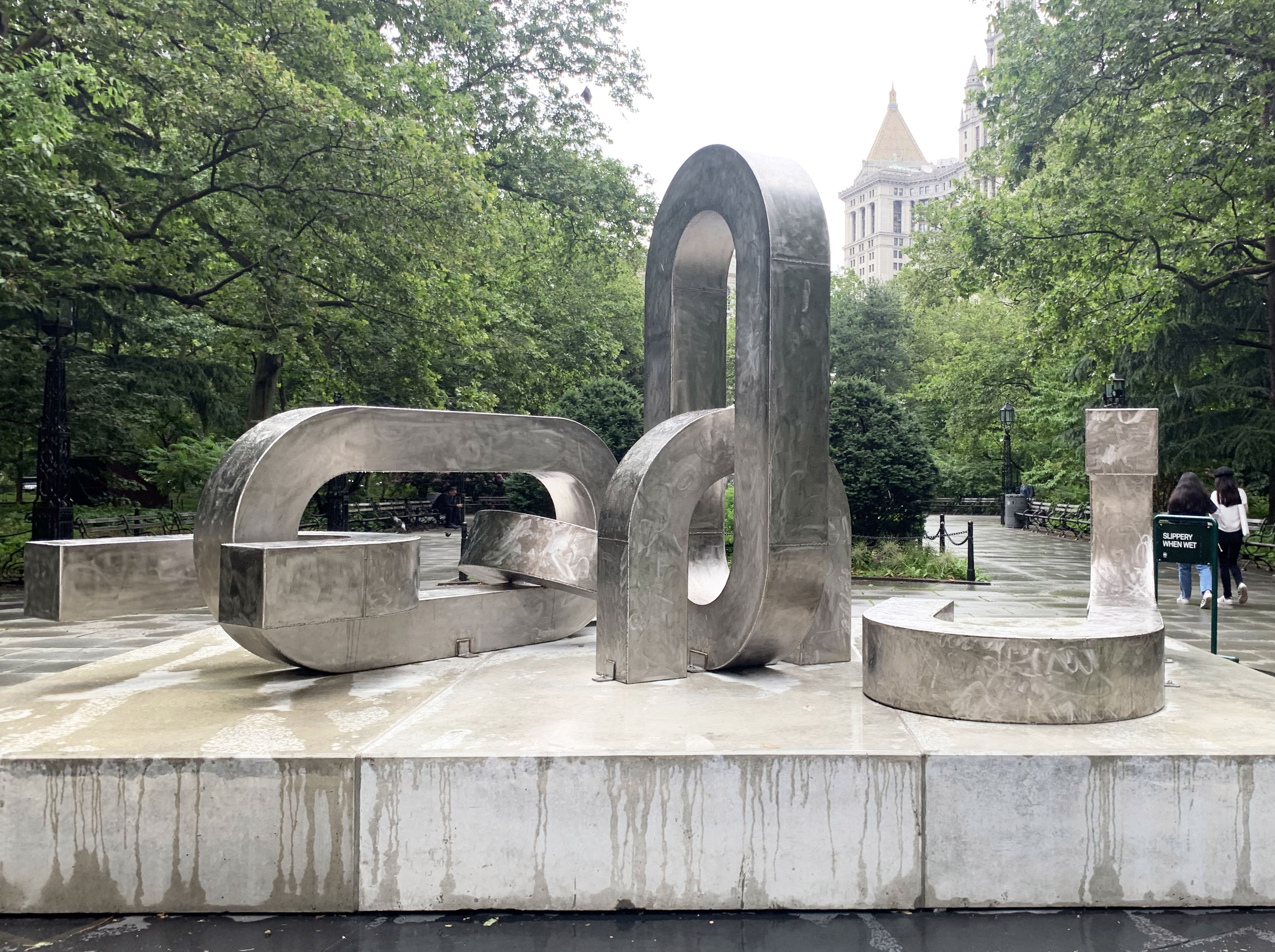
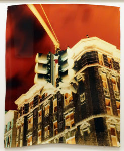
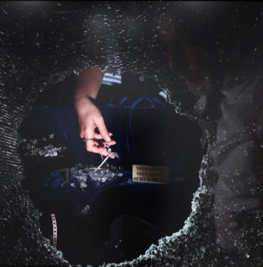
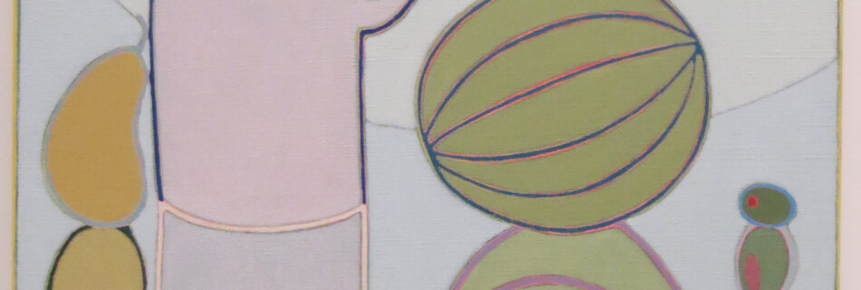


. The Museum of Modern Art, New York. Acquired through the generosity of Jo Carole and Ronald S. Lauder in memory of Mrs. John D. Rockefeller 3rd © 2012 Cindy Sherman")
. Courtesy the artist and Metro Pictures, New York © 2012 Cindy Sherman")
. Courtesy the artist and Metro Pictures, New York © 2012 Cindy Sherman")
. Courtesy the artist and Metro Pictures, New York © 2012 Cindy Sherman")
, inkjet print, 2011. Courtesy of the artist and Tanya Bonakdar Gallery, New York.")
,' camper chunk, plexiglas, steel and paint, 2011.")

,\" 2011. Photograph courtesy of Matthew Marks Gallery, New York.")


,\" 2007. Photograph courtesy of Greenberg Van Doren Gallery, New York.")


,\" 2010. Photograph courtesy of Postmasters, New York.")


.\" Photograph courtesy of the artist and Paula Cooper Gallery.")


,\" 2009. Photograph courtesy of Daniel Reich Gallery, New York.")


, Photograph courtesy of the artist and Lehmann Maupin Gallery, New York.")

, 2009. Photograph courtesy of the artist and The Project, New York.")


