David Hammons’ untitled bottles from the mid-80s are a standout in Alexander Gray Associates’ summer group show, which features artists of color who have a relationship to the Hudson River Valley. Evoking messages cast adrift in bottles or carefully constructed ships in bottles, each curious form invites and eludes easy interpretation. A white lightning bolt suggests magically captured electricity, a fish somehow survives in a glass enclosure and the zippers from the flies of pants become living insects, a series of transformations that invite wonder. (On view through Aug 14th).
David Hammons, installation view of untitled bottles from 1985, Alexander Gray Associates.
Nick Cave’s original Soundsuit, a costume made from hundreds of small twigs that rustled when the suit was worn, was a protective gesture prompted by Rodney King’s violent treatment at the hands of LA police in 1991. His latest series of suits, now on view in Jack Shainman Gallery’s group exhibition ‘Anti/Body,’ are collectively titled 8:46, referring to the amount of time (recently understood to be longer) that Derek Chauvin took to kill George Floyd. Larger than life and composed of bright floral and patterned textiles as well as synthetic flowers, each suit celebrates and mourns a lost life. (On view in Chelsea through July 2nd. Masks and social distancing required).
Nick Cave, installation view of Soundsuits titled 8:46 in Anti/Body at Jack Shainman Gallery, June, 2021.
Inspired by moments of tenderness, Flag Art Foundation’s 35 artist summer group show explores a variety of expressions of affection, from a child asleep in a parent’s arms to a beautifully hand-stitched scene of self-care. British artist Gareth Cadwallader’s Orange Juice, a small oil painting with a lot of detail, suggests we pause to appreciate the pleasures of the natural world, from the orange that produces juice to the jumble of plant life to the left, topped by two bird-of-paradise. (On view in Chelsea through Aug 13th. Masks and social distancing required).
Gareth Cadwallader, Orange Juice, oil on canvas, 32 x 24.8cm, 2015.
‘Don’t think too much about it,’ advises the title of this colored pencil drawing by young Yale MFA candidate Brianna Rose Brooks, but the awkward closeness and intimate immediacy of woman and butterfly is arresting. Brooks’ two portraits are standouts in Gladstone Gallery’s blockbuster ‘Drawing 2020’ exhibition, which includes recent work by over 100 artists. (On view in Chelsea. Masks and social distancing are required and appointments are recommended.)
Brianna Rose Brooks, Don’t think about it too much, colored pencil on paper, 11 ½ x 8 inches, 2020.
Loie Hollowell’s abstracted portraits made during and after her first pregnancy inspired the curving organic forms showcased in her Fall ’19 show at Pace Gallery and pictured here. Recent drawings now on view in an on-line show at pacegallery.com “…convey the uneven roundness of my body,” explains the artist. Created around the time of her recent second pregnancy during quarantine this spring, the new work follows the changes of her morphing body and the bond between infant and mother. (On view through July 14th).
Loie Hollowell, Postpartum Plumb Line, oil paint, acrylic medium, sawdust and high density foam on linen mounted on panel, 72 x 54 x 3.5 inches, 2019.
Bathrooms and all their bodily associations inspired this unforgettable life-sized porcelain and stoneware sculpture by Ann Agee. Another less private domestic object – folk art salt cellars from Florence, Italy – prompted the ceramic sculpture in the artist’s current online exhibition at ppowgallery.com. Merging the functional with the devotional, each artwork features a Madonna and child-like pairing but with a twist – the youngsters are girls. (Online at PPOW Gallery through June 27th).
Ann Agee, Lake Michigan Bathroom (II), porcelain and stoneware, 98 ¾ x 121 ½ x 22 inches, 2014.
Behind Toyin Ojih Odutola’s portrait-like drawings (including this 2017 artwork from New York Art Tours archives) are fictional narratives, hinted at through the images but not detailed in words. Her latest body of work opens on-line this week at Jack Shainman Gallery as protesters around the world demand respect for black lives and justice for George Floyd and others killed by police. Ojih Odutola’s new work continues to picture the complexity of black subjectivity in an uncharacteristic pairing of images and texts in which, as the artist puts it, “exactitude is elusive.” Instead, meaning comes from the gap between pictures and words, a place that prompts viewers to consider how their expectations inform interpretation.
Toyin Ojih Odutola, Manifesto, charcoal, pastel and pencil on paper, 18 ¾ x 23 ¾ inches, 2017.
Aimed at an artist, the phrase ‘Love Your Work’ can be sincere or suspect. This unforgettable 1999 fresco by Rochelle Feinstein brilliantly isolates the phrase below an envy-green field of paint. Color takes center stage in Feinstein’s latest body of work, now on view online in Sperone Westwater’s viewing room. Inspired by a photo she took in Rome of a double rainbow, the recent work foregrounds the color spectrum and the mutability of art. (Online through June 25th).
Rochelle Feinstein, Love Your Work (detail), fresco, 1999.
‘Klaus on Paper,’ a concisely curated, attractively presented five-artist exhibition of paintings and drawings on paper by Klaus von Nichtssagend Gallery stands out among the many new on-line outlets for art. Liz Luisada’s contributions continue to consider the importance of grids and webs; in this painting from her summer ’18 solo show at the gallery, Luisada suggests that human activity creates and causes movement in each system.
Liz Luisada, communing, watercolor on paper, 27 ¾ x 27 ¾ inches, 2018.
Fashion, art history and the relationship between works in an exhibition drive the color choices that make Carol Bove’s hybrid sculptures stand out. Sharp contrasts between aged, found steel and the smooth geometries of urethane-covered forms give pause to consider the relationships between two familiar yet seemingly mismatched materials. This piece (seen in detail) from the artist’s last major Chelsea solo show at David Zwirner Gallery in ‘16 juxtaposes found steel with urethane-covered steel to create a wonderfully misleading suggestion of pliability. When a sculpture’s color can make it appear to have a digital effect, Bove’s at her happiest. She explains this and more on davidzwirner.com where a new on-line exhibition showcases select new works.
Carol Bove, (detail of) Daphne and Apollo, found steel, stainless steel, and urethane paint, 98 x 72 x 61 inches, 2016.
West coast light and the pleasures of color define Hilary Pecis’ recent work at Rachel Uffner Gallery and Timothy Taylor Gallery’s current on-line show ‘Dwelling is the Light.’ Working from a photo archive that includes the homes of friends and family, Pecis creates vibrant portraits that leave out actual individuals but make you wish you could meet the characters who’ve created such sunny environments. (On view at timothytaylor.com through May 15th).
Hilary Pecis, Morning, acrylic on canvas, 50 x 40 inches, 2019.
Exhibition walkthroughs and artist interviews have abounded since the pandemic cut off access to physical gallery spaces, but few videos have been as engaging and personal as Rebecca Morris’ recent Q & As with painter friends at bortolamigallery.com. The untitled work here from New York Art Tours’ archive (May ’16) prefigures the silver and gold paint and the play between organic and inorganic shapes prominent in her show installed through June at Bortolami Gallery in Tribeca.
Rebecca Morris, Untitled (#02-16), oil and spray paint on canvas, 48 x 48 inches, 2016.
Louise Bourgeois’ spiders may be her best-known work (this image from New York Art Tours’ archives captured a bronze arachnid appearing to scale a wall at the American Museum of Natural History), but for 70-years of the late artist’s career, drawing played a key role in expressing states of mind. Hauser & Wirth Gallery’s inaugural on-line exhibition features a selection of drawings from 1947-2007 that channel Bourgeois’ unconscious and personal history.
Louise Bourgeois, Spider I, bronze, 50 x 46 x 12 1/4 inches, 1995.
Titled ‘Pathological Color,’ James Welling’s on-line exhibition of photography at David Zwirner Gallery assaults the senses with intense color contrasts generated by the artist’s experimental practice in Photoshop. This detail of a photo by Welling from New York Art Tours’ archives features images of dancers layered with modernist buildings and landscapes, each suggesting performance on a different kind of stage. Aiming to explore our perception of color, Welling draws on ‘pathologies’ described by Goethe, who considered the impact of particular colors on the senses. For more images, including early examples of his technique, visit David Zwirner Gallery’s on-line Viewing Room.
James Welling, detail of 7809, inkjet print, 42 x 63 inches, 2015.
Iranian-born artist Fatemeh Baigmoradi’s burnt photographs recall her father’s attempt to avoid arrest by burning his photos of events that tied him to an oppressed political minority after the Islamic Revolution in Iran. The artist connects the resulting images – characterized by beautiful halos of color – to a Persian painting tradition that painted a glow around the heads of featureless holy figures. Her installation, seen here in detail, is a standout in Laurence Miller Gallery’s ‘GRACE’ exhibition, a multi-faceted and fascinating exploration of gender, race and identity. (On view in Chelsea through Feb 22nd).
Fatemeh Baigmoradi, installation view of selected works from the series ‘It’s Hard to Kill,’ 2017 at Laurence Miller Gallery, January, 2019.
From the 1980s to the present day, Comme des Garcon’s Rei Kawakubo has defied conventional dualities; in this dress – affixed with a giant teddy bear, she merges childhood and adulthood in a riot of frills, flowers and fun. (At the Metropolitan Museum of Art through Sept 4th).
Rei Kawakubo, Not Making Clothing, spring/summer 2014.
Don’t let the cat fool you. Despite her somber dress and downcast eyes, this actress – who was never identified in this 1926 portrait by Max Beckmann – isn’t relaxing with her pet so much as she seems poised to transform into a new role before our eyes. An intensely colored yellow wall and orange-upholstered chair in the background promise something electrifying as our bolt upright subject leans in towards us. (In ‘Max Beckmann in New York,’ at the Metropolitan Museum of Art through Feb 20th).
Max Beckmann, The Old Actress, oil on canvas, 1926.
Does abstract art tap into a subconscious human understanding of the order of the universe? Curator and artist, Matthew Ronay asks this question in Andrea Rosen Gallery’s summer group show. His own colorful wooden sculptures explore forms recalling (in his words) ‘alien deep sea creatures, glandular secretions, vibrating fields of energy, and tongues and protrusions on scales indeterminable.’ (In Chelsea through August 5th).
Matthew Ronay, The Kernel, basswood, dye, gouache, steel, 18 x 31 ½ x 11 ¼ inches, 2016.
Sharon Madanes merges her preoccupations with hand washing and chairs in this standout painting in DC Moore Gallery’s summer group exhibition. Wearing beads of water like jewelry, an unknown woman (in a cheongsam?) reaches into our space – the seats and table behind suggest we’re about to dine with this mysterious character. (In Chelsea through July 29th).
Sharon Madanes, On the Other Hand, oil, acrylic, and chair caning on canvas, 22 x 25 inches, 2016.
In 2002, the pedestal under a rare early Renaissance sculpture by Tullio Lombardo at the Metropolitan Museum of Art buckled and the piece fell to the floor, smashing into several large pieces and hundreds of fragments. Conservators set to work on a twelve-year mission to restore Adam to his former glory as he contemplates the fruit that leads to mankind’s fall. (Through July 2015).
After witnessing substandard working conditions at a building site for which he’d been commissioned to create artwork, Beijing-based artist Xu Bing created two huge phoenix sculptures composed of construction equipment. Suspended at the Cathedral Church of St John the Divine, their decorative lights are akin to stained glass and their message in keeping with the church’s activist history. (Through Feb 2015).
Xu Bing, Phoenix, installation view at St John the Divine, Dec 2014.
Traditional Japanese Ikebana becomes art in the hands of New York artist Carissa Rodriguez (who memorably showed a Cartier clock owned by FDR at the Whitney Biennial this spring). In Anton Kern Gallery’s treasure-chest of a summer group exhibition, she saddles this gorgeous arrangement with the title ‘I Will Cook Myself Tomorrow,’ making it a kind of pre-memorial. (In Chelsea through August 22nd).
Center: Carissa Rodriquez, I Will Cook Myself Tomorrow,’ unique seasonal Ikebana arrangement, Sogetsu suiban vessel and custom pedestal, variable dimensions, 2012. To the left: ‘Blue Shelf’ by David Korty. To the right: ‘Vase (prototype) and paper bouquet,’ Marc Camille Chaimowicz.
With its gothic title, ‘Bloodflames Revisited,’ and catwalk running above a straw-covered floor, this is one of the more unusual shows on view in Chelsea at the moment. The setting is just right for Deborah Kass’ enthusiastic but ambiguous-feeling rainbow painting reading ‘Daddy, I would love to dance.’ (At Paul Kasmin Gallery through August 15th).
Though it looks like the immortalization of a moment of passion, Jude Tallichet’s ‘Abandoned Clothes’ chronicles in cast bronze items of clothing dropped on the floor. From a jacket to pants with underwear and socks still inside, the installation’s solidly present objects underscore the mystery of what happened to the absent wearers. (At Robert Miller Gallery through August 1st).
It’s hard to tell if this enchanted scene is aided or threatened by the dark-faced spirit behind a frolicking young woman and two sprites. Titled ‘The 1%,’ this painting by New Yorker Inka Essenhigh suggests that their bliss is tenuous. (At Sargent’s Daughters through July 26th).
Inka Essenhigh, The 1 %, oil on canvas, 30 x 12 inches 2014.
LA based artist Nancy Lupo’s sculptures thrive on odd juxtapositions, like this Rubbermaid BRUTE trash can studded with traditional and eco-friendly brands of toilet tissue. In the background, Babybel cheese wheels punctuate a bright yellow can. (At Laurel Gitlen on the Lower East Side through August 1st).
Nancy Lupo, (foreground) So Soft and Delicious, 32-gallon Rubbermaid BRUTE container in white, Cottonelle, Quilted Northern, Angel Soft Pretty Prints, 7th Generation and 365 toilet tissues, 26 x 26 x 24 inches, 2014.
Though hard to photograph, David Kennedy Cutler’s impressive sculptures – created by molding tall sheets of Plexi with a heat gun and his own body – are impossible to miss in Lisa Cooley Gallery’s summer group exhibition. While manifesting a ghostly, physical presence of their own, they also co-opt the gallery’s lighting and use the show’s other works as backdrop. (On the Lower East Side through August 1st).
David Kennedy Cutler, installation view at Lisa Cooley Gallery, July 2014. Plexiglas sculptures from the series, ‘No More Right Now Forever.’
Brooklyn painter Nikki Maloof stands out in Zach Feuer Gallery’s summer group painting exhibition with this tongue-in-cheek homage to the summer sun, which has tattooed her skin with burns and melded her blond hair with the saturated yellow sky. (In Chelsea through July 26th).
Nikki Maloof, Burn, oil on canvas, 12 x 12 inches, 2013.
“With Nozkowski, a good, slow look-’n’-solve is part of the fun,” Tyler Green of Modern Art Notes has observed in response to Nozkowski’s puzzle-like paintings. Packed with familiar yet alien forms, they translate the everyday world into abstraction. (At Pace Gallery’s 508 West 25th Street location through March 23rd).
Thomas Nozkowski, Untitled (9-22), oil on linen on panel, 2012.
David Zwirner Gallery opened its new five-story, 30,000 square foot gallery with the perfect artwork to highlight architecture by Annabelle Selldorf. Eight-foot square pieces from Dan Flavin’s 1966-71 ‘European Couples’ series (titled after Europeans he considered influential) turn light into an artistic medium, washing every white wall in color. (At David Zwirner’s 537 West 20th Street location through March 16).
Dan Flavin, untitled (to Janet and Allen), pink fluorescent light, 1966-71.
Shinique Smith’s fabric sculptures bring to mind the way we fashion our identities through clothing, even when her bright bunches of used garments are bunched together and hung from the ceiling. Here, the artist turns her work jeans into a Hans Bellmer-esque assemblage of biomorphic shapes that touch on body image and the sensuous. (At James Cohan Gallery, Chelsea through March 16).
Shinique Smith, Soul Elsewhere, artist’s clothing, fiber-fil and rope, 2013.
Tam Van Tran is known for dynamic, sculptural wall installations created from usual materials (spirulina and chlorophyll colored stapled paper artworks a verdant green in past work). At Ameringer McEnery Yohe in Chelsea, Tran’s new works literally move, as copper foil catches the breeze and hints at palms moving in West Coast winds, which inspired this series. (Through March 16th).
Tam Van Tran, detail from ‘Palm Shrapnel,’ copper foil, palm leaf, and cardboard on canvas, 2012.
In past work, German artist Michael Riedel has drawn his materials from texts on the web written about his own work, which he turned into exhibition wallpaper. For his current show at David Zwirner Gallery, he puts those images into PowerPoint and causes a ‘freezing’ between slides to create a new merger of information. (At David Zwirner Gallery’s 533 West 19th Street location through March 23rd).
Michael Riedel at David Zwirner Gallery, installation view, Feb 2013.
Trevor Paglan’s latest project ups the ante on artistic ambition; a series of one hundred images titled ‘Last Pictures’ was etched on a disk and affixed to a communications satellite that went into space last November, creating a selective portrait of mankind’s nature and history for all or none who may see it. Here, a gallery visitor examines unselected images from Paglan’s shortlist. (At Metro Pictures in Chelsea, through March 9th).
Trevor Paglen, ‘The Last Pictures’ installation view, Feb 2013 at Metro Pictures.
Gavin Kenyon seems to be channeling influences from Hans Bellmer’s disturbing dolls to Senga Nengudi’s organic sack-like shapes in his new series at Ramiken Crucible on the Lower East Side. The show’s untitled centerpiece was created by casting the insides of faux fur coats, which have left tufts of hair on the surface of this prettily colored, carcass-like beast of a sculpture. (Through March 3rd).
Italian artist Alighiero Boetti proved that conceptual art didn’t have to be visually dull with his Arazzi works – embroidered panels made by Afghan craftswomen in the 80s and 90s featuring Italian and Farsi text from poetry or sayings culled from around the world or authored by the artist. (At Chelsea’s Barbara Gladstone Gallery through March 23rd).
Alighiero Boetti, installation view of ‘La Forza del Centro,’ at Barbara Gladstone Gallery, Feb 2013.
To look at it, you’d never guess that Berlin-based Alicja Kwade’s miraculously curving wooden door was fashioned from a number of old doors cut up and seamlessly pieced together. The sculpture’s title, ‘Eadem Mutata Resurgo,’ or ‘I rise again, changed but the same,’ puts a weighty spin on Kwade’s clever reclamation of found materials but the piece nevertheless appears to be an almost magical portal into another world. (At Lisa Cooley through March 17th).
Originally displayed in an outdoor exhibition by the avant-garde Gutai Art Association in 1956, a recreation of Mononaga Sadamasa’s ‘Work (Water)’ in polyethylene tubes filled with ink-colored water stretches across the Guggenheim Museum’s atrium to create elegant, hammock-like cradles for a valuable natural resource.
Motonaga Sadamasa, ‘Work (Water)’ installation view at the Guggenheim, ’56 (original), 2011.
Lisbon-based artist Jorge Queiroz barely allows a human figure to materialize in this psychologically intense painting, but his indistinct human presence turns the abstract shapes in the background into suggestions of places and objects of significance. (At Chelsea’s Sikkema Jenkins & Co through March 2nd).
Jorge Queiroz, Waiting on the Room, oil stick and vinyl ink on canvas, 2012.
Australian artist Patricia Piccinini has said that anxiety and wonder are at the heart of her bizarrely intriguing human-animal hybrid creatures, which explains why this fleshy fish is simultaneously repulsive and fascinating. Titled ‘Eulogy,’ the piece suggests both a connection between this businessman and toxic waters that spawned this mutant and an individual’s personal loss. (At Haunch of Venison, Chelsea, through March 2nd).
Patricia Piccinini, ‘Eulogy,’ silicon, fiberglass, human hair, clothing, 2011.
In Keith Sonnier’s ‘Ba-O-Ba’ series, lines of neon connect geometric glass shapes and bathe the surrounding space in color. Placed on the floor against the wall, the pieces originally served as performance sets that would include the performers’ bodies as a further reflected element. (At Mary Boone Gallery’s Chelsea space through Feb 23rd).
Keith Sonnier, ‘Ba-O-Ba II,’ neon, glass/transformer, 1969.
Jessica Jackson Hutchins’ blobby anthropomorph nestles in a spray painted chair while Anna Betbeze’s burnt, torn and cut Flokati rug on the wall behind acts as perfectly alien décor in this otherworldly group show at Chelsea’s Mitchell-Innes & Nash. (Through Feb 23rd).
Jessica Jackson Hutchins, ‘Hand,’ spray paint, ceramic, chair, 2012 (foreground). Anna Betbeze, ‘Lava,’ wool and ash, 2012 (background).
West-coast conceptual art legend Allen Ruppersberg is known for adopting LA’s colorful roadside signage (popular for advertising garage sales, etc) for his text-based artwork. Here on 10th Ave and 18th Street in Chelsea, he commands a huge sign of his own to present a series of (romantic?) meditations on relationships between ‘me’ and ‘you.’ (Presented by High Line Art/Friends of the High Line through Feb 28th).
Allen Ruppersberg, You & Me, print on vinyl, 25 x 75 feet, 2013.
Artistic collaborators McDermott & McGough isolate a moment of dawning terror on the face of Anne Francis in the Twilight Zone, then make it more jolting by painting it on the face of nine, one-foot square blocks. This marriage of Minimalism and Pop amuses (by resembling a giant Rubik’s cube) while its fractured state unsettles. (At Cheim & Read through Feb 23rd.)
McDermott & McGough, Just a Memory, 1967, 9 wooden cubes, 2012.
This tidy pile of tangerines looks good enough to eat, but beware – they’re plaster sculptures created by Margaret Lee, who has become known for her ultra life-like fruits and veg. Placed next a blue cushion on a wooden table, this minimal, three-dimensional still life offers the visual pleasure of an orderly arrangment. (At Murray Guy, Chelsea through Feb 23rd).
Margaret Lee, Tangerines and Bench, mixed media, 2013.
Constructed of discarded building materials, Song Dong’s ‘Doing Nothing’ mountains mark the replacement of China’s traditional historical obstacles (‘three big mountains’) of imperialism, feudalism and capitalism, by current concerns about education, health care and housing. Neon characters on the wall spelling out ‘doing’ and ‘nothing’ are subtle protests of slow progress. (At Pace Gallery, 534 and 510 West 25th Street through Feb 23rd).
Song Dong, Doing Nothing Mountains, installation view, window, glass, hinge, doorknob, handrail, lock, multi-layer board, socket, wire and paint, 2011-12.
On a trip to Russia, New York photographer Andy Freeberg was struck by the characterful older women who act as museum guards in the country’s major museums. In a fascinating series titled ‘Guardians,’ Freeberg captures the unposed women as their postures and expressions reflect or contrast the surrounding art. (At Andrea Meislin Gallery through March 2nd).
Andy Freeberg, Mikhail Nesterov’s Blessed St Sergius of Radonezh, Russian State Museum, archival pigment print, 2009.
Young New York artist Anna Plesset’s latest solo show at the Lower East Side gallery ‘Untitled,’ is a tour de force of trompe l’oeil illusion, with work that looks photocopied but is actually hand drawn and paintings of flowers made to look like paint flicked photos. But one of the show’s most remarkable paintings is easily missed – this minute self-portrait of the artist in a partly hidden pose. (Through Feb 24th).
Anna Plesset, ‘Self Portrait,’ oil on latex, 2013.
London-based Guardian art critic Adrian Searle calls British artist David Shrigley’s artwork ‘appalling, abysmal, and painfully dire,’ but likes it so much he has it tattooed on his belly. Shrigley’s off-beat sense of humor encourages such contradictory impulses, as does this cat pairing, which seems aimed at exploiting any viewer’s insecurities with charming hokeyness. (At Chelsea’s Anton Kern Gallery through Feb 16).
David Shrigley, ‘Cat (It’s OK, It’s not OK), acrylic on canvas stuffed with foam, 2012.
Young Israeli painter Maya Bloch is making a splash on the Lower East Side with her liquidy portraits of anonymous characters. This one’s indirect gaze, sloping face and coiffure that looks more like geology than a hairdo suggests an ageless, ghostly presence. (At Thierry Goldberg Gallery through Feb 17th).
Maya Bloch, Untitled, acrylic and oil on canvas, 2012.
Bureau Gallery’s exhibition space is so small (one of the tiniest in the city), it’s hard to find room to take a photograph of ‘Monsalvat,’ a sprawling exhibition of work by over fifty artists. Inspired by the Arthurian tale of the Fischer King, artist/curator duo Merkx & Gwynne recreate a version of the king’s castle here, complete with mystical relics (including the grail) crafted by stand-out young artists. (On the Lower East Side through Feb 17th).
Installation view of ‘Monsalvat’ at Bureau Gallery, Feb 2013.
Nari Ward’s installation of 300 abandoned baby strollers culled from Harlem streets in 1993 is a far cry from the banks of stroller parking around the city’s more family-friendly neighborhoods today. Here, surrounded and entwined by flattened fire hoses (they were first displayed in an abandoned fire house) and displayed to the sounds of Mahalia Jackson’s ‘Amazing Grace,’ they’re emblems of a gritty, made-do urban existence. (At the New Museum’s Studio 231 space next door to the museum through April 21st)
Nari Ward, ‘Amazing Grace,’ installation view at Studio 231, New Museum, approx 300 baby strollers and fire hoses, 1993.
South African photograher Zwelethu Mthethwa’s mother had a hope chest, a custom made box gifted to her when she married and left her childhood home. Likened to a time capsule, women keep the chest their entire lives. In Mthethwa’s ‘Hope Chest’ series, we don’t get a look inside the boxes, but what we do see – the lives and circumstances of everyday South Africans – are just as fascinating. (At Chelsea’s Jack Shainman Gallery through Feb 23rd).
Zwelethu Mthethwa, Untitled (Hope Chest series), digital c-print, 2012. Courtesy of Jack Shainman Gallery.
Francesca Woodman changes from girl to woman within seconds in the first two pictures displayed in her retrospective exhibition at the Guggenheim: first we meet a fresh-faced kid wearing a billowy flower-patterned tunic and her signature Mary Janes, making a motion as if she’s holding a clapper board and about to shout ‘action.’ Next, we see her nude lower body coming from a cupboard, the tilting camera catching her as if in a fugitive act. Taken in her freshman year at the Rhode Island School of Design in 1975-6, the precocious Woodman already explores the signature themes of her short career – non-narrative scenarios in which her young, perfect body interacts with the crumbling architecture of a Providence house or an old warehouse-like space in Rome (during her Junior year abroad).
Whether she’s lying curled up on old floorboards under a heavy wooden door propped precariously against the wall or straddling an old fireplace mantle leaning against the wall, Woodman attempts impossible hiding acts that ironically expose her to both prying eyes and the danger of falling props (in later pictures, we see a snake slithering across her outstretched arm and threat arrives again in the form of a wasp on her neck).
Her interaction with the space of the dilapidated room she’s in (in one, a view out the window shows a presentable house next door) resonates with Gordon Matta Clark’s radical interventions in abandoned or otherwise neglected spaces. But Woodman’s nude or partly clothed body (looking very unlikely to have ripped a door from its hinges or detached a mantel) forces unlikely connections with domestic space rather than destroying it. In one image, she covers herself modestly at breast and pubic area with two jagged sections of ripped wallpaper that cover her face and create a flattening of space that merges her body with the wall.
Using her body and physical surroundings as materials, Woodman aligns with late 70s conceptual art and body art contexts in the show’s most surprising images, such as one alarmingly masochistic image showing her at close range with clothespins attached to her nipples and abdomen. Whether this is a larger comment on womens’ bodies or sexual behavior, references to sexuality are rare, despite her frequent nudity. So much so, in fact, that when a’79-‘80 image cropped to exclude her head shows her clutching three sizeable zucchini, the allusion is so out of place that it’s more funny than it might be in another context. Later, she poses in a jeweled belt or dons multiple garter belts like an overdecorated Bellocq model, but the photos feature her curves more as formal compositions than critiques or self-exploration.
In three pictures, Woodmans lets a man into her mostly solitary, female world. All titled, ‘Charlie the Model’ they feature a heavyset man clothed, crouching nude while peering in a mirror, and smiling through a circular glass while a nude Woodman moves in a blur behind him. Perhaps because of his size or his smiles, he dominates, which put viewers in mind of his personality rather than Woodman’s retiring character and emphasizes how her more characteristic images don’t really aim to explore identity. The closest to narrative or role-play she comes is in an early photo series (exhibited in an easy-to-overlook passageway between galleries) titled, ‘Portrait of a Reputation,’ a five-image artist book from 1976 in which Woodman poses with hand over her heart, with or without clothing and with the outline of her hand eventually degenerating into two handprints suggesting an assault.
It’s a Woodman moment in New York now, with a show of the artist’s late work at Marian Goodman Gallery and the monumental ‘Blueprint for a Temple’ at the Metropolitan Museum of Art’s contemporary photo galleries. Woodman appeared to be in a transitional stage when she took her own life in 1981 at the age of 22, making larger images and experimenting with blueprinting processes and collaged images. In ‘Zig Zag’ from 1980, she creates a zigging and zagging line by linking photos of bent arms, v-shaped dress backs, scissoring legs, and more expanding her subject matter to include other people while still exploring the body and pursing formal relationships in her art. Cruelly, seeing so much of her work whets the appetite for more, but true to the Guggenheim’s purpose, offers opportunity to reconsider the context for photography in late 70s America.
As the reviews come out, Cindy Sherman’s retrospective at MoMA (open Feb 26 – June 11) seems set to break ‘best-loved show’ records. Universal critical adoration usually arouses suspicion of cliquish agreeability. But Sherman takes the very notion of conformity to fashion and self-presentation -negotiated through society’s expectations – as her subject matter. Absurdity and grotesquery appear at every turn in this show, making Sherman an uber-critic whose acuity forces the following homages from New York’s major cultural commentators:
Though Smith takes umbrage with the show’s selection and non-chronological arrangement, calling it “magnificent if somewhat flawed,” Sherman herself is “…an increasingly vehement avenging angel waging a kind of war with the camera, using it to expose what might be called both the tyranny and the inner lives of images, especially the images of women that bombard and shape all of us at every turn.”
Saltz also gives Sherman fighting cred, calling her “…a warrior artist – one who has won her battles so decisively that I can’t imagine anyone ever again embarking on a lifetime of self-portraiture without coming up against her.” He adds, “I think of Cindy Sherman as an artist who only gets better.”
Schjeldahl affords Sherman the highest praise, saying, “The mysteries are irreducible…they qualify Sherman, to my mind, as the strongest and finest American artist of her time.” Pointing out that delusion allows a disconnect between “inner feeling” and “outer attributes” he adds that, “…Sherman makes hard, scary truths sustainable as only great artists can.”
Halle calls the MoMA retrospective “…the best show I’ve seen there since the Gerhard Richter survey [in 2002], and probably the best exhibit I’ve seen anywhere in a while…The way I’d put it is that Sherman uses glamour and horror to send up and celebrate the feminine mystique, including her own. She quantifies and categorizes the notion of one’s appearance, which fashion also does. But unlike Anna Wintour, Sherman isn’t in the business of marketing the cultural; she’s in the business of laying it bare.”
The biggest surprise in Cindy Sherman’s major career retrospective, opening to previews today (and officially on Feb 26th) at the Museum of Modern Art, is that there are few surprises. It testifies to Sherman’s stature and influence that so much of the work in the show – 171 photos from the 1977-80 Untitled Film stills to the most recent send-ups of society matrons – is so familiar that it’s hard to even find the critical distance to reconsider it.
What does emerge is Sherman’s consistent and merciless pillorying of character types from the fashion victim to the aging coquette in galleries arranged by series – history portraits, centerfolds, etc – or by theme – fashion, carnival, abjection. By comparison, the Untitled Film Stills (appearing in their entirety) appear kind by virtue of their hidden fakery and purposefully glamorized subjects.
Grotesquery – not limited to the fairy tale or sex series – is a heavy component of most of the work, whether in the repellent muscles of a prosthetic cleavage or the big hair and garish makeup of a woman trying desperately to hang on to her looks. Sherman’s caricatures let most of us off the hook – at least until we start wearing caftans to lounge around our loggias – by representing ‘other people’ who’ve lost their style compass.
Sherman’s early work – seen at the beginning and end of the show – belies such distancing, specifically a stop motion animated short film depicting Sherman as a paper doll who selects her own outfit only to be returned to her case by a giant hand. The artist’s ‘hand of God’ is now aided by Photoshop, as she alters facial details like those on an 18 foot high mural at the gallery entrance. But though technology lends Sherman the potential for serious distortion, she holds back, continuing to tweek the conventions of dress and representation to which we adhere to a greater or lesser degree.
Can a museum exhibition claiming to “embrace the energy of this generation’s (international artists in their 20s and 30s) urgencies” compete with still fresh images and reports of Arab Spring or Occupy Wall Street protests? While socially aware, The New Museum’s second Triennial, ‘The Ungovernables’ demonstrates less of a radical edge than a persistent questioning of the status quo and power structures in artists’ home countries around the world. More of a chipping away than an uprising, for better or worse the show largely dispenses with aesthetic pleasure or craftsmanship in favor of often personal engagements with broader cultural or national identities.
The standouts include:
Hassan Khan, b. ’75, lives Cairo. Jewel, ’10 – This mesmerizing video choreographing a two-man dance-off in traditional Cairo style is the show-stopper.
Hassan Khan, Jewel, ’10. Photo courtesy Galerie Chantal Crousel, Paris.
Cinthia Marcelle, b. 74, Brazil. The Century, ’11 – Barrels, hardhats and more objects are hurled down a street in a video orchestrated by Marcelle, offering some of that talked about urgency and exciting the senses but without reference to any particular conflict.
The Propeller Group, founded 2006, Ho Chi Minh City. TVC Communism, ’11 – On a circle of five monitors, five ad execs from an international agency hired by the Group hash out the intricacies of rebranding Communism, a fascinating conjuncture between competing ideologies.
The Propeller Group, 'TVC Communism', ’11
Pilvi Takala, b. 81, lives Amsterdam and Istanbul. The Trainee, ’08 – For a month, Takala posed as an intern at an accounting firm raising the ire of fellow workers as she sat motionless at a desk or rode the elevator. Their irritation seems to be the point, and while this illumination of social and workplace expectations yields results that are hardly surprising, it’s an amusing scenario for us, especially when Takala tells chagrined employees that she’s ‘working in her head.’
Jose Antonio Vega Macotela, b. ’80, lives Amsterdam, Mexico City. Time Divisa ’10 – Over a four-year period, Vega Macotela exchanged labor with Mexico City prison inmates, completing agreed upon assignments simultaneous that included smuggling in items in return for a map showing the route that 100,000 pesos took inside the prison.
Slavs and Tatars, Prayway, ‘12.
Slavs and Tatars, founded 2006, Eurasia. Prayway, ‘12 – A communal, ‘riverbed’ seat by the collective Slavs and Tatars appears to be an enormous folded sheet of metal resembling an open (prayer) book with a Persian rug arranged on top and a blue neon glow beneath – a Star-Trek channeling exercise in incongruity that should get conversation started.
Doug Wheeler, SA MI 75 DZ NY 12, 2012, photo courtesy of David Zwirner Gallery.
Relational aesthetics took a beating last fall as critics decried participatory artworks like Carsten Holler’s three story slide at the New Museum and MoMA’s installation of Rirkrit Tiravanija’s free lunch. The visitor’s physical experience is also key to Doug Wheeler’s installation which opened today at David Zwirner Gallery and recreates a 1975 piece made in Milan by the influential So Cal ‘Light and Space’ artist. But the hushed environment, limited to ten people at a time and entered after donning white booties so as to keep the floor pristine, is all about aesthetics, and less about interrelating with your fellow gallery goers.
The lighting in the installation changes in intensity and color as it simulates the transitions from dawn to day to dusk, slowly revealing where the boundaries of the flat floored, egg-shaped room are. But even in the strongest light, it’s a strain to make out where gallery wall ends and floor begins; only the toes can tell as you feel the floor’s upward slope. The impulse is to find the spot where your senses are most confused.
Visitors who stayed in the gallery the longest this morning inched their way to the front and center of the installation and stood looking into an optical illusion – a space that appeared to extend to infinity. The sensation was like peering into a deep fog or a snowstorm (under comfortable conditions) as my perception of space kept shifting to make sense of what I was seeing.
Wheeler’s installation recalls James Turrell’s installations, in which visitors approach a shape on the wall only to realize that it’s a rectangle of recessed light. Here, the experience is more intimate – like entering into the space occupied by light rather than gazing in from the outside. Uta Barth’s photographs of light come to mind, as do Yayoi Kusama’s Infinity Nets but both treat light and infinity as more concrete subjects than Wheeler does with what he calls his ‘molecular mist.’ The scale and ambition of Wheeler’s project won’t be matched again soon in New York; catch it while you can and arrive early to avoid lines.
For more background, read Randy Kennedy’s Jan 15thNYT article.
Uta Barth, ...and to draw a bright white line with light (Untitled 11.2), inkjet print, 2011. Courtesy of the artist and Tanya Bonakdar Gallery, New York.
The centerpiece of Uta Barth’s latest solo show is a photo series depicting a continually morphing strip of light beneath her living-room curtains, a preposterously simple conceit which nevertheless yields complex optical illusions. As this diaphanous sliver shifts course over an afternoon, it variously resembles a snake, a line on an EKG or a trail of cigarette smoke, all the while transforming the space between the camera, the curtain and the window into an ambiguous territory where volumes flatten or swell, and light can pass for white paint.
Two glimpses of Barth’s hand arranging the curtain folds remind us of her agency, but it’s nature’s hand that propels the work’s attractively simple narrative as the sun’s changing position gradually increases the width of the band. At this time of year, as the onset of winter makes Barth’s invitation to contemplate sunlight especially attractive, the work entices us into the pleasures of solitary idleness that are at odds with the pace of everyday urban life.
In the back room, by comparison, a second group of photographs depicting built-in closets and drawers in the artist’s bedroom seems coldly architectural. Each image is emblazoned by squares or rectangles of light cast from an opposite window: One features a particularly bright patch that suggests celestial or alien visitation; another, a band of shadow over a door latch, creates the illusion that the surface of the print is scratched. But otherwise, the real drama of transformation takes place in the front gallery.
Originally published in Time Out New York, issue 839, Dec 1-7, 2001.
Sarah Braman, 'Good Morning (November),' camper chunk, plexiglas, steel and paint, 2011.
Sarah Braman’s trademark combinations of disparate materials in precarious arrangements achieve a new level of gravity with the incorporation of components from a cut-up camper. In her debut at Mitchell-Innes & Nash, hefty chunks of the vehicle act as both painting surface and gritty foil to the clean-cut cubes of gorgeous blue and purple Plexiglas to which they are sometimes conjoined. The resulting juxtapositions defy expectations as the funky, roughed-up trailer becomes impersonal, and the slick geometric elements charm with their transparent beauty.
In a sculpture near the gallery entrance, the back of the RV creates an archway with two Plexi boxes forming an L. Tinted the color of limousine windows, the latter are doodled with spray paint, recalling Sterling Ruby’s defaced pedestal pieces, but without the air of menace. If this treatment somewhat softens these cold, corporate forms, a lack of any trace of habitation within the camper does the opposite, making it makes seem less like a repository of past adventures, à la Mike Nelson’s airstream installation at 303 Gallery last spring, and more like one of Gordon Matta-Clark’s deconstructions of an abandoned place.
In a piece titled 8pm, a smaller fragment of the camper is sandwiched between two aquarium-like shapes, while a larger nearby structure in blue, pink and purple Plexi recalls an empty Damien Hirst shark tank crossed with an Anne Truitt. But it is in Braman’s misleadingly titled and exceedingly lively Coffin that viewers are finally offered the delayed gratification of imagining past lives. Here the Plexiglas takes something of a backseat to a segment of camper laid with a mirrored floor, creating a boudoir-like stage for memories.
Originally published in Time Out New York, issue 837, November 17-23, 2011.
Mona Hatoum, 'Home,' 1999, photograph courtesy of Alexander and Bonin
Mona Hatoum’s 1999 sculpture Home (featuring kitchen implements with wires running out of them, accompanied by the sound of pulsating current) inspired this unsettling exhibition plumbing the darker side of the places in which we live. High on anxiety but regrettably low on risk factor, this hit parade of big-name artists still affords the pleasure of reconnecting with iconic artworks about painful circumstances.
Family relations simmer in the show’s best pieces. Louise Bourgeois’s claustrophobic house teeming with phallic/breast/fungal forms and Rachel Whiteread’s black urethane mattress creased by a labial fold conjure a dread matched by a Luc Tuymans painting of place settings that foretells the drama of a family gathering.
Violence spills over in Gregor Schneider’s photos of a strung-up sex doll and in Mamma Andersson’s painting of a disordered bedroom with ominously bloodred furniture. But the most disturbing pieces hint at souls lost to the chaos (Jeff Wall’s photo of a disheveled character standing by the door of his decrepit domicile) or obsessive order (a Thomas Ruff living-room scene) of their lives.
Even a cheery painting of a beach house by Maureen Gallace turns suspiciously, unbelievably idealized in this context, while a whimsical paintbrush by Michael Brown, its handle crafted from melted Neil Young records, seems primed for a cover-up. Viewed from the right angle, David Altmejd’s plaster sculpture of a fantastical lair with dangling staircases turns out to be the head of some deranged giant. Such twists add intrigue to this domestic thriller of a group show.
Paul Sietsema, "Untitled figure/ground study (Degas/Obama)," 2011. Photograph courtesy of Matthew Marks Gallery, New York.
If it weren’t for the schooner by the doorway at Paul Sietsema’s first New York gallery solo, I’d have missed the boat. Not-quite-right details reveal that what looks like an aged old photograph of a sailboat is in fact a meticulous drawing that demonstrates in a flash how painterly skill adds value and interest to an artwork. In this otherwise aesthetically restrained but intellectually stimulating show, Sietsema allows trace evidence of his hand in pieces that look digitally produced or printed, questioning his own role as a craftsman in the digital age and floating an inconclusive but engaging argument that artistic survival means cleverly thwarting expectations.
In the past, Sietsema has exhibited films of sculptural objects; the drawings here allow us the intimacy to appreciate his handiwork. Two untitled pieces resembling expressive abstractions in black ink also include depictions of bottles of Krylon ‘Short Cuts’ paint, humorously highlighting how Sietsema doesn’t take shortcuts in his labor intensive, cerebral, and non-emotive project. At the bottom of one, the phrase “broken down and experimental…broken down beauty,” bespeaks the pleasure of piecing together Sietsema’s deconstructions.
Two pieces titled, ‘Painter’s Mussel’ refer to shells used to hold paint but show Sietsema flexing his intellectual muscle in complicated pictures of disassembled framed photographs drawn to resemble photographic negatives which appear to have been printed. From the aged photograph of the boat and images that pit old technology (the brush) with new, to two pieces replicating the dated medium of newspaper pages (including an article on Obama reversing a Bush policy) Sietsema suggests that with passage of time ascendency fades – the smart artist adapts by working outside of traditional expectations.
Condensed version of this review published in Time Out New York, issue 815, June 2-8, 2011.
Laurel Nakadate, August 2, 2010. Photograph courtesy of Leslie Tonkonow Artworks and Projects, New York.
Laurel Nakadate cried every day of 2010. And whether she was in her apartment, in an airplane lavatory or on a beach, she captured the result in 365 photographs, meant to document her effort, as she put it, to “deliberately take part in sadness.” Contrary to this suggestion of shared unhappiness, however, the images portray her in isolation. Often nude or semiclothed, she plays the role of a vulnerable woman needing rescue, appearing to offer her body in a compromised sexual exchange for attention. Sensational, narcissistic, yet incisively illuminating in some respects, Nakadate’s project is an uncomfortable portrait of alienation.
It also tests our willingness to indulge in so much self-inflicted pain. The seasons and the artist’s travels introduce a minor narrative arc, but there’s no resolution to her misery. Unlike Tehching Hsieh’s yearlong performances tracking the effects of self-imprisonment, or Eleanor Antin’s photo diary of being on a diet, Nakadate undergoes no transformation and promotes no politics, personal or otherwise. And unlike the lovelorn Sophie Calle’s exhaustive investigation of a Dear John letter, there is no catharsis.
Instead, the act of repetition dominates, and the mind wanders to questions about Nakadate and her motives: How does she make herself cry? Is she merely acting? What goes on off-camera: Does she happily go about her day until the requisite moment to shed tears? Part of “365 Days” is on view at MoMA PS1, where the photographs are huge, implying an unwarranted monumentality to the artist’s questionably authentic emotion. Even in this more modest installation of smaller-size prints in a tight grid arrangement, Nakadate is still center stage, limiting any possible commentary on collective grief or widespread disaffection.
Originally published in Time Out New York, issue 815, June 2-8, 2011.
Angel Otero, 'There's nothing so I wonder," 2011. Photograph courtesy of Lehmann Maupin, New York.
Angel Otero’s unconventional process—fashioning assemblages or lively paintings using “skins” of oil paint applied to glass before being peeled off—is the draw in his New York solo debut. An awkward anthropomorphic object perched on a chintzy armchair, messy Expressionist interiors in garish colors and one uninspired composition with text demonstrate the young artist’s competing sensibilities. Far better are Otero’s large-scale abstractions—action paintings in which paint itself seems to have agency, shooting off the edge of the canvas, bunching dramatically or seductively veiling its support.
The show’s smallest and punchiest piece—a black number whose surface is concertinaed like a crushed soda can—has an affinity with Piero Manzoni’s pleated white canvas, but in place of purity there is an excess of paint, piled up in waves as if to hide some (perhaps failed?) experiment beneath. Likewise, a blocky form wrapped in streaks of yellow and black traffics in concealment, channeling Christo’s early wrapped objects—minus, unfortunately, the mystery.
The play between a vibrantly colored surface and an occasionally glimpsed support that is waxy and dead is more alive than, say, Steven Parrino’s twisted and pulled canvases, and aligns Otero with Fabian Marcaccio’s use of paint as a sculpting material. Recurrent blurring also recalls Gerhard Richter’s scraped abstract canvases, but unlike Richter, Otero’s intent is to build, not cancel out. His undulating skins re-create the drama of a hastily drawn curtain, awaking the senses and offering a celebration of paint’s possibilities.
Originally published in Time Out New York, issue 807, March 31 – April 6, 2011.
Yoan Capote, a stand-out artist in the Havana scene, explained in a recent interview that he wants his work to remain relevant after the ‘political exoticism’ of Cuban art (fashionable since the mid-90s) dies down. In the meantime, his recent subject matter – the allures and disillusionment of migration – and his tendency towards often blunt, sometimes profound statements are the hallmarks of stereotypical Cuban style. Despite the feeling of déjà vu that this show evokes, Capote makes his mark by implicating everyone – us, himself, and Cubans in general – in the complex pleasures and pains of cross-cultural longing.
Capote opens the show with a literal bait-and-switch – a majestically vast (over 26 foot long) and gorgeously deserted seascape that turns out on closer inspection to be an intimidating composition made from thousands of fish hooks attached to the picture’s surface. An equally enticing sea view crops up again in a nearby video in which we watch a waterfront window being bricked in with the pattern of a U.S. flag in a claustrophobic ritual that replaces the imagined but unattainable reality of foreign lands beyond the horizon with a barricade both symbolic and literal.
Surprise menace and repressive restriction create an uneasy mood but leave room for personally inflected interpretation. More heavy-handed pieces kill the spirit of enquiry, as with a room-sized bronze set of scales titled ‘Status Quo (Reality and Idealism)’ that leaves no doubt about how privilege tips in favor of the already powerful. In a series titled ‘Coitus’, human silhouettes cut from dollar bills, pesos, rubles and Yuan play the one-dimensional role of symbolic aggressor or victim. But in pieces like ‘Migrant,’ in which two feet join to tree trunk legs that end in a complex network of roots, Capote pointedly testifies to the personal cost of uprootedness. Laid low on the gallery floor, roots echoing brain synapses make the poignant argument that when it comes to the linguistic, social or cultural nourishment of your native culture, you can’t take it with you.
Originally published in Flash Art International, issue 276, January/February, 2011.
Sean Bluechel, installation view. Photograph courtesy of Nicole Klagsbrun Gallery, New York.
As far as quantity goes, the 36 ceramic sculptures and 25 photos crowding Nicole Klagsbrun’s side gallery suggest that Sean Bluechel is more than ready for his first major Chelsea show. In terms of quality, however, his creative profusion—and a goofy hedonism conveyed by ubiquitous smiley faces, multiple ceramic spliffs and an assortment of phallic objects ranging from digits to a corncob—threaten to distract from the show’s real gems: Remarkable shape-shifting objects conjure fantastical scenarios.
Though the ceramics are the main draw, Bluechel’s photos of totemic assemblages cobbled together from cardboard tubes, Styrofoam, tinsel, balloons and a very accommodating nude woman (who seems to have been shot in a basement) have a furtive quality, as well as a postdebauch air that is in keeping with the sculptures’ juxtaposition of lumpen forms and beautifully colored glazes. Yet they feel more like high jinks than high art.
Bluechel’s apparent references in a few of the sculptures to such artists as Jean Dubuffet and Yves Klein indicate that he’s mindful of the distinction. Yet his efforts work best when you overlook the visual hubbub of his busy installation and focus on select stand-alone pieces: the upside-down mushroom balanced on two blobs, titled Unshaved Wicca Girls; the quasi-camera/gun/musical instrument, rising from a dish amid a flurry of leaves, titledKill Vegans; the Kusama-channeling bouquet of protruding fingers crowned with a laurel. They all deliver their paeans to insouciant perversity with concision and humor.
Originally published in Time Out New York, issue 799, February 3-9, 2011.
Tiffany Pollock, "Easter Loves Mango," 2010. Photograph courtesy of Gasser & Grunert, Inc., New York.
In Tiffany Pollack’s second solo show, baby care and flowers are subjects for dyed silk paintings in glorious washes of beautiful color. The former take shape as quasimodernist grids charting the waking/napping routine of the artist’s infant. Given that mother-child relationships in contemporary art tend more toward the curdled Robert Melee variety, Pollack’s approach is surprisingly anxiety-free.
Though the show includes eight such paintings, Pollack crystallizes the experience of all-encompassing emotional highs and lows in a single piece that registers periods of happiness followed by tears. Like Mierle Laderman Ukeles’s memorable photos of her children’s slow progress in getting dressed to go out during winter, Pollack’s efforts will elicit groans of recognition, their wavy bands of color perfectly conveying the hazy disorientation of sleep deprivation.
Unlike Ukeles, however, or Catherine Opie’s gender-bending self-portrait while nursing, Pollack’s pretty colors and near-total lack of critical remove suggest that she’s enjoying her new role. Coupled with an eye-popping series of flower paintings in which poppies explode against a hot pink ground, bleeding-heart flowers dangle gorgeous buds, and the gathered stems of calla lilies melt together in a downward rush of paint, Pollack revels in the pleasures of fertility. These works recall Charles Ray’s much-lauded room of flowers at the last Whitney Biennial, though they leave hanging the question of whether highly personal exploration, beauty and, in Pollack’s case, pure joy are enough on their own.
Originally published in Time Out New York, issue 798, January 27 – February 2, 2011.
Matthew Monahan, “Seppuku.” Photograph courtesy of Anton Kern Gallery, New York.
For a card-carrying member of the “Unmonumental” generation of sculptors (he was actually in the New Museum show of that name), Matthew Monahan’s latest freestanding bronze sculptures are both reactionary and a logical next step. His previous work consisted of installational displays crowded with objects and figures, idiosyncratic minimuseums chockablock with visual allusions to art history—a Greco-Indian eye here, a Northern Renaissance visage there. At Anton Kern, Monahan distills archetypal characters from a jumble of references, creating a fascinating group that looks like archaeological finds from an alternative art history.
One slender nude’s wire-bound body recalls photographer Nobuyoshi Araki’s soft-core titillations, but her quizzical expression is more provocative, suggesting spiritual superiority and/or mental disability. Another character’s cruciform pose begs explaining, but his craggy and practically concave face closes in as if guarding secrets. Nearby, a motionless, gold-leafed droid version of Umberto Boccioni’s Unique Forms of Continuity in Spacestands stiffly by.
While Monahan’s sculptures pique our curiosity with their mix of vague familiarity and uncertain identity, a series of oil-on-board images resembling tantric diagrams fairly exudes esoteric mystery. Collectively titled “Body Electric,” they summon Walt Whitman’s passionate appreciation of the human form but feature a fairly unnuanced, everyman element: a simplified kind of line drawing made by scraping black-painted paper to reveal the white below. The sculptures, on the other hand, turn appropriation into creation with their affecting cast and enjoyable synthesis of history, pop culture and sheer invention.
Originally published in Time Out New York, issue 793, December 9 – 15, 2010.
Kristin Morgin, Wrecked Spyder, 2010. Photograph courtesy of Zach Feuer Gallery, New York.
The nervous plea in the title of Kristen Morgin’s New York solo debut seems warranted at first glance. This accumulation of meticulously crafted, painted-ceramic replicas of comics, toys, personal mail and more, laid out on rickety tables, looks like the world’s most precious yard sale. But behind a facade of understatement, Morgin cleverly challenges the ways in which we value things, making art that’s real and fake, handcrafted and reproduced, imitative and innovative, vintage and new, high and low, all at the same time.
Category-busting begins at the door with a shelf of roughly fashioned teacups featuring portraits of comics icons, from Wonder Woman to Snoopy, a cheeky mix of useful craft and pop-indebted fine art. Elsewhere, doodles on Post-its lie alongside a ceramic Curious George book, featuring the trouble-prone primate traveling through space. Despite its futuristic theme, the tome’s deliberately cracked and aged condition and added-on sketches—including a version of Picasso’s Guernica—summon a specter of ruin over predigital ephemera. Large drawings of a dodo bird and ticking clocks rendered over other ceramic facsimiles of comic books likewise reinforce the sense of imminent extinction, reminding us that the past is always mediated.
What would ordinarily be the show’s star attraction—a pale and crumpled replica of the Porsche Spyder in which James Dean met his end—is the Bamiyan Buddha of roadsters: a memory so wrecked that it’s barely related to the original. Morgin, however, isn’t after the trompe l’oeil virtuosity of Steve Wolfe or even Allen Ruppersberg’s reshuffled pop references. Instead, she gives us a pointed warning that everything starting out shiny and new inevitably crumbles to dust.
Originally published in Time Out New York, issue 791, November 25-December 1, 2010.
The third of three blockbuster contemporary art survey shows to hit New York in the past year, Greater New York was worth waiting for. The New Museum’s youthfest, The Generational, showcased an under ripe generation still finding its voice. The Whitney Biennial presented artists self-consciously grappling with new ways to be ‘experimental.’ Despite the fact that these shows shared several artists, Greater New York swapped the previous ‘watch-this-space’ vibe for mature, confident work by 68 artists and collectives, evenly balanced between male and female, whose collective fostering of identity politics – sexual, racial, political and personal – broke with recent art world trends towards hermeticism and reconnected with the larger world.
If identity politics has come to sound retro in ‘post-black’ days, Hank Willis Thomas’ monumental photo series made it joltingly relevant, connecting yesterday to today by tracking the persistence of stereotype and recent fantasies of racial integration through forty years of magazine ads. Rashaad Newsome’s video of over twenty female performers uttering partial phrases like ‘excuuuuuse…’ or ‘giiirl’ is one of the best pieces at PS1 (though technically part of an auxiliary exhibition reviewing the last five years of artmaking), succinctly demonstrating how slang and role play create exclusive group identities.
Alternative sexuality was the norm in the third floor galleries, where Sharon Hayes’ five channel video installation ‘Revolutionary Love’ brilliantly integrated the concerns of participants inside and protesters outside the 2008 Democratic and Republican National Conventions before veering quixotically off topic by demanding love along with legal rights. But her assertion, ‘we’re all queer’ makes perfect sense in light of Leigh Ledare’s creepily incestuous photos of his exhibitionist mom, which prove that anyone, heterosexuals included, can pretty much chart their own course. LaToya Ruby Frazier’s photos of her own mother come to mind (from the New Museum Triennial); in her video contribution here, her tense, naked torso – juxtaposed with clouds of factory steam – pulsated with unspoken feeling.
Proving that identity politics don’t have to be dour, K8 Hardy’s fabulously eclectic self-portraits in outrageous getups place her characters outside recognizable ‘types.’ A similar inventive exuberance carries downstairs to A.L. Steiner’s photocollaged lesbian utopia where one nude joker embraces a reproduction of Courbet’s ‘Origins’ and another dangles her pendulous breasts over two globs of dough. Identity aside, other galleries exploded with color or formal inventiveness, including Kerstin Bratsch’s and Adele Roder’s abstract paintings, which distill distinctly a modernist appeal in terms of color and geometry, and Mariah Robertson’s audacious, show stopping 30” by 100’ photogram wrapped around gallery floor, walls, and ceiling.
Press material posited the ‘process of creation and the generative nature of the artist’s studio’ as the show’s dominant theme, though Robbinschild’s installation conveyed little when the artist’s weren’t present, Ei Arakawa gave out candy to studio visitors one day in apology for lack of a performance, and The Bruce High Quality Foundation’s program to swap new pedestals for used ones from art collages was a space-hogging one-liner. On the other hand, Naama Tsabar’s ‘Speaker Wall,’ two walls of bookshelf speakers rigged with strings into irresistible collaborative instruments, generated the hive of activity that the curators must have hoped for.
Tsabar’s invitation to engage in her work was literal, but for the most part, Greater New York’s best pieces stood out for their complex engagement with issues outside the art world (gay rights, racial, class and gender politics, etc). A couch featuring news clippings of President Obama and photos of a disfigured young Marine were among the most memorable images of the Whitney Biennial; likewise, pieces like David Brook’s living trees encased in concrete – a protest of deforestation in the Amazon, amongst other things – made the connection to an existing conversation amongst a wider audience, making this show the one we’ll likely continue to talk about.
Originally published in Flash Art International, no 274, October 2010.
Polly Apfelbaum, "Off Colour" installation view. Photograph courtesy of D'Amelio Terras, New York.
Polly Apfelbaum is in rebellion. Unlike the pleasing forms and intricate color schemes of the floor-based fabric arrangements she’s known for, her latest installation of jagged panels in sequined cloth is attention-grabbing but jarring. Off Colour derives its title and loud appearance from amateur nude photos that Apfelbaum found at a London flea market, suggesting a futile attempt at titillation.
At previous shows Apfelbaum had brought in work crafted in her workshop, but this installation was made directly in the gallery. The result—slender fabric strips extending into the corners or hugging columns—could barely be termed a response to this unremarkable space, though the artist has upended expectations by diverting our attention from the walls to the floor. Still, tiptoeing between the zones of crimson, pink, yellow, green and orange (that a sign warns us not to touch) is more awkward than absorbing; the scheme is so calculated that it discourages any desire for interaction.
On the plus side, the panels’ rough edges, geometry and scattered appearance recall Jean Arp’s torn-paper collages, and look like they might harbor some sort of meaningful relationship between the shapes and the negative spaces they create. Unfortunately, a more concrete reading is elusive, as if Apfelbaum had deliberately left behind a self-conscious collection of isolated parts that, like her source photos, lead us on but give us no satisfaction.
Originally published in Time Out New York, issue 785, October 14-20, 2010.
Liu Xiaodong, “Z’s Family,” 2009. Photograph courtesy of Mary Boone Gallery, New York.
Coincidently, while Liu Xiaodong painted this show’s realist portraits of a Muslim and a Christian family in China’s northwestern Gansu province, ethnic violence broke out between Muslim and Han Chinese in the region. Rather than an argument for peaceful coexistence, however, this body of work seems more motivated by the artist’s curiosity about the unique cultural adaptations of China’s religious minorities.
Coincidently, while Liu Xiaodong painted this show’s realist portraits of a Muslim and a Christian family in China’s northwestern Gansu province, ethnic violence broke out between Muslim and Han Chinese in the region. Rather than an argument for peaceful coexistence, however, this body of work seems more motivated by the artist’s curiosity about the unique cultural adaptations of China’s religious minorities. Complicated family dynamics and Liu’s own idiosyncratic symbolism add animation to already fascinating portraits.
For example, Liu places the Christian brood of Z’s Family inside a chapel, with the young mother astride a donkey while holding her antsy toddler in her lap: an image inspired (according to an entry from the artist’s diary, included in the show’s catalog) by Jesus’ flight into Egypt as an infant. Just as compelling, though, is the painting’s psychological undercurrents, particularly in a woman’s beatific expression, which barely conceals her apparent discomfort. More cryptically, a male relative on the left stands with a giant feather duster in his hand, suggesting some sort of emasculated posture, while the 80-year-old patriarch’s downcast glance conveys weakness as much as presumed humility.
The Muslim H’s Family is seen gathered together in the cramped restaurant that doubles as their home. Four adolescent daughters and a son strike awkward poses but telegraph their individuality by boldly meeting Liu’s gaze. So it seems odd that Liu asked the lively, eldest daughter to wear a head scarf (not owning one, she had to borrow one), then painted her odalisque-style in a cabinet-like enclosure in the background, which serves as a bed for the girls.
Both canvases recall the anthropological air of Thomas Struth’s family portraits, but Liu adds layers of interpretation that symbolize the challenges of understanding others.
Originally published in Time Out New York, issue 784, October 7-13, 2010.
Judith Eisler, "Blondie (standing)," 2007. Photograph courtesy of Greenberg Van Doren Gallery, New York.
Painting and photography intertwine in this handsome if disparate show in which success hinges on how provocatively each artist elaborates upon her source material. Judith Eisler’s canvases of music or film stars seesaw between the bland and glorious, Mariah Robertson’s unique prints picture ambiguous spaces in eerily alluring color, while recent SVA grad Bryn McConnell limns vibrantly toned, if shallow, renditions of fashion spreads.
McConnell’s composition of a model draped over the edge of a bed is the show’s most attention-grabbing piece; its glowing orange and yellow highlights make Eisler’s two adjacent monochromatic paintings of Romy Schneider appear lackluster by comparison. Yet McConnell’s effort feels vacant, as she strips the identity of her subject—a model from a Miu Miu advertisement—reducing her to little more than a series of painterly strokes. Eisler, on the other hand, uses appropriated film stills to play up Schneider’s momentarily masculine look, nearly crushing her starlet charm. Similarly, in another nearby piece, Eisler seemingly morphs Deborah Harry into an astronaut by showing the singer as she retreats into a gorgeous blue shaft of light on a dark, smoky stage.
The artsy nudes and repeated palm motifs Robertson incorporates into her collagelike compositions look like borrowed stock photography, but they were actually created by the artist, who plays with photographic conventions. More pleasurable, though, are her purely aesthetic touches: horizontal bands of sunset colors, multiple images of an anonymous figure on a rooftop, and drip patterns, all creating an abstract scenario in which the imagination is set racing.
Originally published in Time Out New York, issue 777, August 19-25, 2010.
Martin Schoeller, "Christine Roth," 2004. Photograph courtesy of Hasted Hunt Kraeutler, New York.
Can photos of babes in bikinis with big biceps be more than gratuitous? Martin Schoeller’s portraits of women bodybuilders pander to the inherent sensationalism of their topic, but also manage to transcend it, playing up deeply disconcerting contrasts between traits typically considered female (makeup, hair) and male (bulging muscles). He puts his subjects on pedestals as goddesses of discipline and self-control. By contrast, a second body of work largely deglamorizes the faces of celebrities who’ve agreed to pose for his flaw-baring lens.
In the former series, Schoeller magnifies his sitters’ bulk, framing them from the waist up in enormous 61.5″ x 50″ photos. The same women (e.g., Christine Roth, Carmella Cureton) appear on bodybuilding blogs and websites in more feminine—and, perhaps, objectifying—poses, but Schoeller’s gender-bending emphasis on pumped-up arms and abs showcases hard-won physiques that rebuff mainstream ideals of the female physique. Valerie Belin’s images of bodybuilders (who look so shiny as to seem practically chromed) come to mind, but Schoeller’s subjects are proud and unique.
In an ironic reversal, the best photos in the second series are of women with normal features and inflated personalities: an ethereal and unrecognizably dignified Paris Hilton; Sarah Palin, captured as a cipher constructed out of makeup. Most of these other portraits, however, are about as compelling as a driver’s-license picture. Marina Abramovic shows no trace of the pain and drive she’s poured into her career, while deadpan studies of Chris Rock and Jerry Seinfeld, clinical takes on Bill Murray and a dozy Kobe Bryant beg for something to make us take notice—be it brawn, beauty or brains.
Originally published in Time Out New York, issue 776, August 12-18, 2010.
Carol Bove, Sterling Ruby, Dana Schutz, installation view. Photograph courtesy of Andrea Rosen Gallery, New York City.
At first glance, the works of Carol Bove, Sterling Ruby and Dana Schutz wouldn’t seem to have much in common besides their creators’ hot-artist status. Yet an undercurrent of aggression unites their otherwise disparate efforts. Bove’s unusually severe sculptures, Ruby’s antiauthoritarian sculpture and painting, and Schutz’s gruesome canvases (including one showing a finger sliced in a fan) range from bold elegance to cheeky flipness in their flirtation with darkness.
Bove’s huge Plexiglas-and-expanded-sheet-metal boxes are the surprise of the show: a cold departure from her intimate assemblages of books and ephemera nostalgically evoking the ’60s and ’70s. The diamond-patterned mesh covering the top, bottom and sides of these rectangular objects explains the title, Harlequin, perhaps after Picasso’s predilection for that subject; here, they become obstreperous gatekeepers, obstructing access to the back galleries.
Bove’s works would have made an interesting match with Ruby’s creepy cage sculpture from his last solo show at Pace Gallery; instead, the latter is represented by the comparatively refined Consolidator, a dark-brown sculpture resembling a cross between a cannon and a coffin, whose title, scrawled across its face, exudes a vague corporate threat. A nearby painting references both a notorious nightclub and a supermax prison, starkly contrasting freedom with lockdown.
Lack of self-control afflicts Schutz’s hapless characters, which include an escape artist who’s pinned himself to a target with knives, and the numskull whose appliance-sliced finger has just generated a tasteful if gory modernist abstraction. After Bove’s monuments to the beauty of power and Ruby’s ominous embodiment of fear, Schutz’s tongue-in-cheek portrayals are laugh-out-loud funny, and the highlight of this show.
Originally published in Time Out New York, issue 775, August 5-11, 2010.
Tala Madani, "Reverse Alphabet, " 2009. Photograph courtesy of the artist and Lombard-Freid Projects, New York.
Tala Madani’s solo show offers relief from the aggressive nastiness of her sadistic characters and their hellish world but, while the mood shift is palpable, it’s still far from redemptive. Legions of tiny male nudes in neon colors on black canvas spelling out the letters of the alphabet are an irresistible lure. But when the letters form words and phrases like in Men R Hot with Fire (2010) (where the ‘t’ is depicted on fire) or in XO with Stripes (2010), they don’t communicate brotherly love. Dehumanized by lack of distinguishing characteristics and gruesome contortions, the characters are no longer perpetrators of abuse; instead, responsibility for their treatment lies with the artist.
Yet a stop-motion animation of a dancer — a standout from the show’s other violent videos — suggests that Madani’s inspiration comes in part from the human body’s astonishing range of movement. This injection of sincerity into Madani’s sinister world is counteracted by cautionary pieces like a giant composed of letters, Leviathan (2010), who hints at the abusive power of language; and an eye exam chart populated by human letters, Eye Exam (2009), which begs the question of what we really see in the world around us. Taking on communication itself as a subject matter, Madani keeps a critical eye while making a welcome break from the claustrophobic world of her past work, opening up promising new directions.
Originally published in Flash Art International, no 272, May/June 2010.
Trisha Donnelly, Untitled, 2010. Photograph courtesy of Casey Kaplan Gallery, New York.
It says something when an artist can produce an exhibition of totally abstract artwork that runs the risk of being too obvious, but Trisha Donnelly’s latest solo show is almost unsettlingly easy to read. With no gallery statement and only one titled work, a few things are still left up in the air, but this show’s layout and content make for a pleasant, if straightforward, journey through the artist’s thought process.
A kidney-shaped desk (a found object) titled The Secretary, which greets visitors in front, seems at first uncomfortably obtuse, blocking access while posing the question of what we’re meant to glean from it. Only in the next room do its feminine curves make sense in comparison with a pretty pink marble sculpture, adorned with concave impressions that evoke breasts or eyes and appear to channel Brancusi. It seems we’ve stumbled on the secretary herself, a surprisingly primal creature, minimally altered from her natural state but with striking features nonetheless.
Such amusing opportunities for personification eventually peter out as Donnelly, who used a rotary saw to incise columnar and grille-like shapes into two sculptures, settles for the traditional role of mason. This suggests that while her contemporaries are content to dig into modernist history, Donnelly goes further back in time, mining raw material from the same earth as the ancients (the pieces are made out of limestone quarried in Bolzano, Italy). She calls to mind their labors while producing forms that resonate with contemporary life.
Originally published in Time Out New York, issue 769, June 24 – 30, 2010.
Patricia Esquivias, "Natures at the Hand." Photograph courtesy of Murray Guy, New York.
Patricia Esquivias’s immediately likable narrator voice is the hook in her major new video,Folklore III, keeping us engaged through dull, repetitive images and the creeping suspicion that there is less to the historical connections she weaves between two lands—Galicia, Spain; and Nueva Galicia, Mexico—than her deadpan delivery suggests. Unsupported by video evidence, the details Esquivias describes—childlike decorations on the houses, a vast unfinished monument—gradually come to seem more fanciful than believable, and thus, wonderfully entertaining.
Old Galicia represents endings—we see scenes of the coastline and hear about the rituals enacted there—while new Galicia presumably offers a fresh start to immigrants. Yet it’s the Old World that hosts a peculiar and inherently hopeful architectural custom, whereby homeowners build successively larger floors onto their buildings, creating edifices shaped like inverted Aztec pyramids. Such optimism in the future contrasts with the stasis of Nueva Galicia, where newcomers never really find their feet, subtly upending the assumption that newer is always better.
The show’s second major piece, Natures at the Hand, (from 2006) reverses tactics by favoring visuals over story, though it continues to forge similarly tenuous historical or thematic connections—comparing topiary in European castles with that in Guadalajara’s front yards, for example. Collaging disparate images together to create new narratives is a common strategy these days (Fischli and Weiss and Fia Backström come to mind), but Esquivias makes the approach her own by delighting in the simple absurdities of life, and evoking a cross-border culture in which the fluidity of facts meets the charms of quirkiness.
Originally published in Time Out New York, issue 768, June 17-23, 2010.
Thomas Houseago, "Spoon IV," 2010. Photograph courtesy of Michael Werner Gallery, New York.
The sculptures in Thomas Houseago’s first New York solo show defy reigning art trends by embracing monumentality, mining art history for subject matter without being overacademic or self-conscious, and conveying meaning without detailed background info. None have the commanding presence or shape-shifting potential of the artist’s towering Baby, a standout in the current Whitney Biennial. But his totemic and iconic pieces, made with labored simplicity, plumb life’s mysteries with hopeful optimism.
A line of skulls just inside the gallery would be grim if not for their wealth of associations, from Darth Vader’s mask to Picasso’s haunting late self-portraits. Jonathan Meese’s Cubist-indebted faces come to mind, but Houseago’s heads are more in keeping with the simple, alien grotesquery of Ugo Rondinone’s all-black visages. With their hollow, zombie eyes, quizzical semi-squints and fingerlike ropes of flesh on their faces, the figures float between life and death, pop culture and high art.
The show itself ambitiously aims to be many things at once—figurative and abstract, humorous and serious, historical and contemporary—but it feels crowded and thematically discordant at times. It’s tempting to hunt for humanist metaphors to tie together pieces like the two giant spoons à la Claes Oldenburg (nourishment?) and the Brancusi-like totem with bird’s head/bike helmet on top (spirituality?). Other objects make more fruitful associations: A repeated circle pattern appearing in a ghoulish face, a geometric frieze, and a sculpture representing sunrise and sunset merges personal and cosmic concerns, connecting dark souls to shining celestial bodies—and speaking for art’s ability to enlighten.
Originally published in Time Out New York, issue 764, May 20 – 26, 2010.
Los Carpinteros, "Bola," 2008. Photograph courtesy of Sean Kelly, New York.
MERRILY KERR: What brings you to New York?
Los Carpinteros: We’re designing the set for a ballet performance by Morphoses/The Wheeldon Company. Using windsocks filled by fans, we’ll play with the drama of Rachmaninoff’s “Suite for Two Pianos.” We’re combining the technical and emotional, a bit like at the airport, when windsocks are the last thing you see before you leave the earth.
MK: How has the difficulty of traveling to the U.S. affected your work here?
LC: After 9/11, the interest in Cuban art calmed down because visas were impossible to get. So while our work kept developing in Europe, South America and Asia, we had to arrange our last exhibition at Sean Kelly Gallery by email. When we do an exhibition, we like to touch everything, and this was too cold.
MK: If less of your work is handmade, will your name become meaningless?
LC: By now, Los Carpinteros is like a family name, so it won’t grow old. Originally it didn’t just refer to woodworking; we were acting as outsiders to the art scene, which made a lot of sense in the ’90s when censorship was an issue. We’ve actually been given a new label in a book project with Thyssen-Bornemisza coming out in May: Post-Industrial Craftsmen, which describes how we use industrial and prefabricated sources and craft them to our inventions.
MK: What do you still make by hand?
LC: The exploding rooms, for example, are still a labor of craft. Our work has always been about constructing, but for these we deconstruct a fragment of architecture making it both alive and static. When we showed a version of the piece in Prague in 2005, we didn’t want it to carry political overtones of the fallen Berlin Wall, so we decided to include furniture, making it unclear whether a storm or bullet had struck.
MK: Do you suppress politics in your work?
LC: We did our most politicized work in Havana when we exhibited a functioning lighthouse lying on its side in a dark gallery. We expected this symbol of fallen power to be censored, and were surprised when it wasn’t. Making political work can be addictive. They say that creation is an allergic reaction to reality. When you have a political situation you have a lot of opportunities to make political work, but we don’t abuse it.
MK: Do you consider how people from different cultures will interpret your work?
LC: It’s always a surprise. We try to choose the most polysemic, works. A piece might be understood completely differently in Cuba, South America, Asia.
MK: How does this apply to the humor in your work?
LC: It’s one of the most difficult things you can imagine to make a joke, especially because we don’t use human figures. Creating humor with cinder blocks, for example, is a challenge. We had an idea for a series of one-roomed hotels, which turned into a drawing illustrating an actual proposal in Athens to construct brick caravans to house gypsy families. The idea is heretical, but our work doesn’t judge.
Originally published in Flash Art International, no 270, March – April 2010.
The concept behind the Bruce High Quality Foundation’s third New York solo show is more engaging than the artwork, which comes as no surprise. The anonymous artist collective’s move to start its own free, unaccredited school is a gutsy and overdue reaction against the pressure on artists to complete costly MFA programs. But just as student work generally hasn’t had time to mature, the sculpture created by the artists known as ‘the Bruces’ in response to the past semester’s discussions and plans for the future is more a collection of ideas than a profound statement.
Sculpture in the form of chalkboards summon the spirit of Beuys, while unusable desks fashioned from broken drywall resemble post-apocalypse Bauhaus furniture; neither looks meant to last. Literally erasable, the chalkboards epitomize the experimental, non-product-driven nature of the Bruces’ approach. Humor is rampant, from a blackboard reading ‘in the future everyone will be a foundation,’ a twist on Warhol’s famous 15-minute bon mot, to a study of art world gender disparity with a female superhero mask and hairdryer balancing a beer stein with a fake breast. Obviously, these artists are having a good time inspiring each other and now a larger audience of ‘university’ attendees. The resulting artwork may not stand the test of time, but it’s an enticing invitation to join the fun.
Originally published in Flash Art International, March – April, 2010.
John Bock, installation view, 2010. Photograph courtesy of Anton Kern Gallery, New York.
The remnants of John Bock’s current performance at Anton Kern Gallery—a floor littered with Plexiglas sheets covered in marker drawings, smiley-face stickers and sausage slices; a suitcase full of handmade, low-tech mechanisms—speak to the artist’s willingness to mine the ridiculous, grotesque and nonsensical in order to build fantastical, alternative realities. The new work, including two videos shot in Korea and a series of wall sculptures, offsets confusion with absurdity, striking an appealing balance between eccentricity and humor.
Bock’s videos feature an assortment of antiheroes who use a revolving lineup of devices to navigate unfamiliar terrain. The live performance distills this same sort of activity, via a hired dancer who tests a series of contraptions cobbled together from wood, stuffing and masking tape, as Bock diagrams his actions in rapid-fire sketches on Plexi. Like an artistic MacGyver, Bock’s resourcefulness in crafting, say, a sandbag-like weapon out of a pair of tights enables his characters to meet the challenges of an illogical world.
Just as performance partially decodes Bock’s frenetic, abstract diagrams, a mini horror movie, Büsche (Box), pokes fun at the psychological drama of a longer video titled Para-Schizo, ensnarled, in which two muttering loners employ totems and devices to walk, eat and engage in a destructive love affair. Their tools don’t fix anything: One character meets an abject death, the other finds a secluded peace, suggesting that while life may present us with obstacles, our efforts to overcome them—reasonably or not—are still valiant.
Originally published in Time Out New York, issue 756, March 25 – 31, 2010.
Steve Mumford, "The Great Good Friends (Suicide Bomber)," 2010. Photograph courtesy of Postmasters, New York.
Steve Mumford may have taken six trips to Iraq in the past seven years, allowing his art practice to be absorbed by picturing the war there, but while his agenda remains curiously ambiguous, he clearly avoids propaganda. In a style inspired by the 19th century American Realist painters, he treats his subjects, from Iraqi prostitutes to Islamic leaders, U.S. soldiers to jihadist fighters with dignity regardless of their beliefs and dealings, a tactic bound to rile his various subjects, never mind his audience.
War is Mumford’s ostensible subject, but the people he depicts are in limbo, not action, putting the emphasis on their individual characters rather than symbolic identity. The prostitutes are modest and brave, huddling together in their black, one-piece swimsuits isolated at the center of an empty swimming pool; a jihadist pausing to write in a notebook on a rocky hillside commands respect as a thoughtful intellectual. Mumford’s paintings work both sides of the fence, eliciting sympathy for a beautiful U.S. soldier who lost her arm one minute, a male suicide bomber who bids a tearful goodbye the next.
Are terrorists worthy of compassion? Sympathy? Mumford shifts the decision to us, obscuring his point of view by framing the painting in cheesy fake flowers and explosives that diminish its sincerity. Likewise, there’s nothing straightforwardly heroic or the reverse in the appearance of U.S. troops skinny-dipping in a marsh, no uniforms hiding their unique complexions, builds and tattoos. Small text paintings inspired by bathroom graffiti in military camps round out the show, trafficking in disillusioned cliché and acting as foil to the nuances of the portraits that spare judgment and replace dogma with real people.
Originally published in Time Out New York, no 755, March 18-24, 2010.
Liam Gillick’s sculpture, writing and design relate to architectural space, but rarely encourage us to inhabit it, making the seemingly simple addition of benches to his previously debuted overhead sculptures (titled ‘discussion platforms’) a profound development. In a video, Gillick advocates occupation of time, not space, as a means to bring about social change; paradoxically, the new sculpture seems to allow both and relies heavily on the artist’s habitual hope that simple objects will convey complex ideology.
Gillick would be the last artist to purposefully set up binary oppositions, but fundamental incongruities abound, as when the proximity of colorful sculpture makes ordinary benches look beautiful. In the video, we peer over the artist’s shoulder into the dual emptiness of his sterile workspace and his computer screen, where he manipulates an architectural drawing of a factory inspired by a Godard film. The accompanying jargon-filled soundtrack offers a flood of words from the ‘authoritative voice’ Gillick abhors and frustratingly resists any connection to the source material.
In the main gallery, a textual exchange between a quasi time traveler and a contemporary bartender paired with images from medieval woodcuts is more likely to catalyze Gillick’s audience with its provocative blur of time and place. Familiar and strange at the same time, the centuries-old scenes of labor and communal celebration are a puzzle and an exhortation to consider the leisure time we’re enjoying as we sit. Benches – perches of lovers, readers or the homeless – may be less the seats of power than tables or desks, but their identity as temporary resting places is a perfect fit for the in-and-out patterns of gallery visitors and the speculative nature of Gillick’s project.
Daido Moriyama, Hawaii, 2007. Photograph courtesy of Luhring Augustine, New York.
A lone, hunched figure—Van Gogh’s Sorrow draped in a beach towel—opens postwar Japanese photography legend Daido Moriyama’s show about Hawaii, but its brooding mood is misleading. In contrast to a selection of his photos from the ’70s and ’80s in the back gallery, Moriyama’s recent work is literally and figuratively lighter, departing from his trademark rough, blurred and out-of-focus style in a redemptively upbeat portrayal of the islands.
With refreshing honesty, Moriyama doesn’t pretend to be anything other than an outsider, sticking to themes of sun, sand and tourism. Apart from a few shots—weeds engulfing an abandoned car or a hula girl mural in a grubby yard—he’s less interested in exposing life behind the scenes than transforming stereotypical subject matter, which he does with mixed success. A grainy shot of fog rolling in over tropical vegetation and blurred images of palms are nothing new, but a fast-food joint made radically strange by dramatic sunlight or a still close-up of a highly erotic conch shell render the overly familiar strange.
Instead of mounting a critique of crass commercialism, Moriyama portrays tourists as intrinsic to or respectful of the landscape—a kid crawls turtlelike on the beach, and poncho-wearing lava watchers resemble pilgrims—while uncommonly pleasant tourist-shop mannequins portray commerce as low-key. Lest the series come across as too feel-good, Moriyama adds an excremental pile of lava here, a grotesque sunbather there. But with the exception of a kitschy image of a dog wearing sunglasses—a far cry from the artist’s iconic 1971 depiction of a menacing stray—the series’s positive tone is striking evidence of Moriyama’s sensitivity to Hawaii’s mutability.
Originally published in Time Out New York, no 753, March 4-10, 2010.
Virgil Marti, installation view. Photograph courtesy of Elizabeth Dee Gallery, New York.
Virgil Marti threw a party, but no one showed up. Or so appears his latest decor-as-fine-art installation of wallpapers and furnishings. Chromed mirrors, and anthropomorphized home trappings claiming James Whistler and Chippendale as inspiration, drive home Marti’s recurring theme, that kitsch and excess are two sides of the same coin. But while his show perfectly sets the mood for a high-camp soiree, in the quietly trafficked gallery, it leaves the lingering impression that our invitations must have been lost in the mail.
Not many artists would represent their parents as settees upholstered in flowers, fur and gold lamé (for Mom) or deep blue with black polka dots rimmed in yellow accents (for Dad), as this one does. These fabulously eccentric character studies suggest that Marti is either the secret love child of Liz Taylor and Barry White, or he’s using liberal doses of artistic license to charming effect.
Unfortunately, the seats are off-limits according to a posted sign, sinking the possibility of an impromptu gathering or interaction with strangers. Granted, Marti’s work speaks to the history of objects, but relational aesthetics has us primed to enjoy a coffee and film à la Rirkrit Tiravanija. Frankly, this show could use a little of that, especially since references to role-play, social interaction and posturing seem to run throughout, from the swagged wallpaper (resembling the curtain of an opulent old theater or movie palace) to the hardwood patterns on the mirrors (a reference to treading the boards?). Sadly, allusions to socializing aren’t as compelling as the real thing.
Originally published in Time Out New York, issue 748, January 28 – February 3, 2010.
William Daniels, "Untitled," 2009. Courtesy of the artist, Luhring Augustine, New York, Vilma Gold, London and Marc Foxx, Los Angeles.
“I thought they’d be bigger!” exclaimed one visitor to William Daniels’s first New York solo show of oil-on-board paintings, none bigger than 13 inches square. In reproductions, Daniels’s images of angular metallic surfaces—mystery objects wrapped in aluminum foil situated within foil-covered sets—grab attention. In person, the seven tiny pieces dotting the walls of the main gallery convey a cheery yet shallow intimacy, evoking shiny candy wrappers or Christmas lights glinting off an ornament.
Despite the bonhomie of pretty hues, Daniels’s subject matter is monotonous, and seesaws between superrealism and lyrical license—a style that’s especially frustrating when the objects are hard to distinguish from their backgrounds and merge into shallow planes of crinkly foil. Eschewing the temptation to depict people or things in reflection—à la Jan van Eyck’s The Arnolfini Wedding, for example—Daniels rejects references to the outside world, creating little hermetic dioramas of light and color, calculated to break boundaries between abstraction and representation, painting and sculpture, by being all at once.
Undoubtedly, this show proves Daniels’s painterly ability and experimental creativity. But unlike his previous meticulously painted reproductions of torn-paper collages sending up or paying homage to canonical art-historical images, the latest work is, unfortunately, literally reflective, and not metaphorically so. The foil covered objects recall John Chamberlain’s twisted auto parts without their bravado, or James Rosenquist’s chrome panels segueing into spaghetti minus the subject matter. Ultimately, while Daniels’s paintings connect with the contemporary fashion for antimonumentality, they have disappointingly little to say.
Originally published in Time Out New York, issue 748, January 28 – February 3, 2010.
The feeling of silent stillness in this memorial exhibition of Tracey Baran’s self-portraits and photographs of her family and friends is palpable, an affecting parallel to a life suddenly stopped short after a brief illness at age 33. The action of Baran’s past hunting, demolition derby and road-trip photo series has been excluded to show the artist in the context of those she cared about in intimate moments of friendship, restful calm, and longing. Sometimes considered a chronicler of small town life, this show convincingly argues that Baran pursued grander themes, uncovering evidence of the profound mysteries of familial and romantic love in rural America.
Baran’s more wistful pictures now appear prescient; as she kisses a steamy window after a goodbye or gazes out a window with fingers crossed, she’s not just a young woman caught up in her inner world but a harbinger of more profound loss. Other pictures beautifully capture a time of life when major decisions are frighteningly open and the future is yet to be written, as in ‘Today I’m 30’ in which Baran greets a new decade with a spirited scowl as she curls up on the edge of her bed near a solitary cupcake.
Baran’s photographs have the quietude of a stage, not just the country or her thought life. Several of her contemporaries were influenced by Gregory Crewdson’s artificial dramas; Baran shares his fascination with rural life but not its noir mood, the stories told via her portraits are informed by art history and first-hand knowledge of her subjects. Her father morphs from misfit to thinker in a bathtub portrait that recalls David’s Marat, Baran channels Girodet to picture her boyfriend awash in a celestial glow in a mossy glade, ‘In the Garden’ pictures the two in archetypal roles as Adam and Eve, while ‘Ivy’ depicts Baran as an unorthodox odalisque who’s taken a roll in some poison ivy. Such references might help validate her eccentric characters for us, but the tenderness with which they are depicted suggests that for Baran, the ones she loved transcended time and place.
Originally published in Flash Art, November – December 2009.
Janine Antoni, "One Another," 2008. Photograph courtesy of Luhring Augustine, New York.
Tied together only by an amazingly adaptable title, Janine Antoni’s new photography, sculpture and installation leap from theme to theme — new motherhood, Hurricane Katrina, a cheeky re-imagining of the female anatomy — in an ad hoc exploration of intimacy and/ or adversity. Though some of her best-known artwork has delved into her relationship with her mother, Antoni is frustratingly ambivalent about her own connection with her young daughter. Ironically, it’s when Antoni herself seems to be acting juvenile, in a piece that has her urinating from the top of the Chrysler Building, that her work is most resonant.
At the gallery entrance, a photo of Antoni’s toddler poking a spoon at her mother’s exposed navel portrays the artist as authority figure, so it’s startling to encounter an image of her using a bronze, shoehorn-shaped gargoyle as a substitute penis to direct a stream of urine in a hilarious piss take of the adolescent male urge to mark territory. Less daring than Margaret Bourke-White’s famous perch atop the Chrysler’s eagles, more restrained than Lynda Benglis’s raunchy posturing, Antoni’s absurd gesture is nevertheless empowering, removing one more obstacle between the sexes.
The show’s final two pieces are less original. A damaged wrecking ball coupled with a close-up projection of an eyeball blinking to resounding booms is a one-dimensional parable of destruction in the blink of an eye and too closely tied to the context of its debut at “Prospect 1” in New Orleans. In a final photo collage, Antoni hovers, spider-like, from a rope web wearing a doll house as skirt, her flesh filling rooms and pressing against tiny furniture in a beautifully succinct illustration of motherly overbearing. But it’s not clear what Antoni’s getting at with the spider reference (and hard not to compare with Louise Bourgeois’s powerful Maman), while the martyr-like pose she strikes doesn’t say anything new about mothers’ sacrifice. We’re extended a tantalizing invitation into the intimacy of her personal experience but come away unenlightened.
Originally published in Flash Art International, no 267, November – December 2009.
Walid Raad, "Part I_Chapter 1_Section 139: The Atlas Group (1989-2004)." Photograph courtesy of the artist and Paula Cooper Gallery.
The Arab world has recently jumped on the global art bandwagon with a spate of new fairs, biennials and galleries, but Walid Raad is less than enthusiastic. His jam-packed résumé makes him an unlikely candidate to critique the forces of globalization, but surprisingly, this show of new sculpture and work on paper—subtitled “A History of Art in the Arab World/Part I_Volume 1_Chapter 1 (Beirut: 1992–2005)”—cynically argues the powerlessness and conflicted interests of artists.
In text accompanying a sculpture of a miniature exhibition space installed with pint-size versions of his work, Raad asserts that his entire oeuvre mysteriously shrank the moment he agreed to show it in his vast Beirut gallery. The premise is absurd, but the message cautionary: Participation in the system comes at the cost of meaning.
Artists are bypassed as active parties in the exhibit’s two other main pieces. A wall text and photo essay are based on telepathic communication from misguided future artists, who long for an authoritative, editing hand. Elsewhere, a collection of pages from various publications purports to demonstrate the fanciful notion that during the Lebanese wars, compositional elements—color, line, shape—became refugees, hiding in the text and format of various documents and ephemera.
Raad’s critiques are so tangential, his story lines so elaborate, that he doesn’t quite get around to concrete hypotheses on how conflict shapes aesthetics. But if his own resistance is a catalyst for other artists to ignite a new flurry of art activity, one couldn’t hope for more.
Originally published in Time Out New York, issue 740, December 3-9, 2009.
Nick Mauss, "Insert," 2009. Photograph courtesy of 303 Gallery, New York.
For his first solo show at 303, Nick Mauss takes a decisive step away from his best-known earlier work—paintings of dandyish figures adrift in lush fields of color—with minimalist sculpture and stark, etchinglike compositions on silver leaf. Somewhere between an attack on history and self-editing in overdrive, the work makes explicit the frustrations involved in the impulse to communicate.
Though his approach is nearly abstract, Mauss takes pains to invite viewers into his universe. A huge sheet of paper hung to suggest a doorway, then torn open, stands near the gallery entrance, ushering us into the show. Beyond it, a house-shaped framework suspended from the ceiling surrounds a slide projector showing blank slides, continuing the metaphor for transparency but literally and conceptually offering little substance.
Both feel like mere stage setting for the panels, rife with subject matter yielded grudgingly. Because the works are positioned at awkward viewing heights against the gallery wall, it’s easy to miss the occasional vessels, mythological characters or beasts that remain after the artist distressed the surface to reveal a void of black paint under the silver leaf. The vigorous scratch patterns nearly obliterate the sketchy figures, evoking an aura of vandalized archaeological treasures. This subtle attack on icons of ancient art history also recalls Rauschenberg’s erased De Kooning drawing, but Mauss’ idiosyncratic selection of subjects suggests something more personal, like burning a diary or sketchbook. While he doesn’t always strike a proper balance between emulating the past and wanting to eradicate it, his bold marks on delicate panels are an admirably decisive act.
Originally published in Time Out New York, issue 739, November 26 – December 2, 2009.
Jessica Stockholder, “Flooded Chambers Maid,” 2009. Installation view at Madison Square Park, New York. Photograph courtesy Mitchell-Innes & Nash, New York.
Jessica Stockholder’s synthetic aesthetic is a strange fit for the beautifully planted Madison Square Park, and her first outdoor installation was a confusing mix of resistance and concessions made to its setting. The alien, saturated colors of a seating platform and set of bleachers took little inspiration from their verdant surroundings. Yet to make this durable furniture for park users, she disappointingly abandoned the improvisatory quality that makes her work so rich. True to Stockholder’s practice of experimenting with unconventional materials, she also created a design in greenery and colorful plastics, but the result is as disjointed and uncommunicative as the installation as a whole.
Among the characteristic sculptures of repurposed consumer goods in her concurrent gallery show at Mitchell-Innes & Nash, a standout assemblage resembled a matronly figure standing before orbs of light on a lawn-like base, making a clever connection between inside and out. But instead of taking the next step and actually engaging the natural world in the outdoor installation, the piece looks ill at ease, its colors and geometries relating less to the park itself than the man-made objects and structures visible on its perimeter.
In what should have been the installation’s focal point, but which was instead a segment of the show half-hidden behind the bleachers, Stockholder attempted a literal combination of nature and culture with a winsome, asymmetrical arrangement of grasses and flowers alongside a too-sparse scattering of man-made materials. The myriad associations that Stockholder can evoke with everyday objects makes her practice compelling; but the banality of this planting suggests we have a more developed relationship with our most commonplace, manufactured junk than with the products of nature. Stockholder’s outdoor debut can leave one wanting to see the artist get back indoors to her studio.
Originally published in Flash Art International, no 268, October 2009.
Sarah Anne Johnson, "Explosion," 2008. Photograph courtesy of Julie Saul Gallery, New York.
There are gaping holes in the shocking story told by Sarah Anne Johnson’s latest sculptures and drawings done on old photos, but the omissions speak volumes. Filtered through the artist’s own childhood memories, as well as first- and secondhand accounts, Johnson revisits the harrowing experience of her late grandmother, Velma Orlikow—one of a group of unwitting patients under the care of a CIA-funded psychiatrist who experimented with brainwashing techniques. Orlikow was subjected to various shock and drug therapies, as well as bouts of prolonged, medically induced sleep. If such a tale can have a lighter side, Johnson looks for it, while also conveying the shattering effects of Orlikow’s ordeal.
Orlikow, who’d originally sought treatment for postpartum depression, plays a starring role in the work, while Johnson’s mother remains an enigma, prompting the question of how the trauma might have passed down through the family. It’s also dubious how Johnson could find a comic element in her grandma’s situation, offering diminutive nude sculptures that depict her with a squirrel’s head or a nuclear cloud blossoming from her skull. (Did Orlikow herself have a sense of humor about what happened?)
Yet an elaborate doll house, which could have been the show’s most lighthearted component, gives sobering insight into Orlikow’s psychological hell, with its hallway going nowhere, foyer under water and melting kitchen walls. While her daughter and husband sleep, Johnson’s grandmother is shown dancing nude in the attic with her doctor, suggesting her sense of vulnerability.
Eventually, Orlikow gave her testimony during a class-action suit that ended in a settlement. Johnson succeeds in adding feeling to those facts with stunning glimpses into the depths of her grandmother’s suffering.
Originally published in Time Out New York, issue 734, October 22-28, 2009.
Alessandro Pessoli, "Madre e figlio." Photograph courtesy of Anton Kern Gallery, New York.
Though ubiquitous in art history, Christ rarely makes an appearance in Chelsea, meaning that Alessandro Pessoli’s recent paintings of him are surprising for their subject matter alone, not just Jesus haunting weakness. A standoff between a glowing crucifixion at one end of the gallery and a crude portrait of an unruly boy flexing his muscles in mockery at the other sets the scene for a clash between man and God. But the show gets mired in a stumbling uncertainty that there’s any difference between divine and mortal characters.
Pessoli reinvents Christ’s suffering with idiosyncratic symbolism: a body flayed pink or burnt red and a prosthetic arm bearing sunny-colored but sour lemons reinvigorate his identity as the man of sorrows. Pessoli’s indistinct style perfectly captures Christ’s unknowable depth of loss and pain, though certain details—fat, clownish tears; huge, mouselike ears—recall George Condo’s buffoonish caricatures of the Almighty. Pessoli’s portraits aren’t irreverent, however; they afford Christ dignity, just not majesty.
Judging from the show’s other centerpiece—a pessimistic portrait of humanity as presented in a series of small painted sketches—the artist similarly fails to exult God’s crowning creation. Despite being interspersed with panels of gold textile suggesting icons, ghoulish characters with exaggerated features often appear alongside—and overpower—other, more innocuous images of a family, a musician and a runner to create a picture of a corrupt mankind. Paint-encrusted scraps of cloth Pessoli used to clean his brushes accent these vignettes, implying that humans are not the apogee but the castoffs of God’s process. The artist prompts an insincere question: If creation is badly made, who’s to blame?
Originally published in Time Out New York, issue 732, October 8 – 14, 2009.
Phil Collins’ ability to find entertainment value in social conflict is stronger than ever in his third New York solo exhibition, in which a soap opera and amateur snapshots become lowbrow delivery mechanisms for universal truths.Soy mi madre, a telenovela-style tale of class struggle steals the show, while a subtler, voyeuristic installation of amateur photos shot by residents of several European cities is a low-key paean to everyday life.Melodrama contrasts the mundane, but each elaborates convincingly on the complexities of human relations.
Soy mi Madre is a tour de force of upper class dysfunction and working class resentment, featuring a pampered lady of the house whose hilariously quick and frequent mood swings are matched by rapid-fire clichés that paint her husband as a lecherous alcoholic and her as mentally fragile, cold and ruthless.By the end, a pistol-wielding servant declares the house’s social order irrevocably changed and one wonders if this video, commissioned by Aspen Art Museum to broaden an audience that includes the area’s immigrant workforce, has the power to alter real life labor relations in ritzy Aspen or beyond.
Free Photolab, a slide projection of selected images by amateur 35mm film users who gave Collins the rights to their images in exchange for free processing, involves exploitation of a softer sort.As photojournalism by proxy, the project provides cheap source material for Collins and more than a few gratuitous glimpses of oddballs or exhibitionists for us.But the collective result – mostly portraits of friends and family at special occasions – has an eerie familiarity echoing common experiences and recalling Nan Goldin’s intimacy, Juergen Teller’s seediness, and Jamel Shabazz’s sassy posers.Several consecutive slides present jarring contrasts (a pregnant belly, then a funeral) but the pictures’ surprising strength is in their poignant take on universal experience.
Originally published in Flash Art International, no 267, July – September, 2009.
Auction houses are gravitating towards mature artists and critics have sounded the death knell for the ‘young art star,’ but the New Museum’s first triennial still carries the torch for youth with its showcase of work by fifty international artists, all thirty-three years young or less. If this extravaganza of newness suddenly seems a little out of touch, the show’s curators insist that they’re following the lead of sociologists and marketers in examining the Millennial identity, intending to show it as a generation of producers, not just the consumers they’re made out to be. It falls to one of the generation’s own to honestly portray his contemporaries as consumable; Matt Keegan’s year-book style photo portraits of recent college grads, fresh faced and earnest, tellingly point out that their lives are, as of yet, still largely unlived.
Perhaps that’s why, despite input from fifty artistic voices, the generation’s defining characteristics stay hazy, regardless of the curators’ anthropological efforts. Artists like Liu Chuang get in on the investigation with a creepy, clinically neat display of personal effects he purchased from unknown women on the street. Fellow Chinese artist Chu Yun takes a reverse approach, inviting women to sleep in a bed in the gallery, presenting us with a person but no information on who she might be. Ryan Gander’s blood-flecked white tracksuit worn by one of the museum’s guards is one of the show’s best pieces, primarily because it creates a compelling, if fictional, identity for its wearer.
The show’s two most ambitious, riveting and unsettling works loosely relate to what the Millennial dossier does make clear: that the under-thirty population around the world is booming and its perception of social relations has been radically altered by the Internet. Cyprien Gaillard’s video of two large rival gangs in a sprawling, organized fight amid Soviet-era high-rises taps into fears of a generation out of control. Less alarming but no less alienating, Ryan Trecartin’s two-room bachelor(ette) pad is an eccentric setting for fast-paced videos in which zany characters act out personal dramas in a world of their own.
Josh Smith’s hastily produced, collaged abstractions are a painterly version of this overdrive, though their installation in a huge, pretty grid neuters their disregard for art making tradition. Appropriation and recycling also plays into Elad Lassry’s whimsical, ad-inspired images that evoke Sara van der Beek’s carefully constructed setups and Roe Ethridge’s mood-creating series but with more humor. Cory Arcangel’s gorgeous, fakey cyan abstraction (a default pattern from Photoshop) resonates with Tauba Auerbach’s process driven paintings, which recall Liz Deschenes’ op art patterns and Eileen Quinlan’s abstract setups in their adherence to a set of parameters established by the artist.
But the Generational isn’t the context for artists who are in conversation with their slightly older peers and its homogenizing approach to art from around the world assumes a global, artistic lingua franca, devoid of contextual details, that probably doesn’t exist. Several works echo better known artwork or familiar ideas, they appear to be fragments of a more complex practice, or simply beg the question of why they’ve been chosen to represent a generation. The show’s premise is more compelling than its content, its flip title promising big ideas that the artists themselves don’t even aim to produce. In a recorded introduction to the show, one of its curators says that today’s super-abundance of art product forces a redefinition of ‘new,’ though it may be better to ask if we should continue to expect the youngest artists to be the chief suppliers of ‘newness’ or original artwork in tune with contemporary life. Because to judge by this show, art’s obsession with youth is past its prime.
Scott Reeder, "Cubist Cokehead (Blue Table)," 2009. Photograph courtesy of Daniel Reich Gallery, New York.
Last spring’s late-Picasso blockbuster at Gagosian Gallery posited the nonagenarian as a potential role model for young artists today, a suggestion only partially rebuked by Scott Reeder. Reeder likewise takes sex and death as themes, but while Picasso raged, Reeder cracks jokes. With his characteristic slacker painting style and irreverent humor, Reeder’s work demonstrates just how wide the gap is between the 20th-century canon and the contemporary artists who appropriate it.
To his credit, Reeder isn’t anxious at all about the influence of modernism: His transformations of the subjects of classic Cubist portraits into coke whores, for instance, are funny. (After all, what are all those noses good for?) But while Duchamp’s addition of a mustache to the Mona Lisa was a groundbreaking act of cheek, Reeder’s alteration of Duchamp’s Nude Descending a Staircase into Cops Ascending Staircase seems like a cheap knockoff.
The entire show feels saddled with a pre-recessionary tone of sex and binge drinking, though Nickel & Dime (End of the World)—showing the two coins flanking a mushroom cloud—does convey an ominous vibe in keeping with the current economic meltdown. Still, if Reeder’s images illustrate anything, it’s that the more things change, the more they stay the same. Basically superficial, sometimes juvenile, Reeder’s paintings refuse to take life or art too seriously, which may limit their staying power, but makes for an entertaining show.
Originally published in Time Out New York, issue 725, August 20-26, 2009.
Paula Hayes, "Excerpts from the Story of Planet Thear" installation view, 2009. Photograph courtesy of Marianne Boesky Gallery, New York.
The abundantly planted new High Line, a hydroponic vegetable garden in Eyebeam’s windows, and now landscape designer/sculptor Paula Hayes’ terrariums and rooftop plantings testify that in Chelsea, green is the new black.Though Hayes’ resume includes gardens for prominent dealers and collectors, giving her plenty of art world cred, her work appears as much on terraces as galleries, and her primary media are plants and pots, begging the question of how vegetation becomes art.
Gardening has figured in the work of artists from Monet to Carsten Holler, but Hayes’ natural arrangements are an end in themselves.In undulating glass vessels roughly pedestal height, collections of tiny plants present nature as luxury object.Tiny succulents, or the fronds of a mini-fern are exquisite – a kind of maison du chocolate for greenery.Add the thrill of behind-the-scenes access to the gallery’s private rooftop installation, and taking in Hayes’ work can be a heady experience, inspiring wonder at the natural world and our ability to create beauty.
Unfortunately, Hayes doesn’t allow her terrariums and sculptures to stand on their own, introducing a thin storyline about a quasi-human gardener.On the roof, superabundant white sticks and a scattering of blue stones try for magical but come across as tacky.Part of the intrigue of Hayes project is the contrast between her organic-shaped planters and their glaringly synthetic materials – think of a small tree wearing a big blue sock over its roots.Such connections between plants and people – also evident in upright, body-shaped terrariums, or living, plant ‘necklaces’ – turn gardening from hobby to art form.
Originally published in Time Out New York, issue 722, July 30 – August 5, 2009.
Louise Bourgeois, Couple, Photograph courtesy of Cheim and Read, New York.
What is the ‘female gaze?’According to this show, it’s a category as wide-ranging as it sounds, running the gamut from riotous to reserved, racy to prim.In forty-one paintings, photographs and sculptures of female subjects by female artists, we’re repeated faced women demurely averting their eyes, but also find ourselves the objects of scrutiny by stony-faced characters.
In the front gallery, Diane Arbus and Julia Margaret Cameron promote voyeurism through their choice of subject matter.The former offers up a delectable young blond; Cameron, on the other hand, presents the quintessential ‘still waters run deep’ romantic type.Cindy Sherman skillfully mimics the slightly dopey Cameron look in her self-portrait, making her wistful character appear bland.
A graphic sex scene by Joan Semmel, rendered in lurid purples and pinks, is joined by a soft focus Lisa Yuskavage playmate and a coupling couple by Louise Bourgeois –all boisterously embodying the main gallery’s theme of pleasure in looking and being looked at.Pleasure meets pain in sexually derogatory texts presented by Jenny Holzer and Marina Abramovic’s self-abuse by hairbrush.The variety of approaches in this smart show, ripe with formal and conceptual connections, reinforce the idea that there’s no such thing as detached viewing.
Violet Hopkins‘ latest paintings won’t blow your mind, but her subject matter might.A hand holding a frog, a spiraling shell and more seemingly random subjects are actually based on photographs encoded on a solid-gold laser disc sent into space aboard on the 1977 Voyager mission as a primer to life on Earth for anyone out there who might be interested.Thirty years on, with interest in aliens confined mostly to the movies and economic concerns trumping the cosmos, Hopkin’s project neatly summarizes the current national psyche while posing the question of how one would create such a summary today.
With their fuzzy photorealism and drab palette, Hopkin’s small ink and pencil paintings redirect attention from themselves to Voyager’s impossibly ambitious aim of depicting everyone and everyplace.The show’s two largest works acknowledge the daunting nature of the task: A close-up of an eye reflecting a solar eclipse represents a quintessentially awesome experience which should actually blind its subject, while a rendering of the instructional diagram inscribed on the golden record looks undecipherable.The landscapes and portraits in the show, along with two ‘indexes’ – gridded images showing the vast variety of human achievement – would be of little use to E.T., but are uncomfortably revealing nonetheless, especially in our security-conscious times.
While the country may be more inwardly focused now than three decades ago, Hopkins, at least, gives us a chuckle with one image here of a groovy 70s landscape painter working in his chalet-style studio.Dated stereotypes aside, her project acknowledges art’s challenge to interact with a vast, ever-changing world.
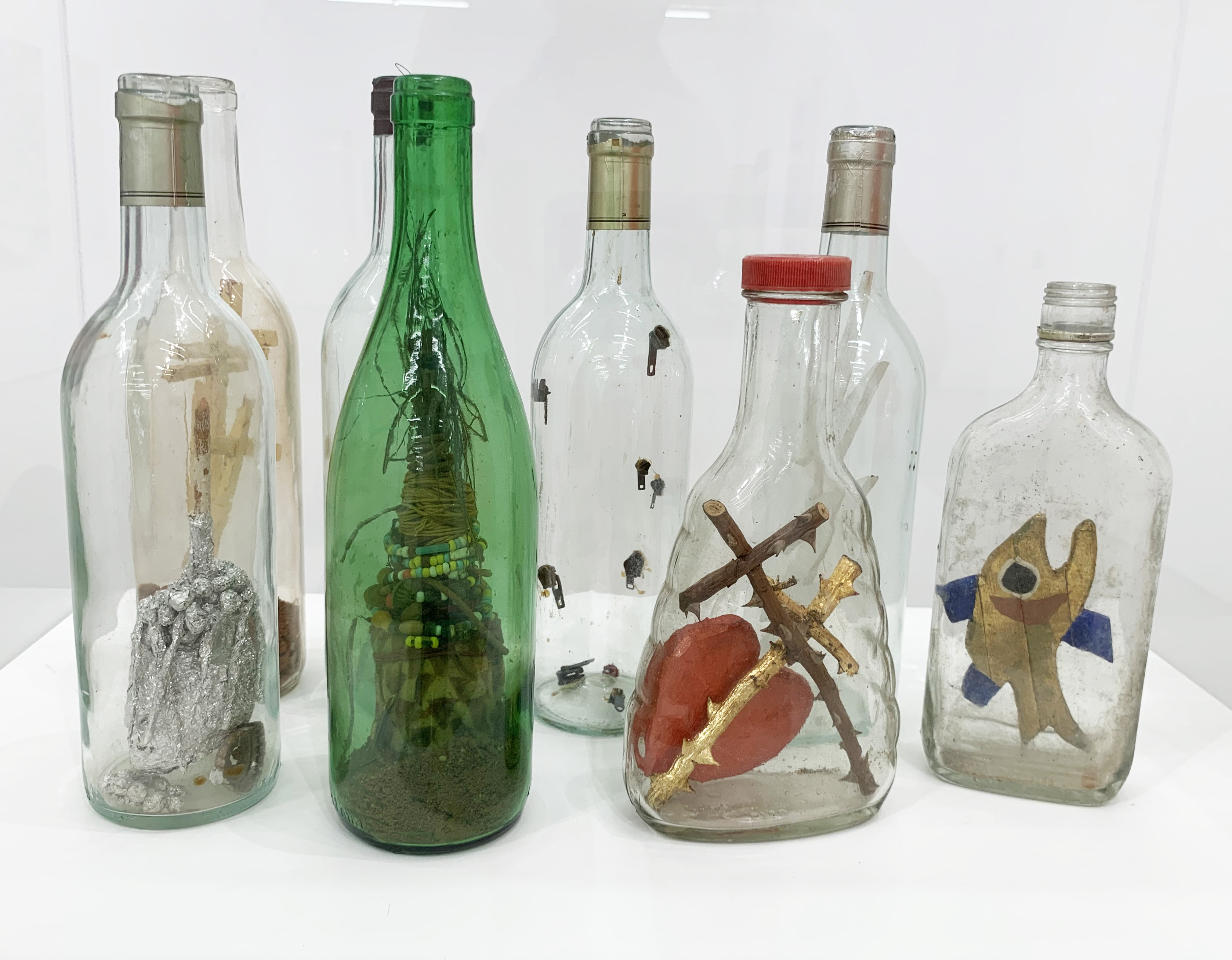
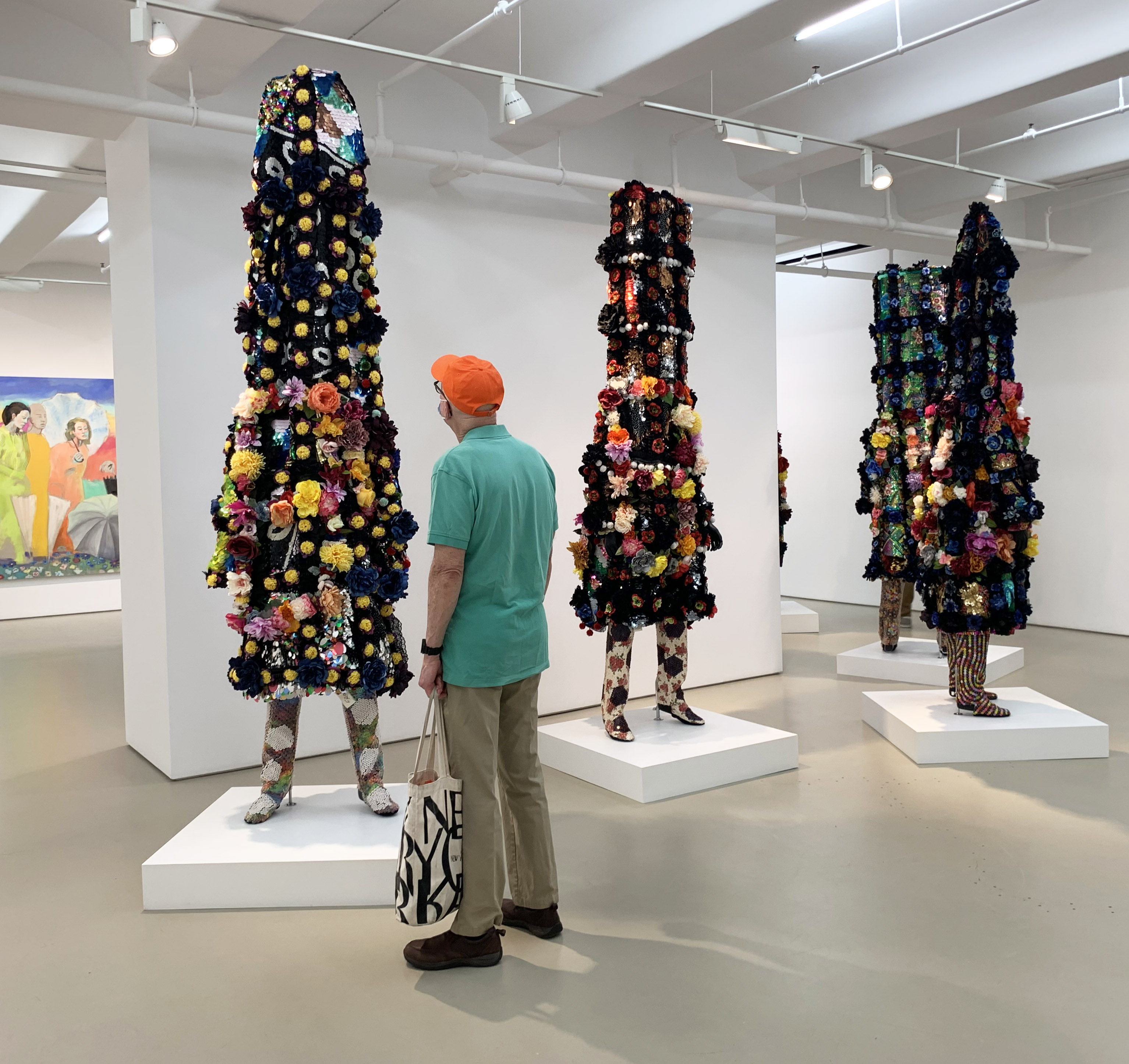
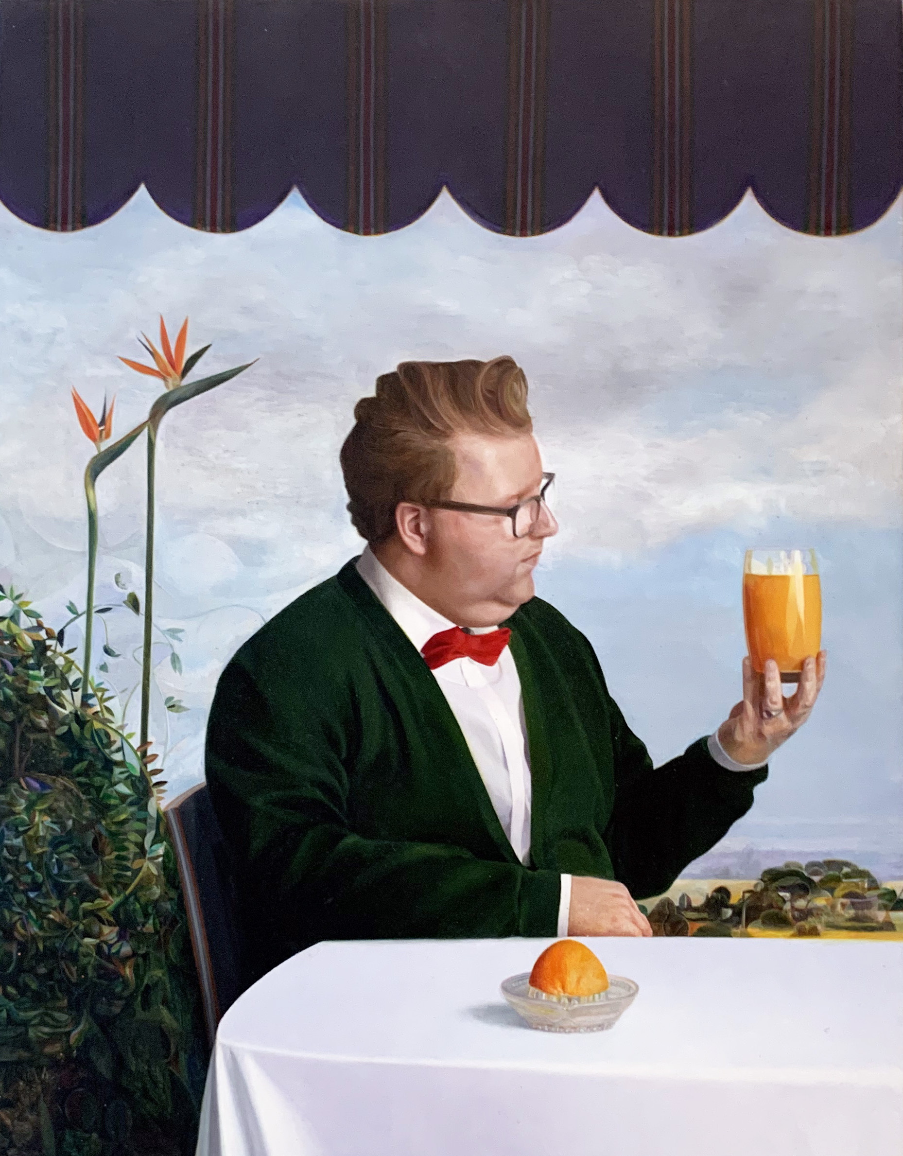
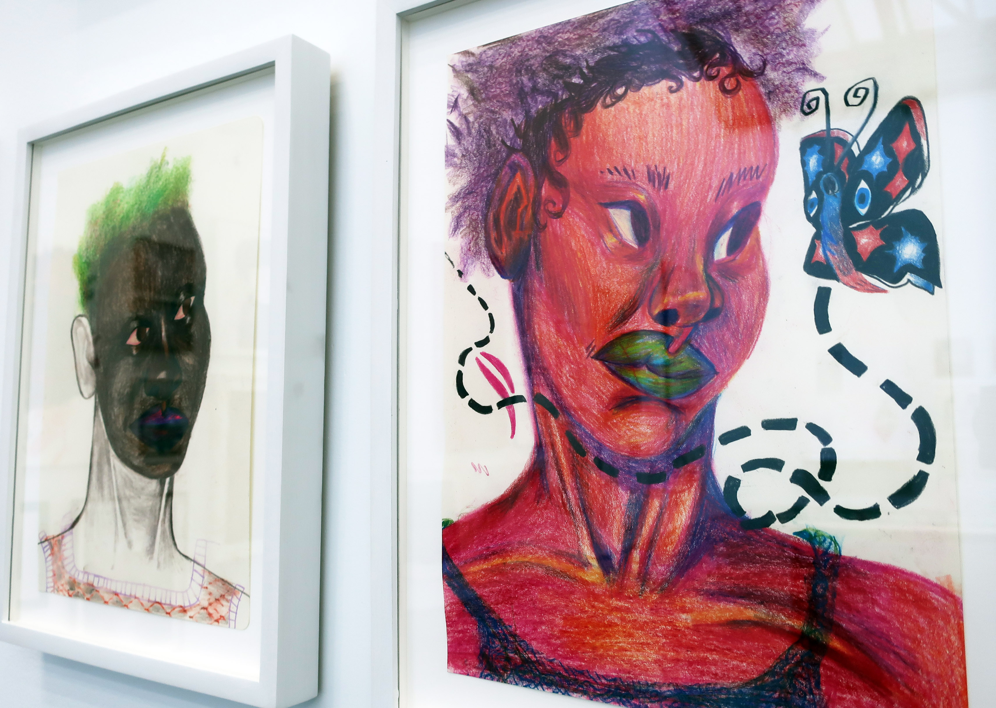
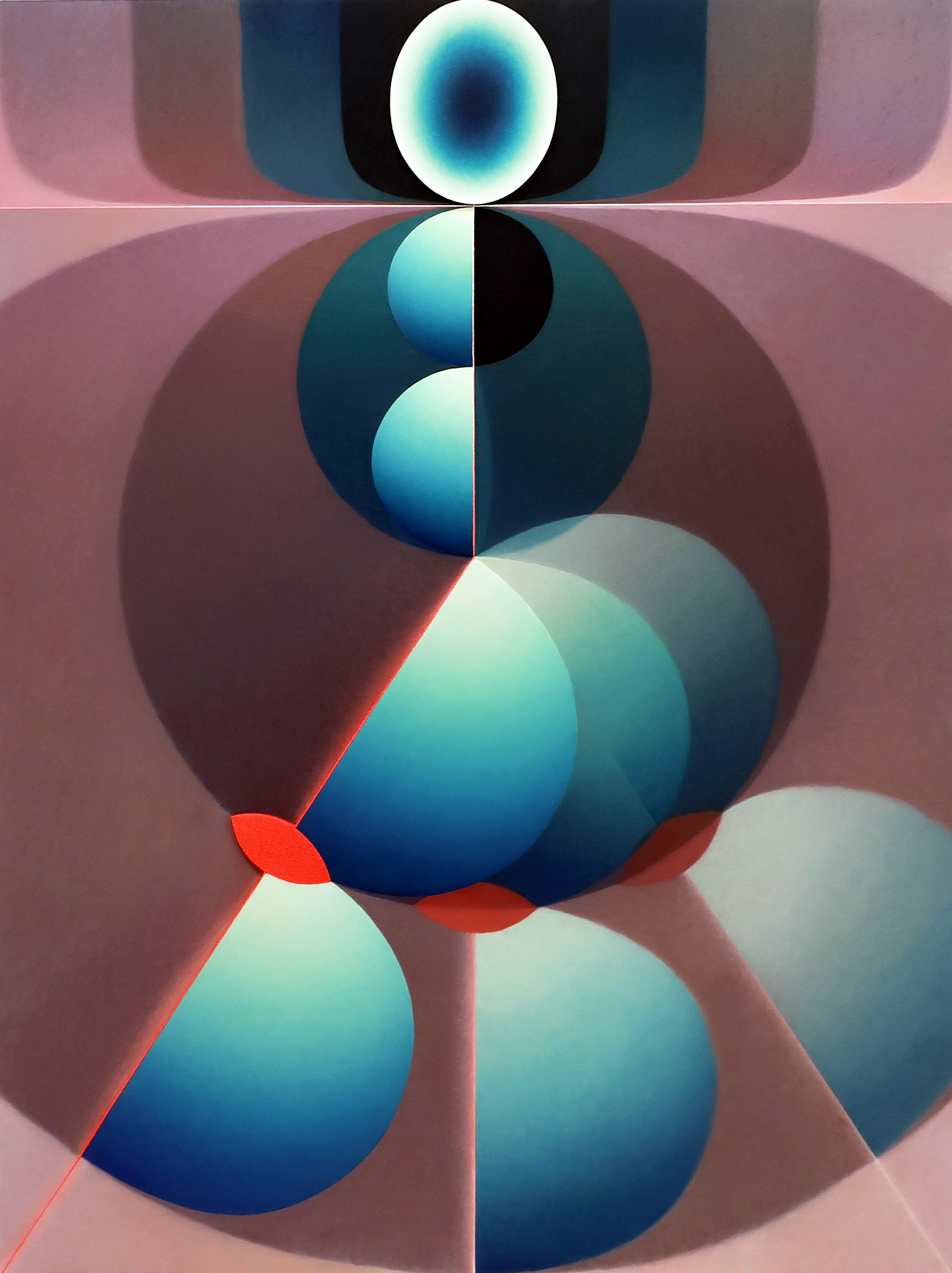
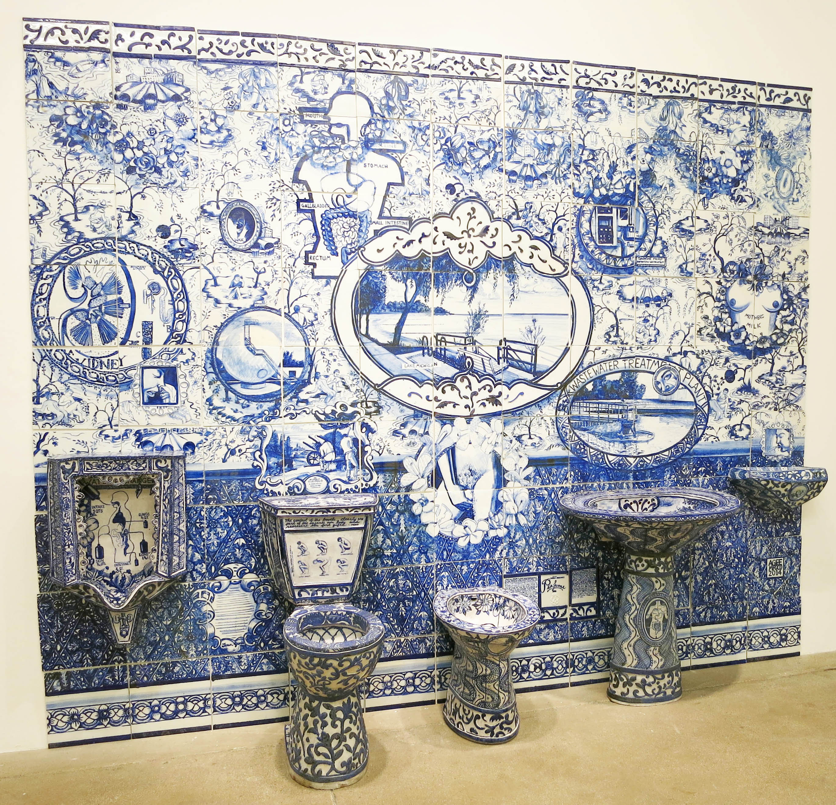
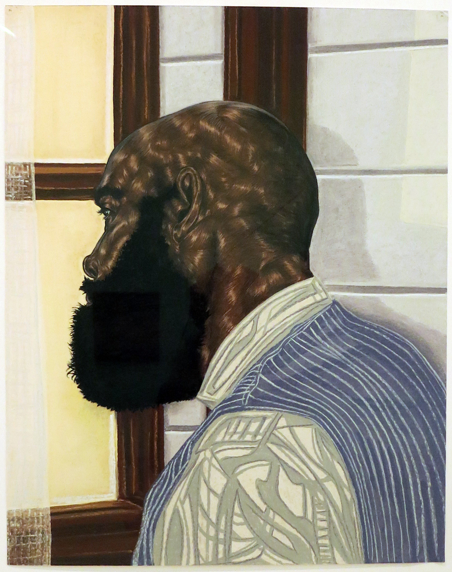
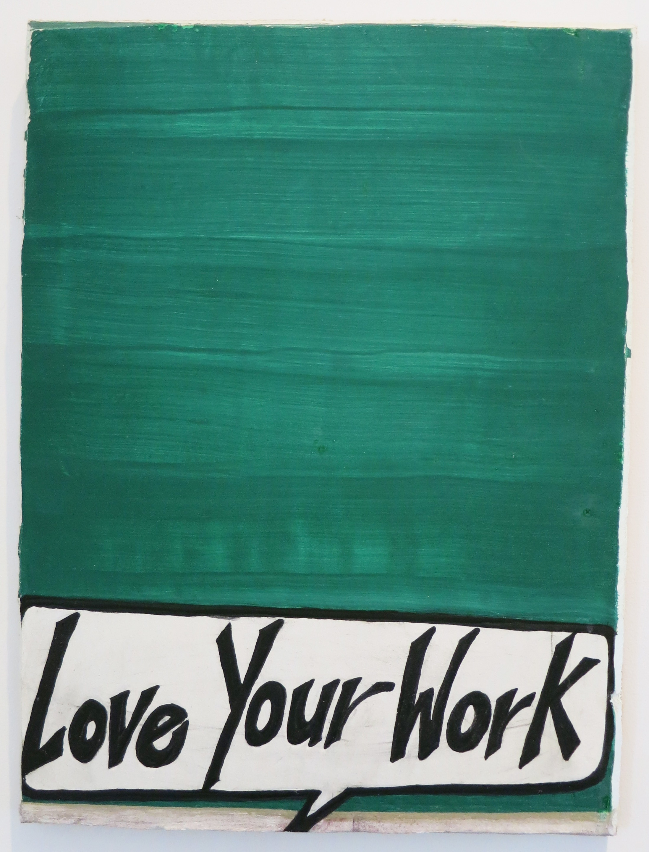
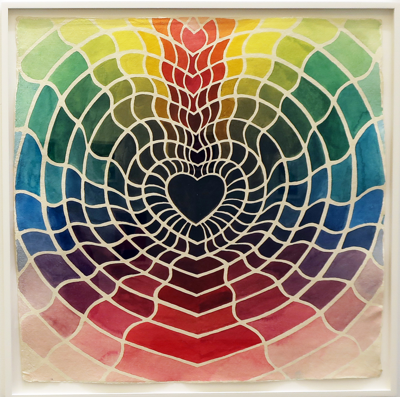
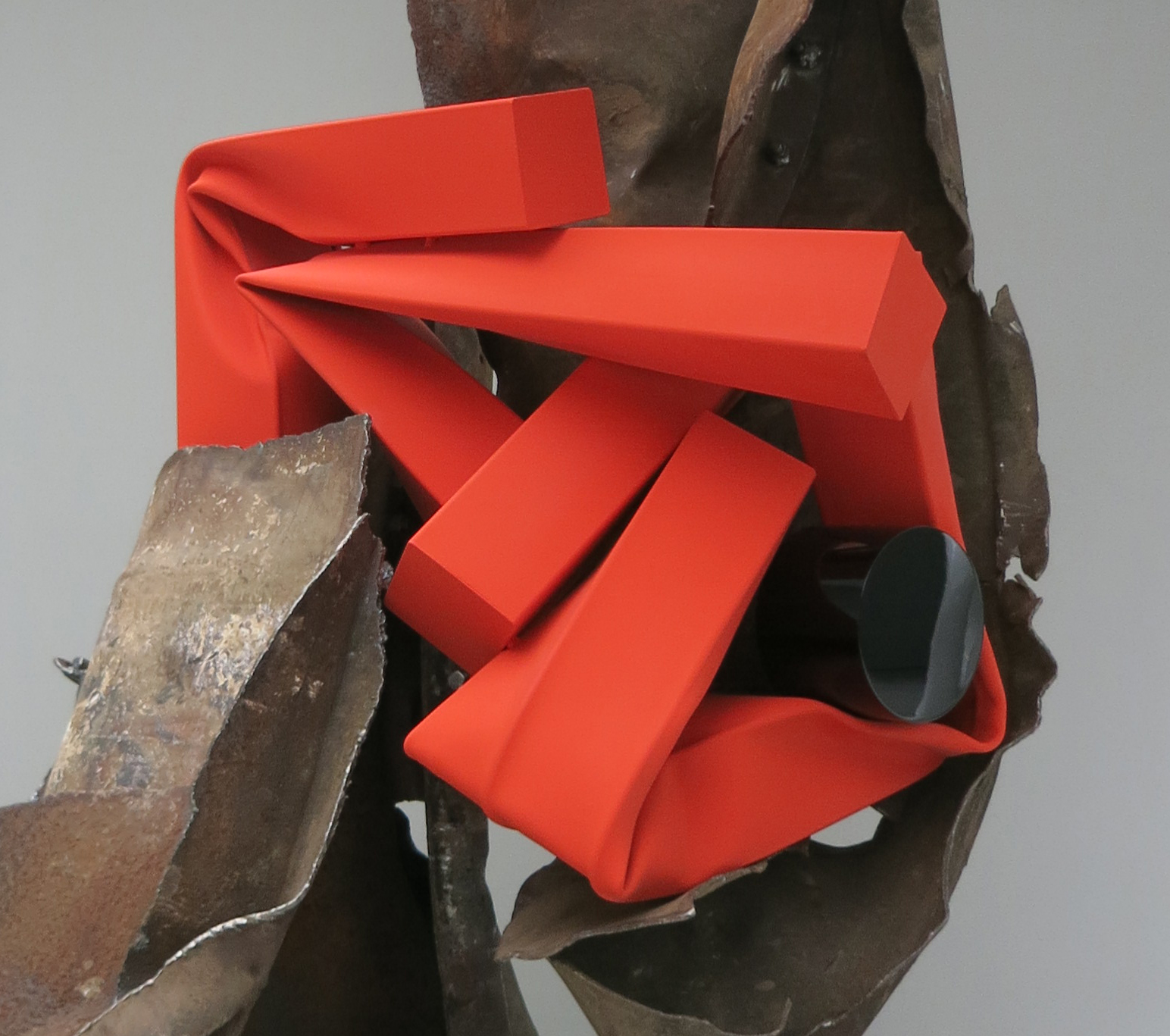
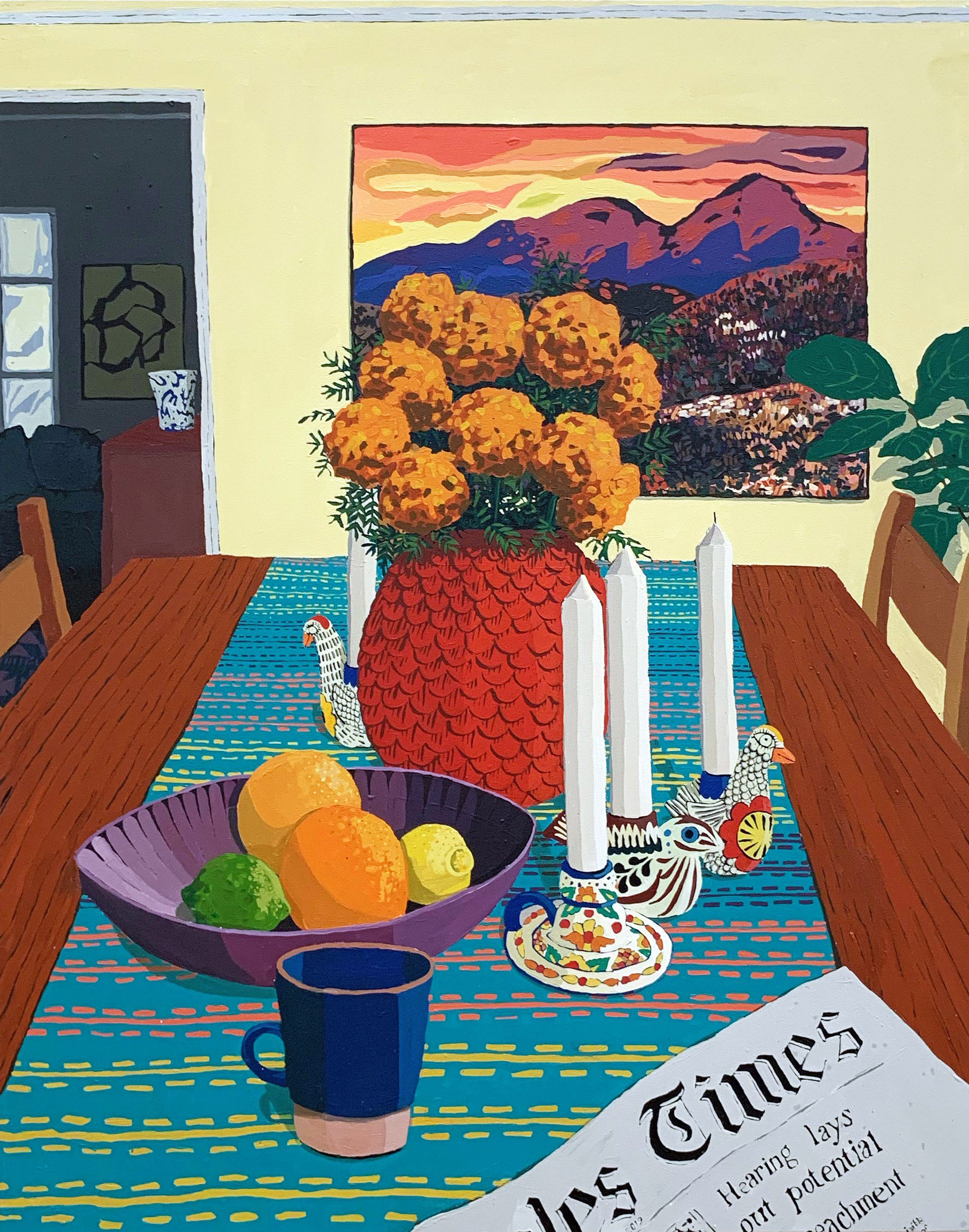
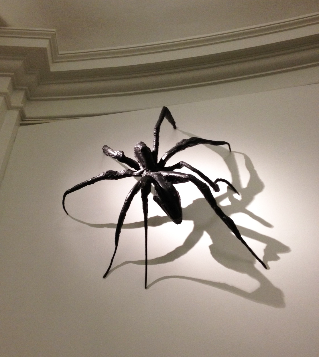
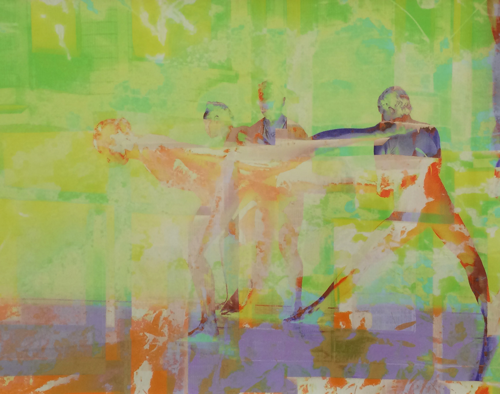
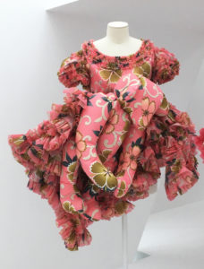
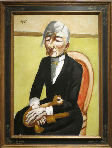
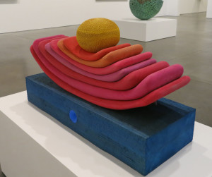
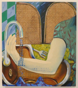
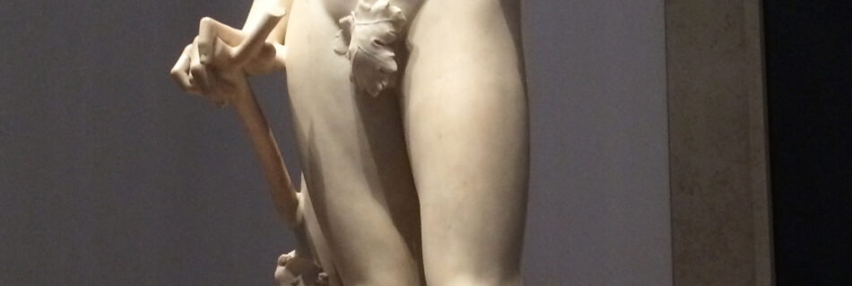

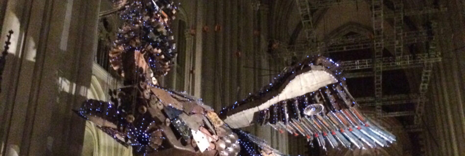
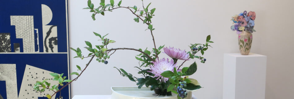

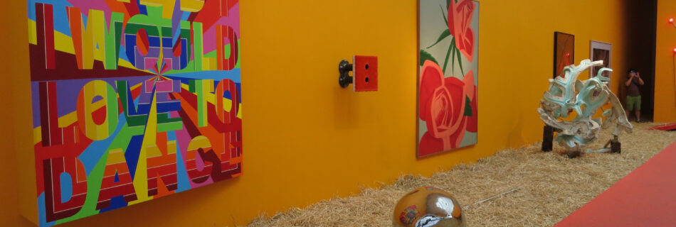

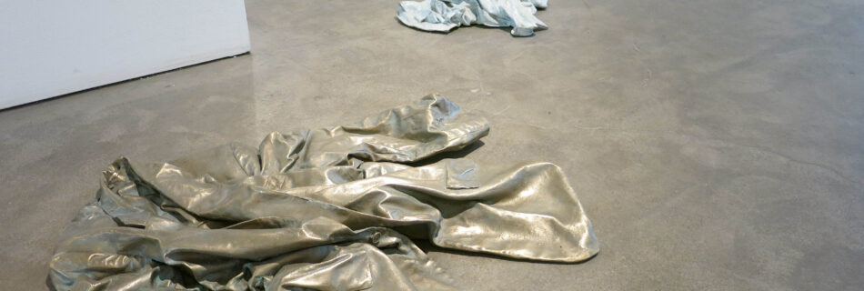

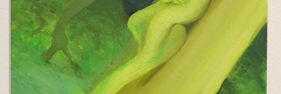

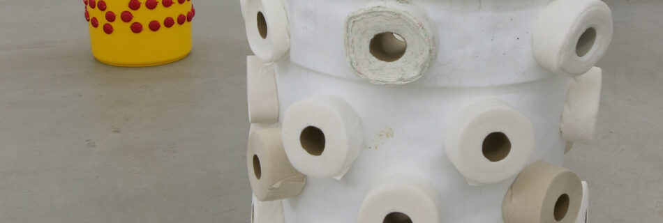

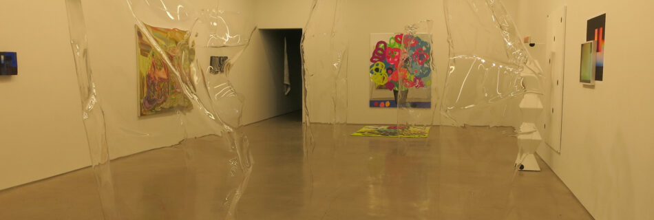

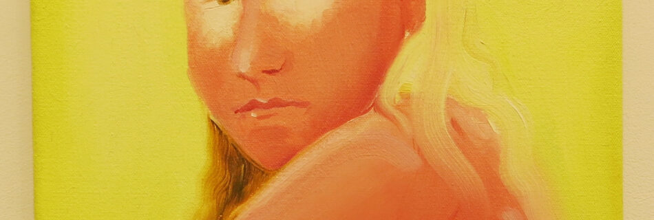


. The Museum of Modern Art, New York. Acquired through the generosity of Jo Carole and Ronald S. Lauder in memory of Mrs. John D. Rockefeller 3rd © 2012 Cindy Sherman")
. Courtesy the artist and Metro Pictures, New York © 2012 Cindy Sherman")
. Courtesy the artist and Metro Pictures, New York © 2012 Cindy Sherman")
. Courtesy the artist and Metro Pictures, New York © 2012 Cindy Sherman")


, inkjet print, 2011. Courtesy of the artist and Tanya Bonakdar Gallery, New York.")
,' camper chunk, plexiglas, steel and paint, 2011.")

,\" 2011. Photograph courtesy of Matthew Marks Gallery, New York.")


,\" 2007. Photograph courtesy of Greenberg Van Doren Gallery, New York.")


,\" 2010. Photograph courtesy of Postmasters, New York.")


.\" Photograph courtesy of the artist and Paula Cooper Gallery.")


,\" 2009. Photograph courtesy of Daniel Reich Gallery, New York.")


